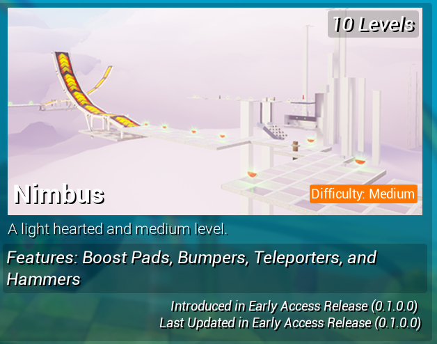
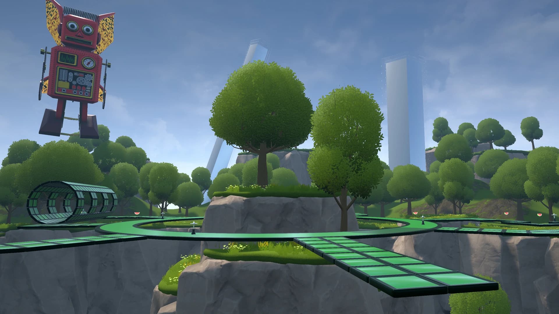
Two things here. Nimbus was updated shorty after early access launch.
Also the picture used for Nimbus is that old version that I mentioned. (You can see plinko in the back on level 8 while also seeing level 10 and the old platform placement on level 7 in the front)
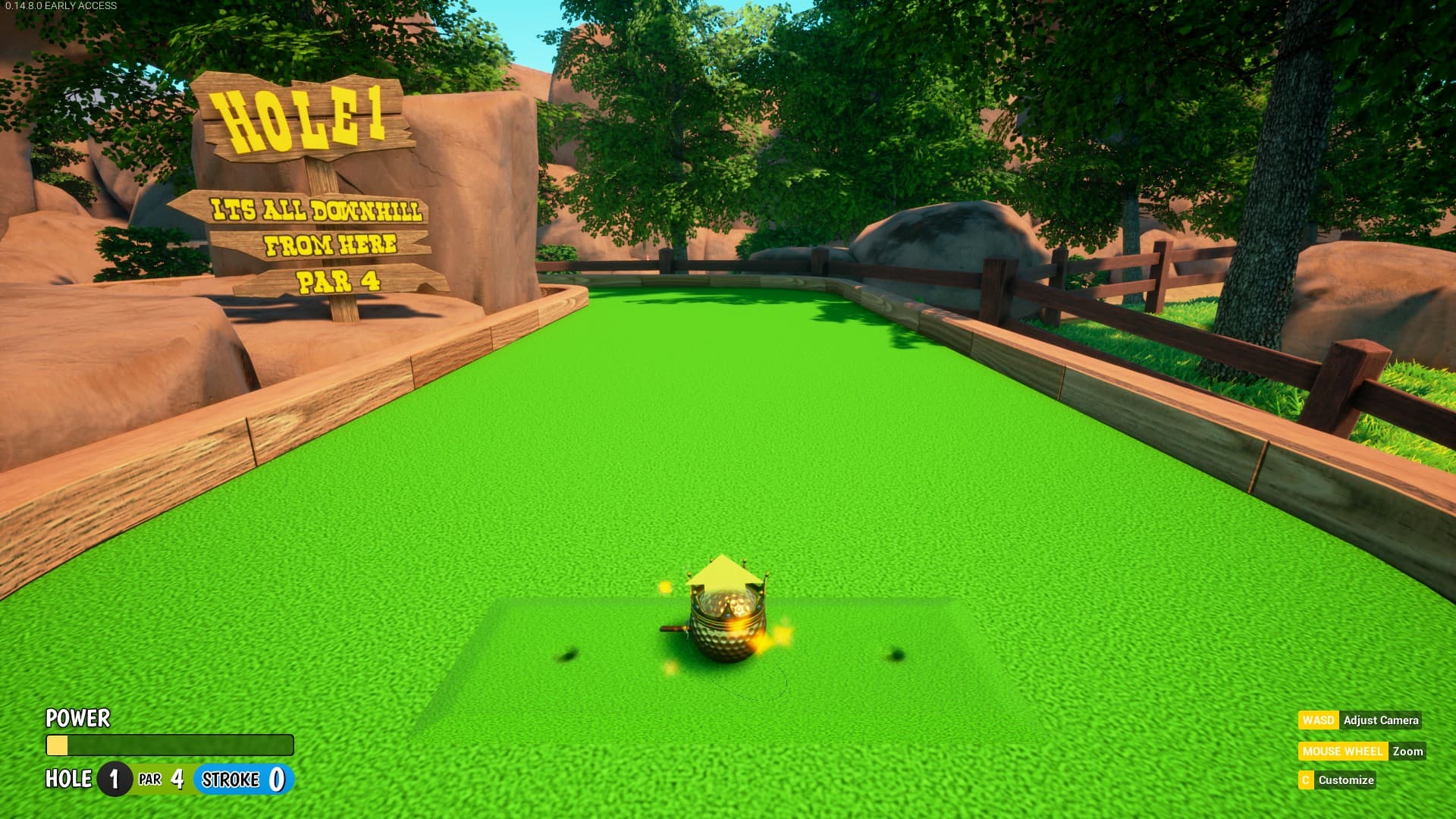
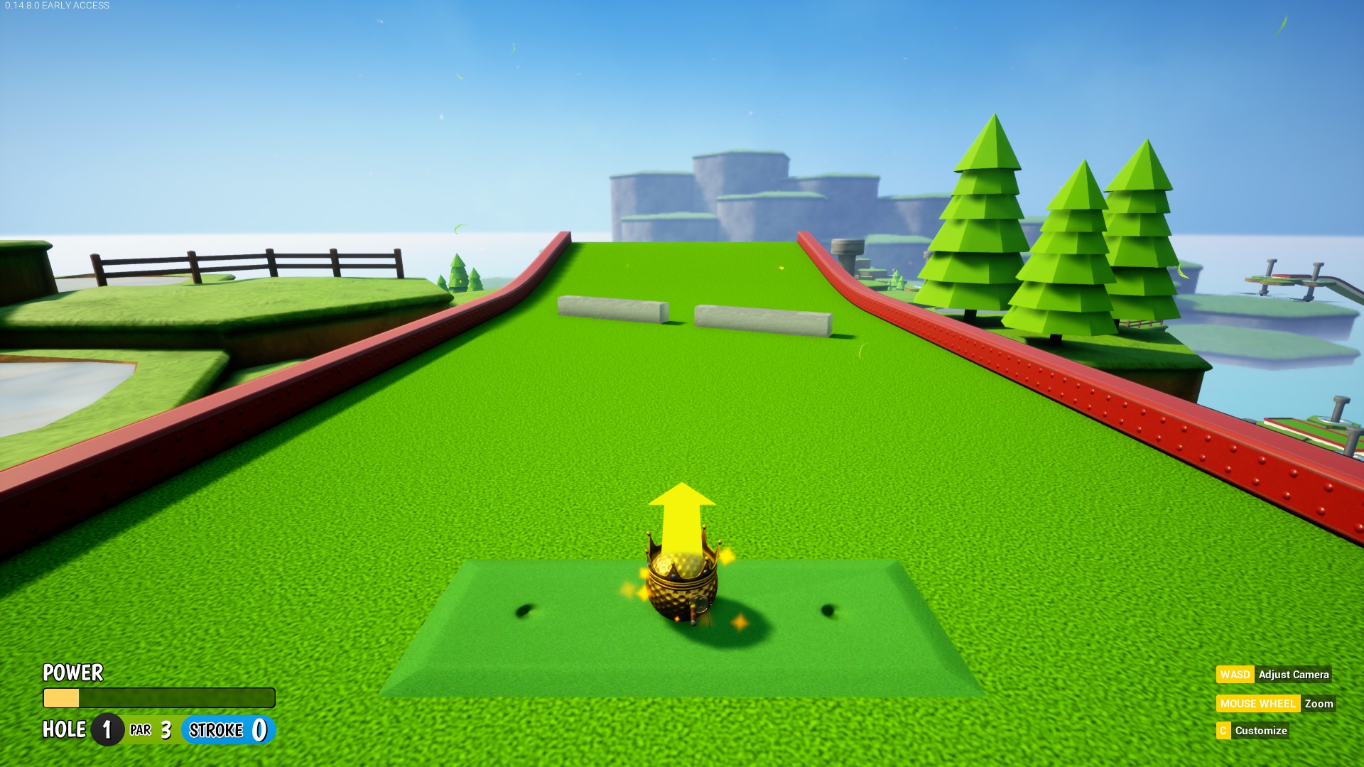
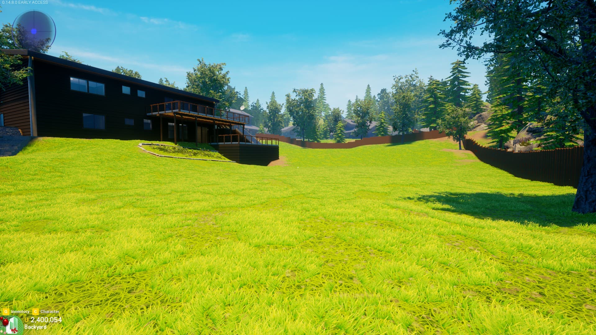
I’ve been very split on most art passes, but there’s something I’ve felt consistently strong about. I, uhh…dislike how green has been used for grass a lot lately.
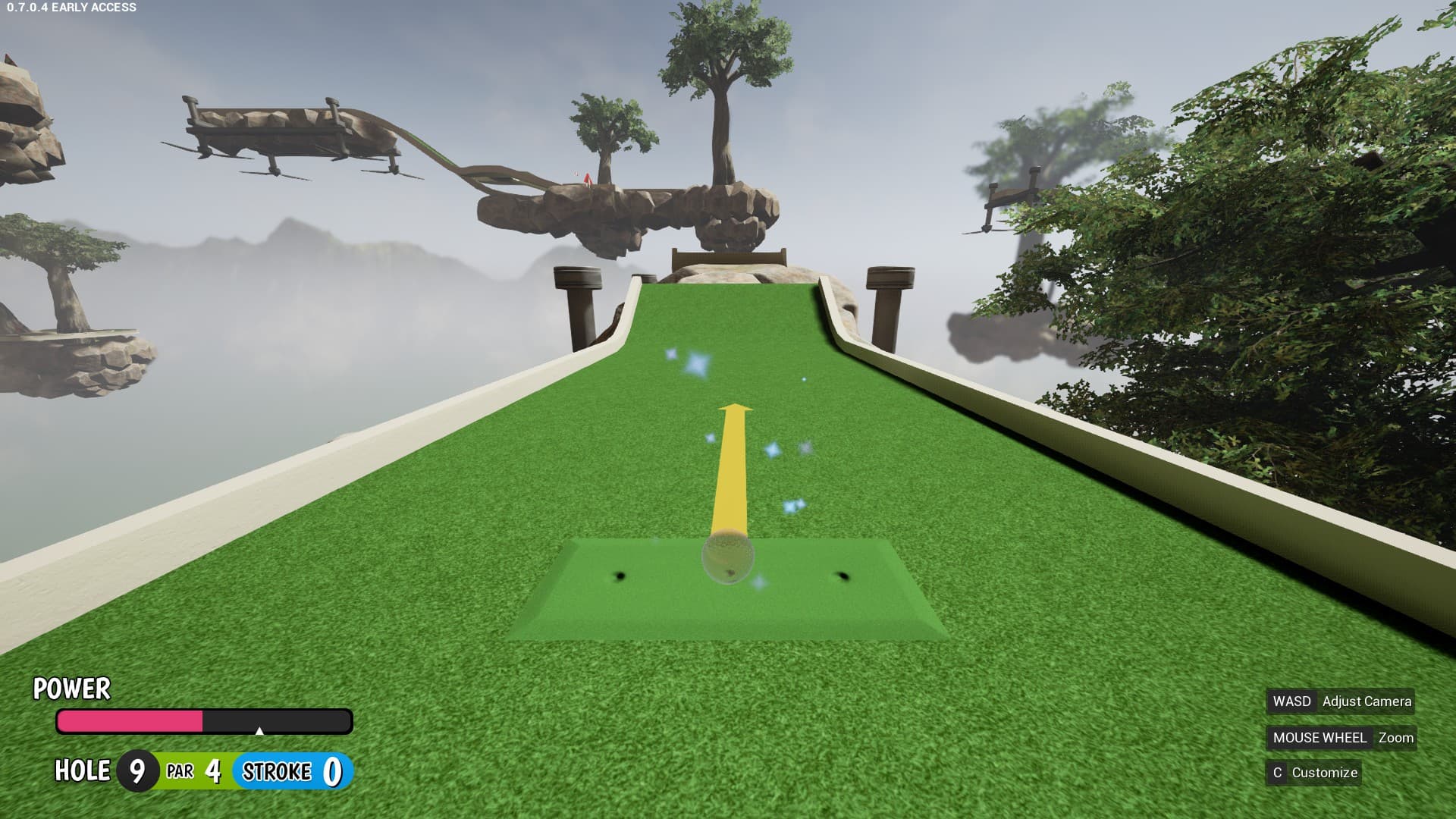
Quite a few maps (usually in Minigolf) received art passes that update the looks, and it seems like every time this happens that colored elements become brighter & over-saturated, especially grass. I know there’s been a push for the game to develop a consistent visual style, which has largely been more cartoony, so of course colors are going to be vibrant, but this is too much imo.
When you’re playing minigolf, most of your time will be spent with the camera angled towards the ground, which fills the screen with some shade of lime or neon green. Compared to every previous version, I’ve always found it less relaxing and extremely uncomfortable on the eyes.
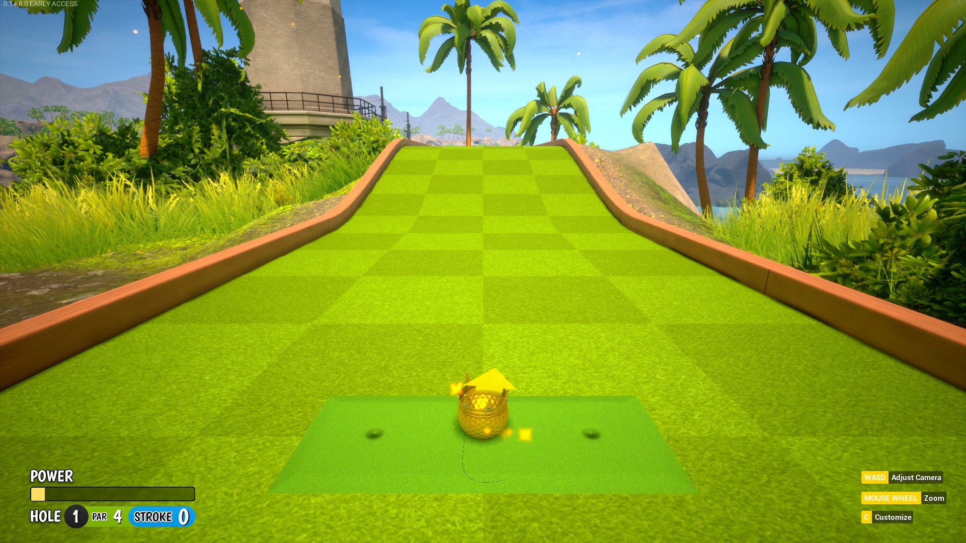
And before. Not perfect, sure, but easier on the eyes. (Screenshot from Computrix on the forums)
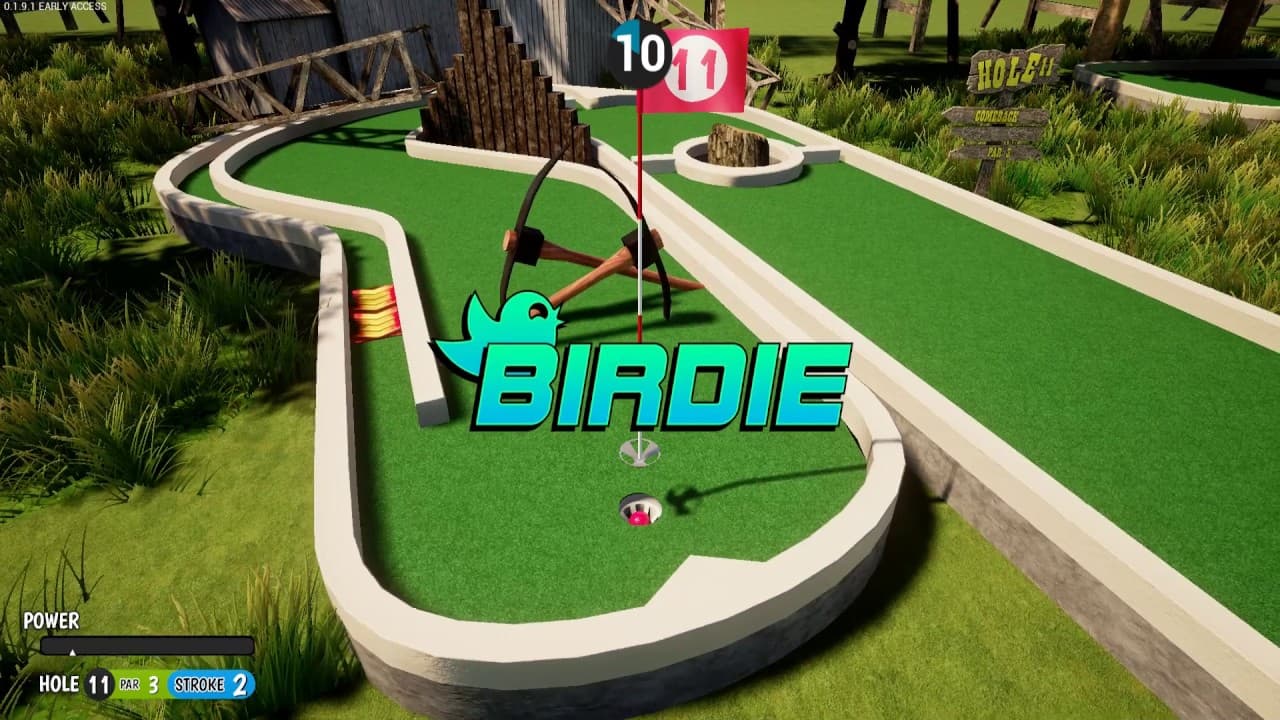
Ironically, the Midori art pass is pretty toned down, despite being one of the most high-tension maps in a fast paced mode. (Not a criticism, though. It looks nice.)
Yeah, all of the new grass colors are really weird for sure. It’d be great to see the colors changed to be more similar to how they were pre-art pass while keeping the new textures, the maps are hard to look at in a way with how bright the colors are
Welcome to font rendering in Unreal. Different icons have a different width to them as well which could be quickly adjusted for this element, but Unreal tends to have issues with scaling DPI on its font.
When starting a new level in Ball Race, it used to be that you start with zero velocity, but after a recent update you sometimes start rolling at start (usually in the wrong direction) and you can’t stop or control your character because the READY text is still up. This might give some players unfair advantages or disadvantages.
Also when you hit the end, the camera continues moving slowly in a random direction which I find a bit jarring.
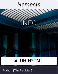
It bugs me a little bit that after downloading a map the button gets replaced with an uninstall button instead of a play button.
I feel like it’d be more intuitive to have it be a play button on the front page and then you have to go into the workshop info page to uninstall instead of the other way around.
Tacking this on to this post cuz it’s short, I wish that the UFO on top of the Arcade spun you when you stand on it like the big bowling ball on top of the Bowling building does. Even the little spotlights that were on the Nightclub but then moved to the Arcade rock you back and forth when you stand on 'em.
All this space we could fill with trailers but there’s no Accelerate, Arcade or Nightclub. I guess also co-op condos could be a thing in there too since workshop is, since those are both sorta UGC type dealios.
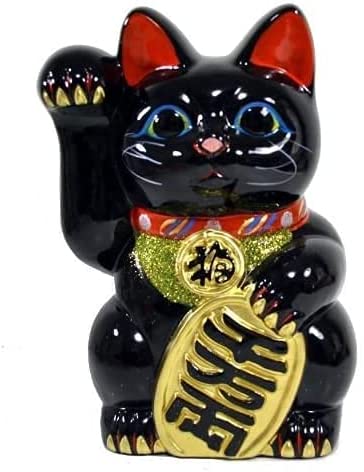
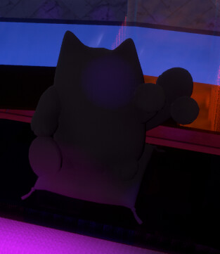
I’m making a condo that has every catsack on display, but every time I walk past it, I keep getting hung up on the jarringly low quality of the Lucky Catsack textures.
The texture is noticably low res, blurry and flat. With a tiny bit of effort, I feel like this could be easily improved.
Shine it up. These things are supposed to be ceramic and have some gloss. It even has a bell.
Resolution. You can see the pixels on this thing.
Color. Lucky cats come in a huge variety. When recoloring it, it’d be nice if it looked like this:
And not this…
While it is an insignificant 2,000 ticket arcade prize, I love maneki neko, and this does neither justice to them nor the rest of the items in the game.
I swear the Lucky Cat didn’t used to look this way at release.
At some point the glowing aura disappeared and the colouring got screwed. tbh that may just be an LoD bug, though.
But yeah, I think it should be ceramic instead of a plush (?) and petting the Cat should cause it to glow and its paw to wave.