I disagree with your exact angle, but I’ll just say that I at least understand how you feel. I’m not a fan of the Altitude art pass myself, and I’ve made some pretty recent complaints that are adjacent to yours, so I wanna chime in here too.
In spite of what I’ve said in the past, I actually don’t mind Forest at all. Being a literal forest, deep greens everywhere makes sense, and the tall trees make it naturally shady and darker in a lot of areas anyway. I quite like it as is.
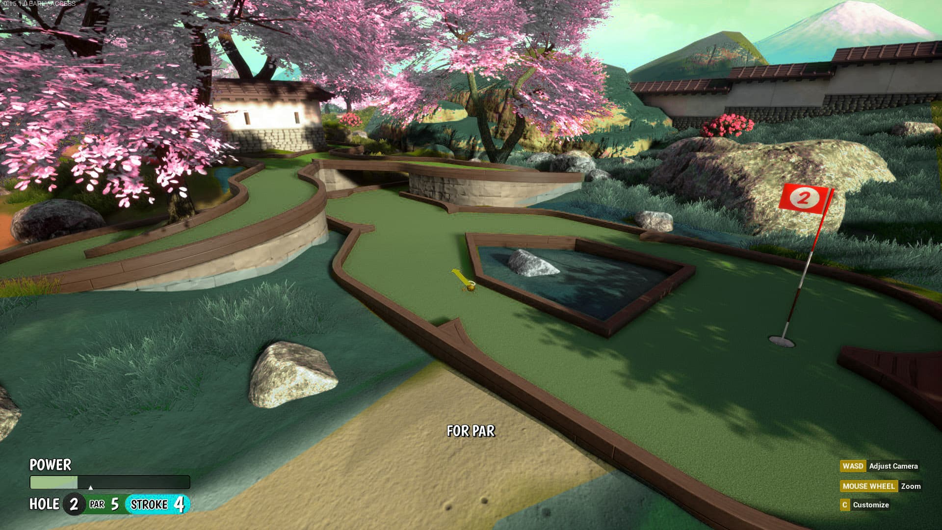
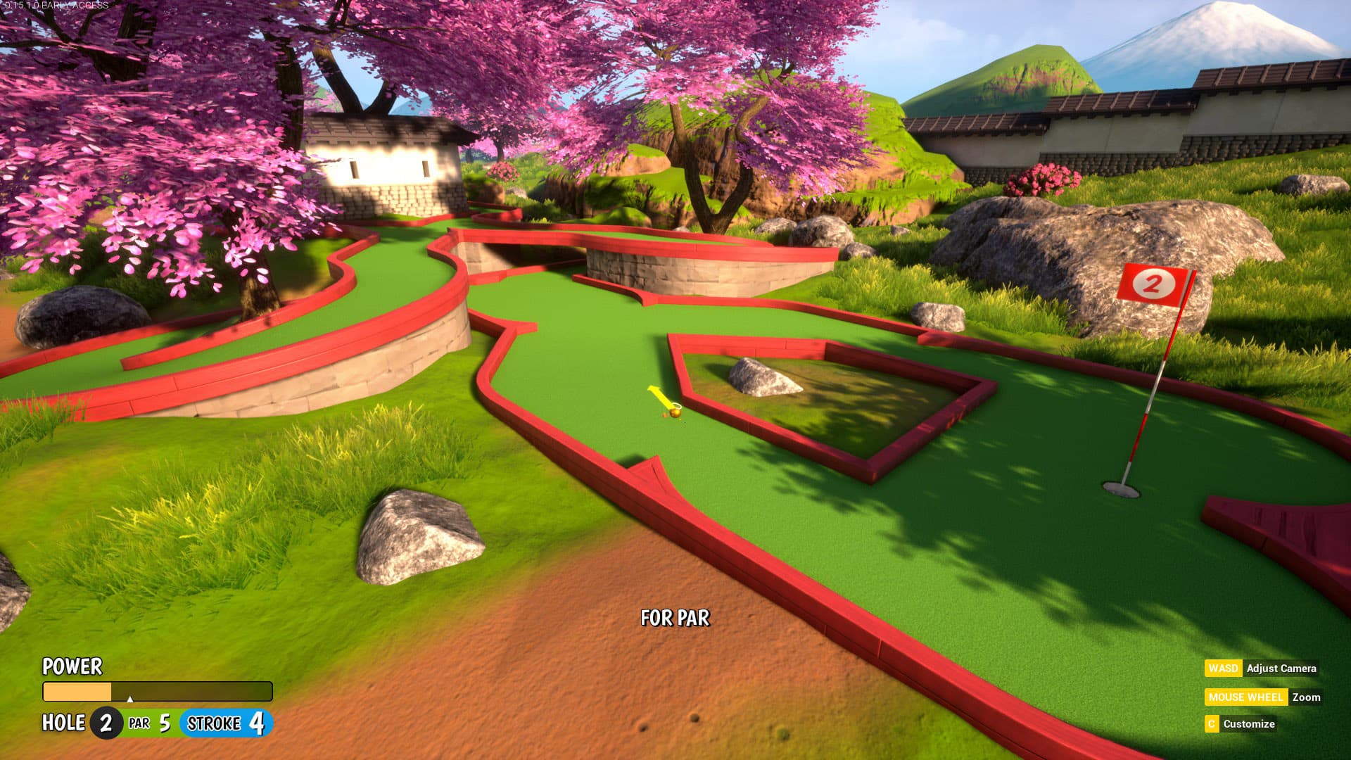
Garden, however, I’ve felt funny about ever since the addition of the red border around the entire map. I’m just not a fan of complimentary red & green, and altitude has it too. I get what they’re going for though; it’s not like there’s a shortage of laquered, red wood in Japan. I think maybe it’s less about saturation and just the color scheme in general. It’s pretty bold. I’d even call it fruity.

At the end of the day, It’s a good looking map either way.
Now if it were me? I would go all ukiyo-e with it, though