Weekly Dev Log for July 20th, 2020
Hello everyone, and welcome to the Weekly Dev Log for July 20th, 2020, detailing all the changes that have happened since July 13th, 2020. Note: Devs that don’t appear in the weekly log are not necessarily away or not doing work, but may be working on things currently not announced or backend work that doesn’t need to be detailed.
Update 0.10.2.0
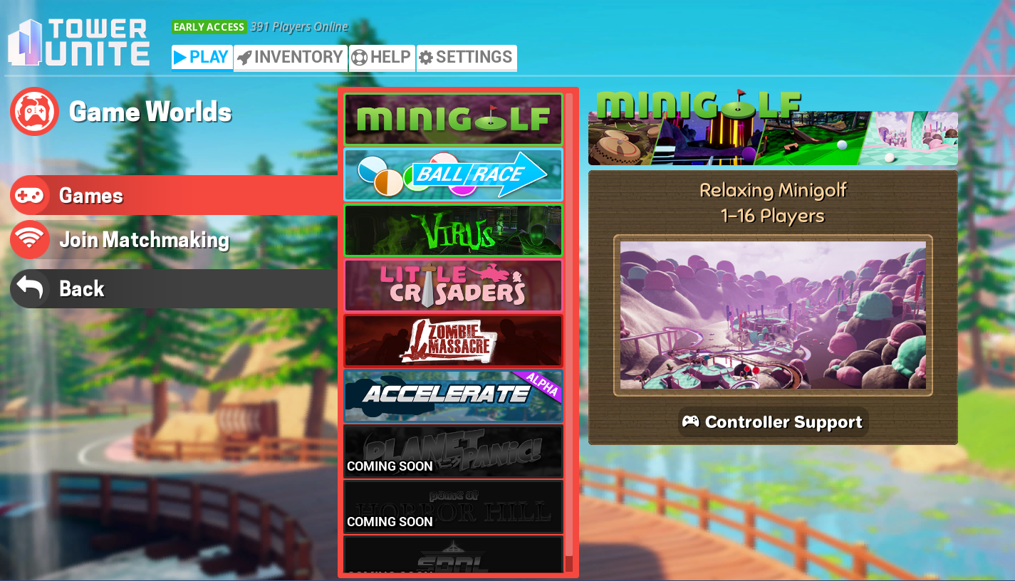
Work continues on getting Update 0.10.2.0 ready for release. As mentioned last week, this update will feature not only Steam Workshop Vehicle Support and Track 2 of Bedzoom, but will also include an improved Main Menu, the return of Global Chat, a built-in crash reporter, along with a bunch of other bug fixes and improvements. You can read more the contents of this update here.
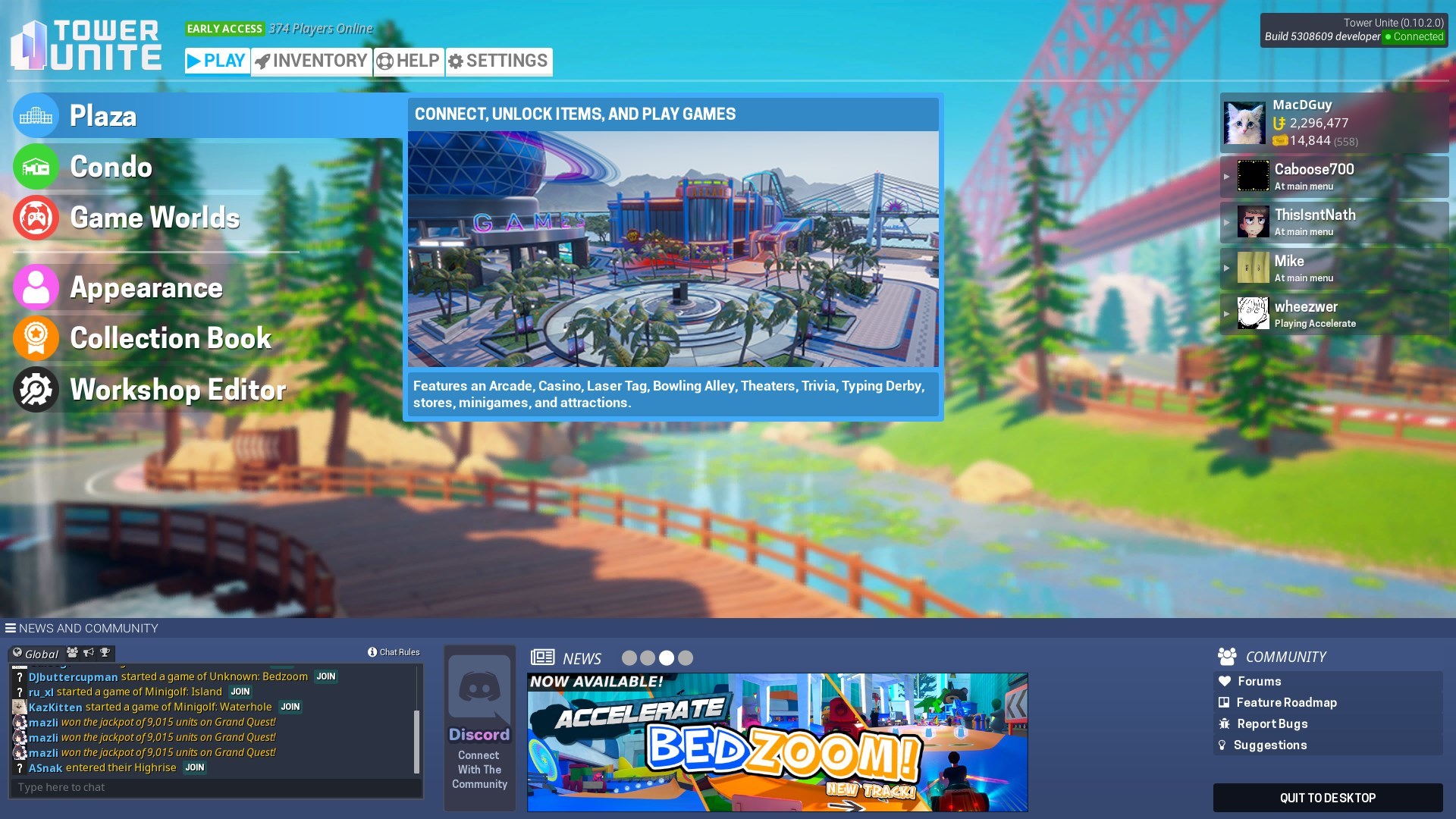
New Main Menu
@macdguy started working on a new Main Menu, in an effort to make the user interface cleaner and less cluttered. The main menu featured in 0.10.2.0 is still in progress, but conveys the general idea that we’re going towards.
New Main Menu WIP
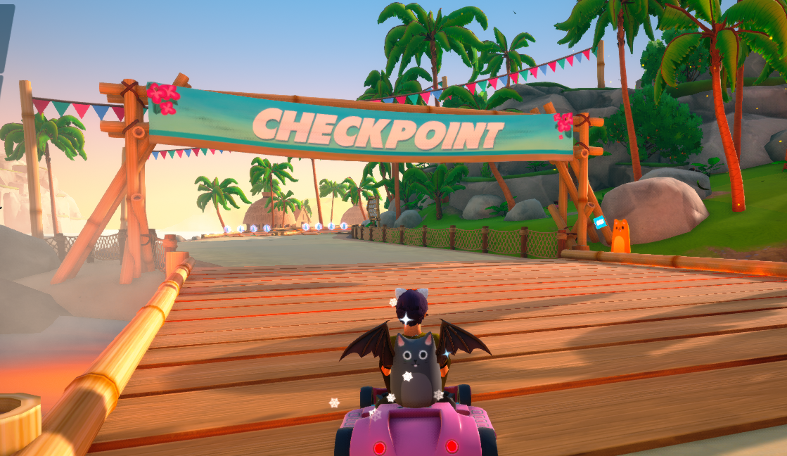
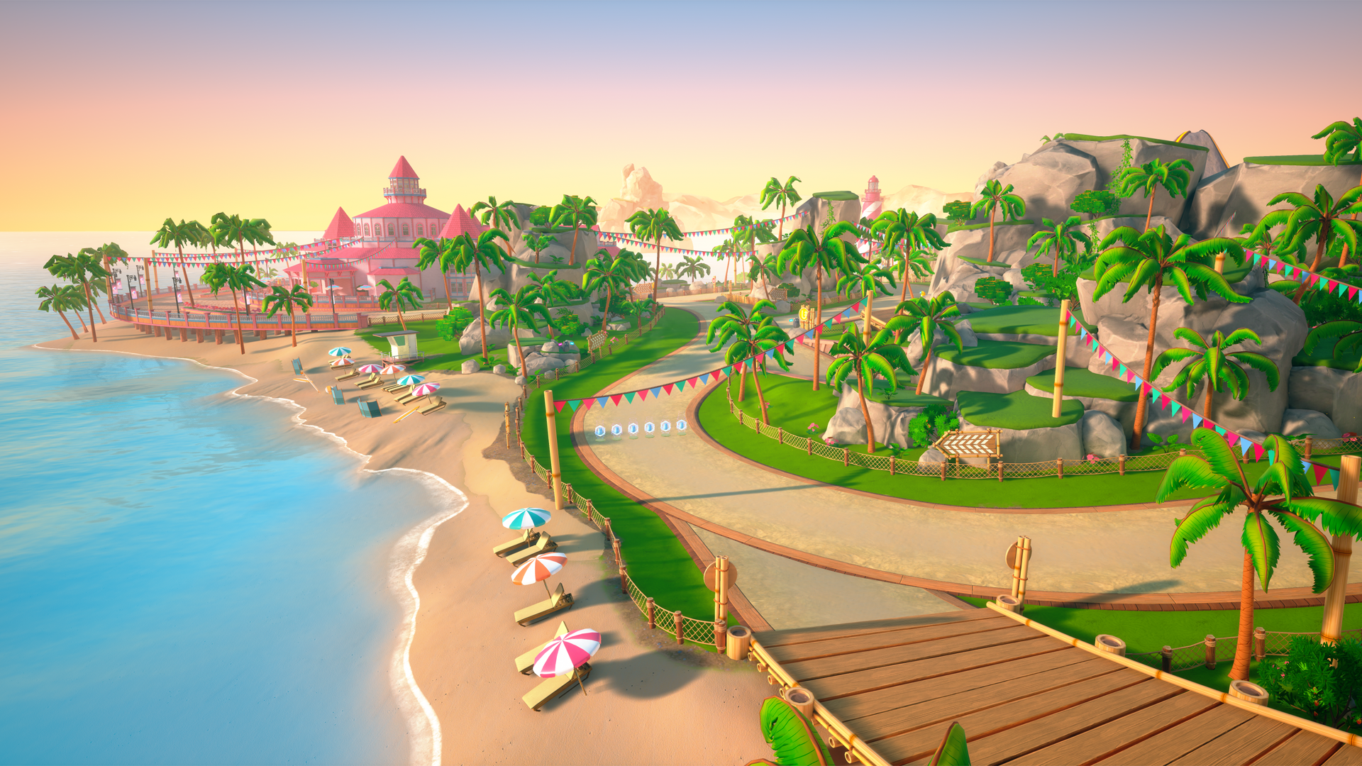
Accelerate Progress
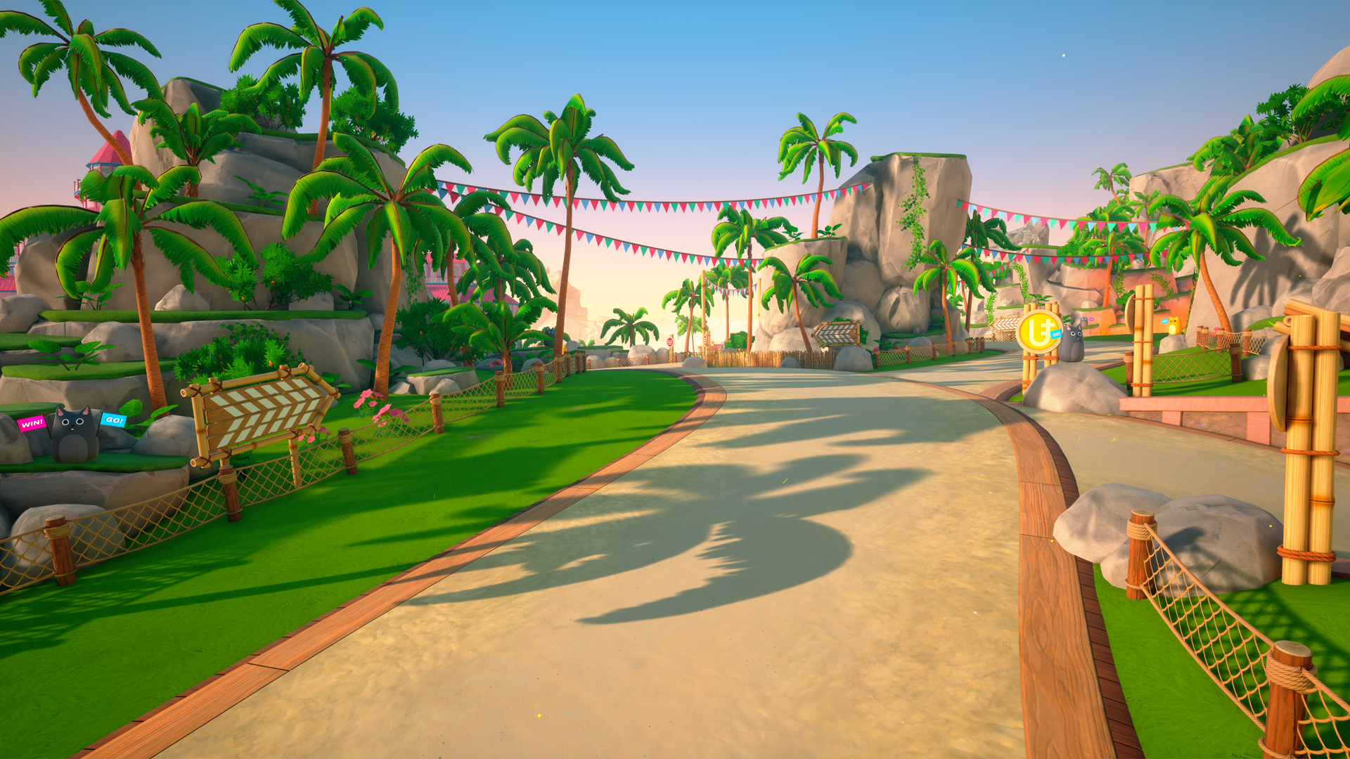
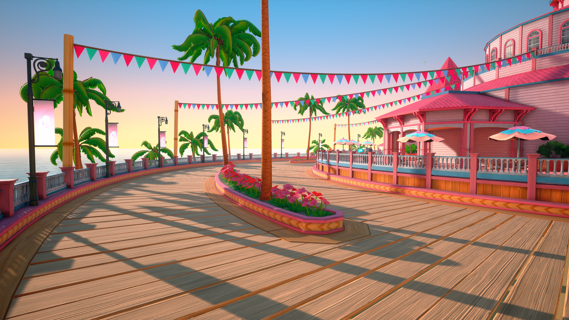
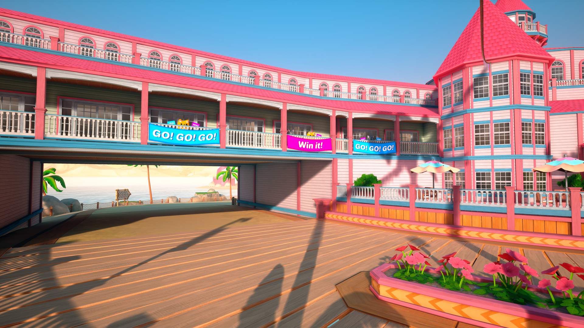
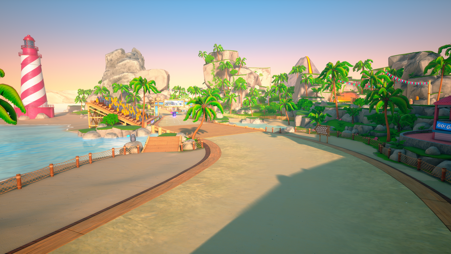
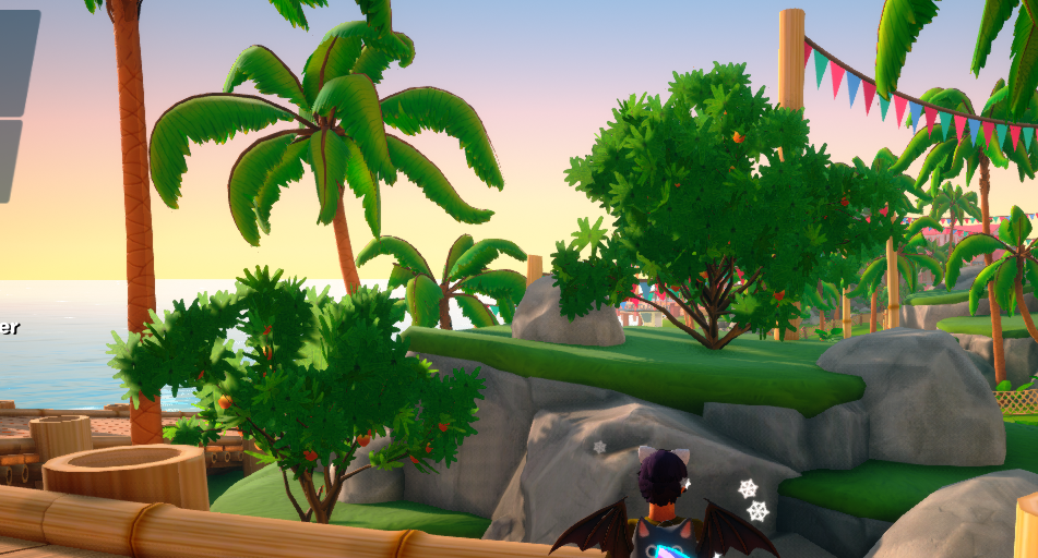
@Johanna continued working on Sunrise Isles, 99% finishing Track 1. Her next task is working on Track 2 of Pine Valley.
@Wheezwer worked on artwork for the start line, checkpoint banners, foliage, and other art for Sunrise Isles. She also started working on concept art for Nightcity.
@Will finished the music for Nightcity, and continued working on music for Sunrise Isles.
Accelerate: Sunrise Isles WIP

Miscellany
@Sabrina worked on building and integrating a in-game crash reporter, which will appear in the event of a fatal error, allowing the end user to quickly give a description of what occurred, and upload the crash dumps automagically.
@macdguy did some work on Workshop Condos, which would allow a user to upload their condo save data to the workshop for anyone to download. He also worked a bit on co-op condos, and “continuous gameplay”, which would allow players to choose a next map without having to go back to the main menu and create a new server.
@madmijk worked on fixing colorable items, rewriting some of the base code to make it more flexible. This involved touching a bunch of items to reflect these changes. He also worked on a fix for Planetary Piano where sometimes notes wouldn’t appear.
@Sketchman continued working on the player grouping system, and also looking into integrating the new server browser.
Wrap It Up
That about covers everything that happened since July 13th, 2020 at PixelTail Games. See you all next week!
Join our Discord for development updates and community fun!
https://discord.gg/pixeltail
We love awesome people like you!
We’re also active on Twitter!
https://twitter.com/PixelTailGames
Follow our developments on our Trello in near real-time:
https://trello.com/b/6BwRMiPw/tower-unite-roadmap
Take a peek at what’s being worked on every week in our weekly dev logs! There’s bound to be something interesting every week!
http://forums.pixeltailgames.com/c/devupdates/weekly-dev-logs
Please report bugs & submit suggestions on our forums. We’re active everyday & here to help.
For bug reports: https://forums.pixeltailgames.com/c/bug-report/18
For suggestions: https://forums.pixeltailgames.com/c/suggestions/7


<3 PixelTail Games

 . Other than that, I think it would be a good idea to add some of your other community links there. I feel like there are probably a lot of players who aren’t aware that you guys have a Twitter, Patreon, Ko-fi, or Redbubble page so it would help. I’m sure some people might be opposed to the merch / Patreon links, but I think the Twitter link at least would be a nice addition.