I think I can sum up the complaints: “I don’t like change and I want to be able to complain about the old stuff.”
I think most people here were able to give a valid argument when saying they didn’t like the new UI. Personally, I like to wait until the feature is launched to say what I feel about it but it’s also valid to give feedback while they work on it
2 Likes
This is already a much better improvement and reduces some of the extra clicks that were involved with the process! I don’t know if it’s just my impression or not, but the text on the general buttons also seem to be much more readable (I had people comment on our side that it was hard for them to read against the background even with the shadowed rectangles due to their conditions). I do admit that I like the scrolling animation when you hover over an option too.
I’ve also read your reply and some of the arguments that you presented towards your design decisions and can comprehend the design goal of wanting to more empty space to not overwhelm players, and can admit I am a bit biased on the use of space (I’ve had to fit UIs in 256x144 before) and also a bit biased towards the existing main menu, if not for starting at for five years, so I’m trying to approach my thoughts with a less skewed vision now.
Regarding the Appearance, Collection Book and Workshop Editor, I can understand why you want them to be regarded as important options as well, but depending on the user, I still think the average player will only access those when specifically looking for those rather than reaching the menu and thinking “Alright, what now?”. In my opinion I’d still reduce the size of those options to give more prominence to the main-three of this game.
Given the goal of eliminating things to overwhelm the player and wanting to give more prominence to existing options, I’d argue that the top bar with the ‘Play’/‘Inventory’/‘Help’/‘Settings’ should be the next thing to go, given how it’s laid out differently from anything on the game, and I’d possibly add them underneath the new set of three options, possibly as text only.
I am also a fan of @Woofbyte’s idea of having a background for easy readability, but I think it likely looks weird when you don’t have something hovered over. At this point it’s just spit-balling, but maybe adding a vertical pane across the menu where the options are at, similar to the design theory of the pause menu could help make things more consistent while at the same time more readable? I can try mocking-it up later to see how it looks, if you’d like that.
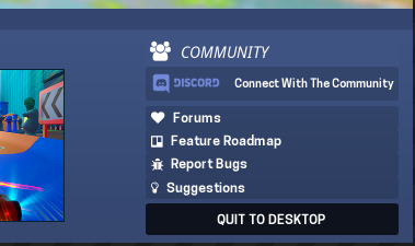
Finally, I can also see some of what Mario’s points were, and I have to say that I am also not really a big fan of the Discord button, both on styling (since a few updates ago) and on it’s placements. The gradient on the text is not only incredibly distracting (rather than working as call-to-action) but is even something that brands really don’t like. I’d honestly change it’s styling (using the Blurple for the button will likely make people click faster with the fact it’s Discord) and move it closer to the community pane on the right.
Sorry for the long-reply, but I think this is moving in a good direction. Thanks for listening to the feedback so far, @macdguy and I look forward for the next iterations!
On another side note though…
As for these replies, I just wanted to say that some of the over-protective attitudes over the criticism of this game is what made several of the original zealot backers and buyers move away from its community and lose interest in the game (myself included). Criticism is fine, as long as you provide reasons, proposals and are non-rude about it (and I apologize if I came out that way in the original posts).
I made these and the previous posts in good faith, and I am glad and thankful to see Mac implementing some of the addressed suggestions and proposals and think some of the additions are already looking better. That’s how you move any creative product forward, and listening to criticism and knowing how to filter it within the limits of your vision is a developer’s best virtue. Listen and only giving space to positive feedback, and you’re creating a bubble that will only hit yours and team’s morale harder when something actually gets harsh criticism.
main menu is noice. I just wish the tab in the middle was really in the middle. maybe it is and im dumb but it looks like it leans more towards the left side of the screen
Looks good. But now I’m wondering if the tabs on top should stay. Inventory and the rest could be buttons like the appearance one too, maybe even smaller but all in the same column.
1 Like
This is something I’m working towards. Help menu is going to be completely redone, along with inventory.
2 Likes
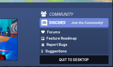
Here’s an updated Discord button.
7 Likes
Looking great!  Though the blue on the logo is kinda mixing way too much with the background. Maybe the opposite is more attention catching/readable?
11 Likes
Yeah, I like your version better
1 Like
About the quick access thing, instead of a vertical rectangle button, how about a semicircle on the edge of the screen? I think it would be much easier to click and much more aesthetically pleasing
This is the classic “OG v NG” debate: we were here first so we should have more say. They are working within their vision.
They are taking more criticism than they’re taking suggestions. A lot of what I am hearing from backers is, “Do you remember when…?” and being upset the devs are not following the plan the OG backers had formed in their own minds. I don’t think that’s fair. I also don’t think it’s fair to demand that that the devs have to respond to each criticism in order to justify how it fits within the vision of the game. The game is growing. The game is in preschool, it’s not an infant anymore. One day it’s going to get into elementary school where it’s going to meet an even wider base. Then it’s going to get in with those rough crowds in middle school. Then it’s going to feel its oats in high school. Then it’s going to get into college. Part of the innovation of the game can’t be being completely tied to the hopes and dreams of when it was born. The game is a bit colorful, flamboyant, serious, weeb–reflective of its base. The game is going to change as its base changes. Its base is going to change based in who gets brought in. OGs aren’t bringing people in anymore, the new group is.
The devs are doing their best to strike a respectful compromise, but pretending to be victimized for receiving criticism for giving criticism is not going to garner you points. OGs have been complaining about every aspect of this game since it came out and continue to complain about each and every change, preferring what used to be. That is not a fair standard for the devs or the growing comminity.
1 Like
Just saw the new announcement and have taken a look at the additional changes that have been made to the menu and really like how it’s looking. The overall scaling and spacing also seems much better laid out (though it could be from the reduced screenshot).
Even the small details like the reduced importance of the second set of options were addressed, and it is genuinely pleasing to see this latest iteration of the new menu. Looking forward for more iterations over the next updates, and again, incredibly thankful for the opinions from different members having been addressed. 
1 Like
Love the new menu, and the new track is great as well. One question that I have is a bit of a two part-er, one, when could we expect mutators to arrive, two, will it require the upgrade store also being complete before mutators can be released? Are the two tied together at all?
3 Likes
Thanks for the feedback! Mutators and upgrades are independent of each other and therefore don’t need to be in the same update. @Johanna is working on an extensive update to the visuals of the Plaza and the Gameworld Ports which will feature a new upgrade store and should be one of the later upcoming updates. As far as I know, we don’t have an estimated time for when the mutators will be done, but they will be worked on for coming updates as well.
8 Likes
In the mean time, can I interest you in in-game mutator-light suggestions such as:
Dodge Zomb (If you can dodge a zomb, you can dodge a wrench) Credit to Shadon, Baylor, and Pyroxie
Flip Sign (If you can flip a sign, you can flip a zomb) Credit to Blade and Michael
Kitsune Protocol (Our Bomb and Exploder TNT will protect all those in observance) Credit to Eternal Kitsune
Fool Powa (Because only fools play minigolf) Credit to Haikari