There are some frustrating things about using items that you put in the weapons hot bar
-
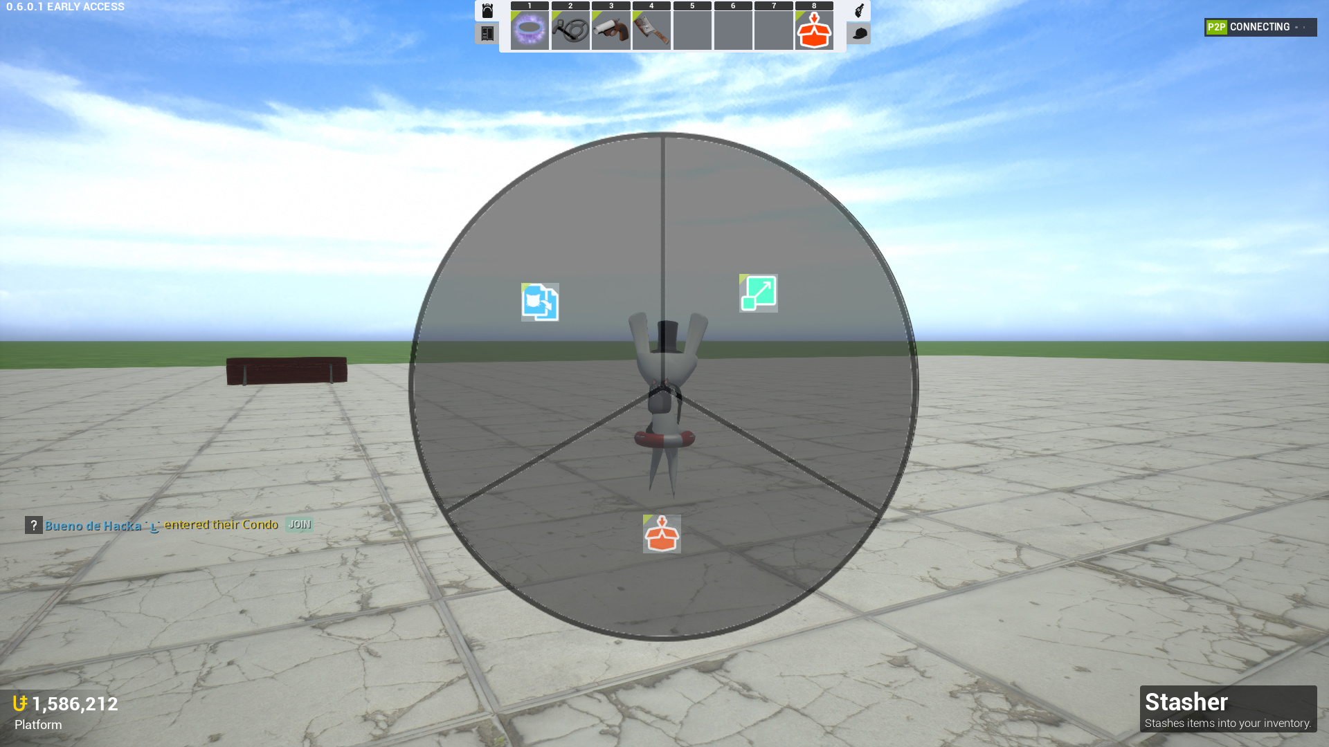
There’s only 8 slots. TU continuously adds more fun items to mess around with, but I’m constantly having to find balance between the fun stuff and things like the condo tools. There’s not enough space for it all. As time goes on and you continue to add more, this will only become more frustrating. I know that making a new bar for purely passive equipment slots was meant to mitigate this, but it’s really not enough.
-
You have to open a menu to see what’s there. Good FPS player will generally remember what hotkeys they have to press to quickly switch weapons, but in this case, what you have equipped can be in any spot based on your whims. Traditionally, FPSes let you see the ordering of your arsenal of weapons as your browsing through them. Even VIRUS mode, within the same game, has this. Maybe using stackable columns in this fashion could give us more slots at once.
-
There’s no feeback for switching items. I understand that towers is still in early access, but I feel like there needs to be some sort of feedback when a player is switching their items. As of right now, all we see change are the items in our hands. At the very least, I think that the hotbar need to briefly display when switching weapons, and show some feedback that it’s happening. For example, Minecraft also has a self-assignable hotbar, but has a border that circles the item in hand in real time.
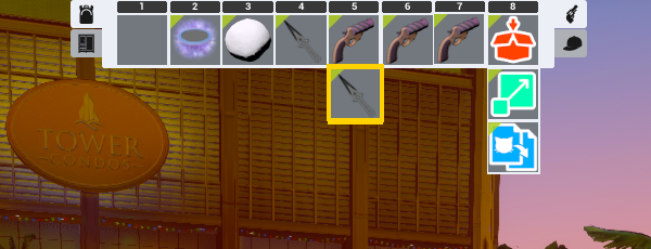
Heres a super rough mockup. In this picture, hypothetically I’ve pressed 5 twice and I now have the second item in that column in hand, with the gold border showing this. I could put all my condo tools in a single column and keep pressing 8 to switch through them in order