Main Menu Redesign Concept (Long Thread Warning)

Even after multiple redesigns the main menu of Tower Unite is still a hotly debated topic, from legitimate criticisms to various nitpicks and little adjustments requested.

I figured I’d throw my hat into the ring to try out menu design and to try addressing a few noted problems I’ve seen brought up. Please keep in mind this is all for fun, so:

  1. Please do not “backseat” the Tower devs – while I believe good constructive criticism is incredibly important for a healthy project, it can also be INCREDIBLY exhausting to be nitpicked constantly over otherwise miniscule details. This is a fun “what-if”.
  2. This is PURELY concept art. While I have used Unreal Engine in the past, I understand its menu systems can be a bit… tricky.

Current Main Menu:

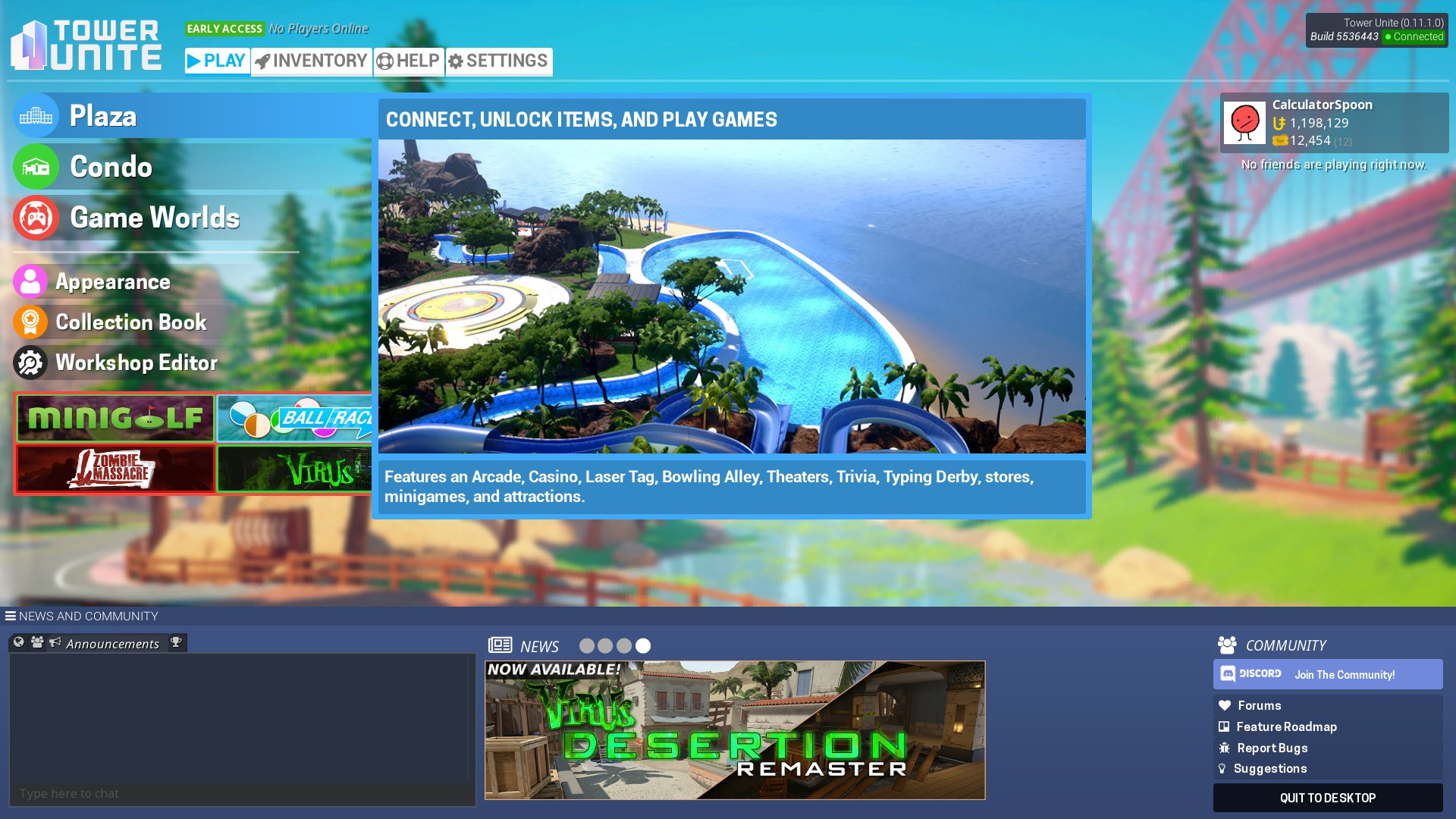
The current menu is very simple to understand. While sub-menus have lost a bit of needed categorization, it’s still very simple to wrap your brain around, albeit a bit strangely oriented.

This menu is very mouse oriented, as it lacks the proper navigation tools needed to use with controller. This is not currently a big problem, but as more and more Game Worlds support controllers, the option may need to become available.

It also seems to lack a strong design philosophy in favor of “showing all its hands at once”, so to speak. The screen is proportioned and split up into different catagories, which seems to have an odd effect of not really guiding your eyes to any intended location. In fact, the spot with most contrast seems to be the News and Chat tabs, which I believe could be better placed in focus of the Plaza and other game elements.

Concept Goals:

Easy to navigate buttons that contain all necessary information.

Add support for ease of access for controller while retaining good navigation with mouse function.

Infuse a strong sense of design into the menu. How much can we tell the player about the game from one glance? Not just all needed information, but the game’s character as well?

Menu Studies

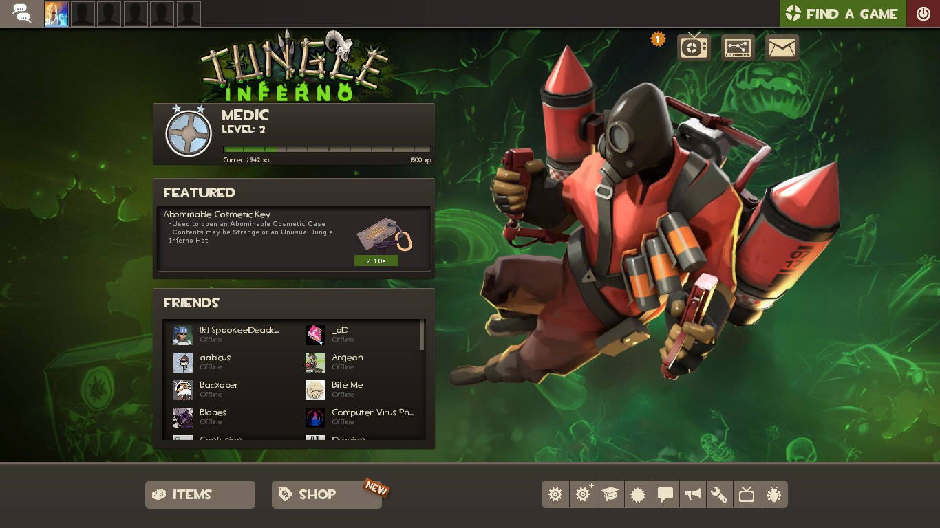
Team Fortress 2’s newest main menu is incredibly slickly designed. While containing a lot less needed information than Tower Unite could ever need (Condos, Workshop, Appearance, all community tabs, etc.) it still does a marvelous job of subjugating a lot of the less important buttons to simple square buttons with info tooltips.


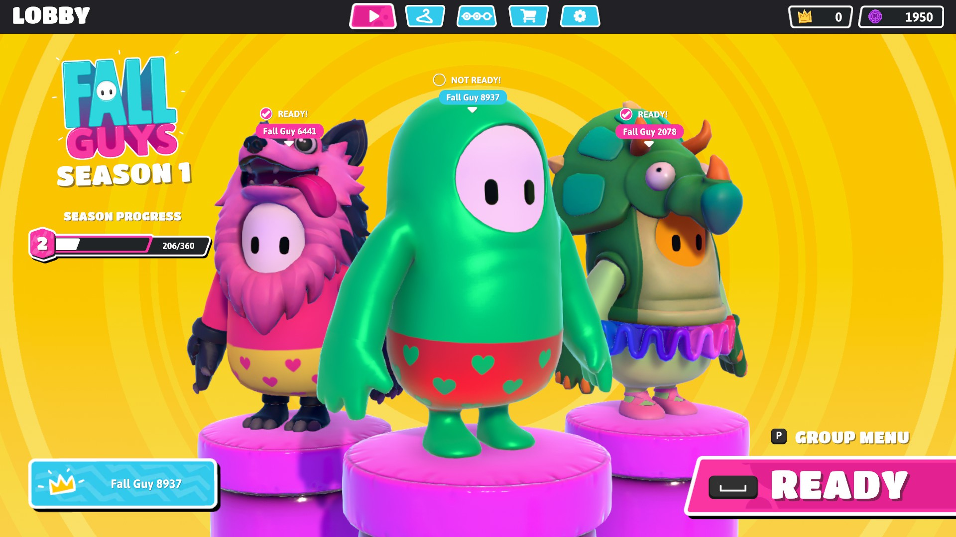
Fall Guy’s main menu is a case study on ease of access, with a hovering bar on the top of the screen you can navigate through arrow keys, controller bumpers, or simply clicking. While more is hidden behind a sub-menu, it is still one of the most slickly designed menus I’ve seen in recent years. 10/10
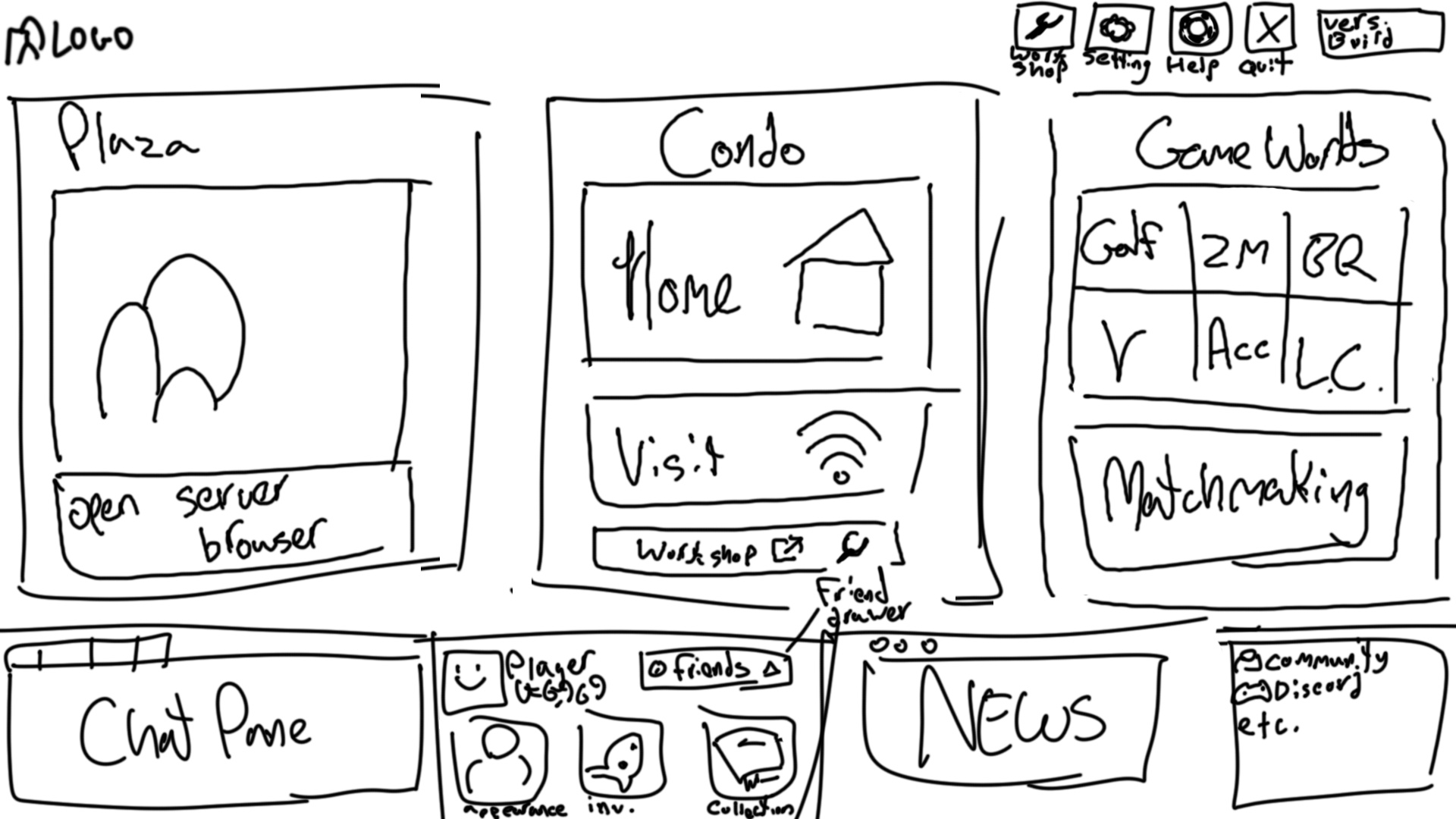
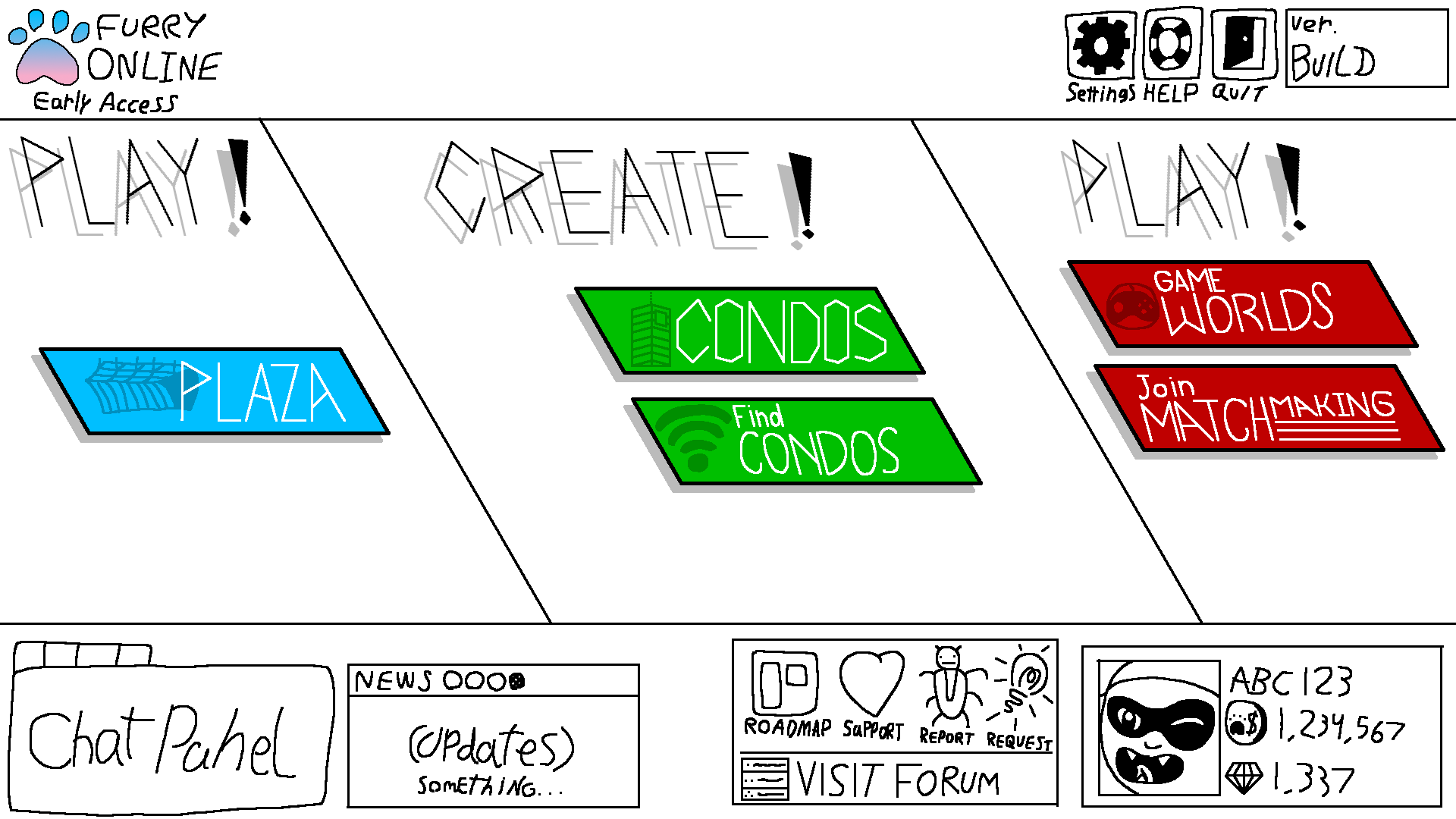
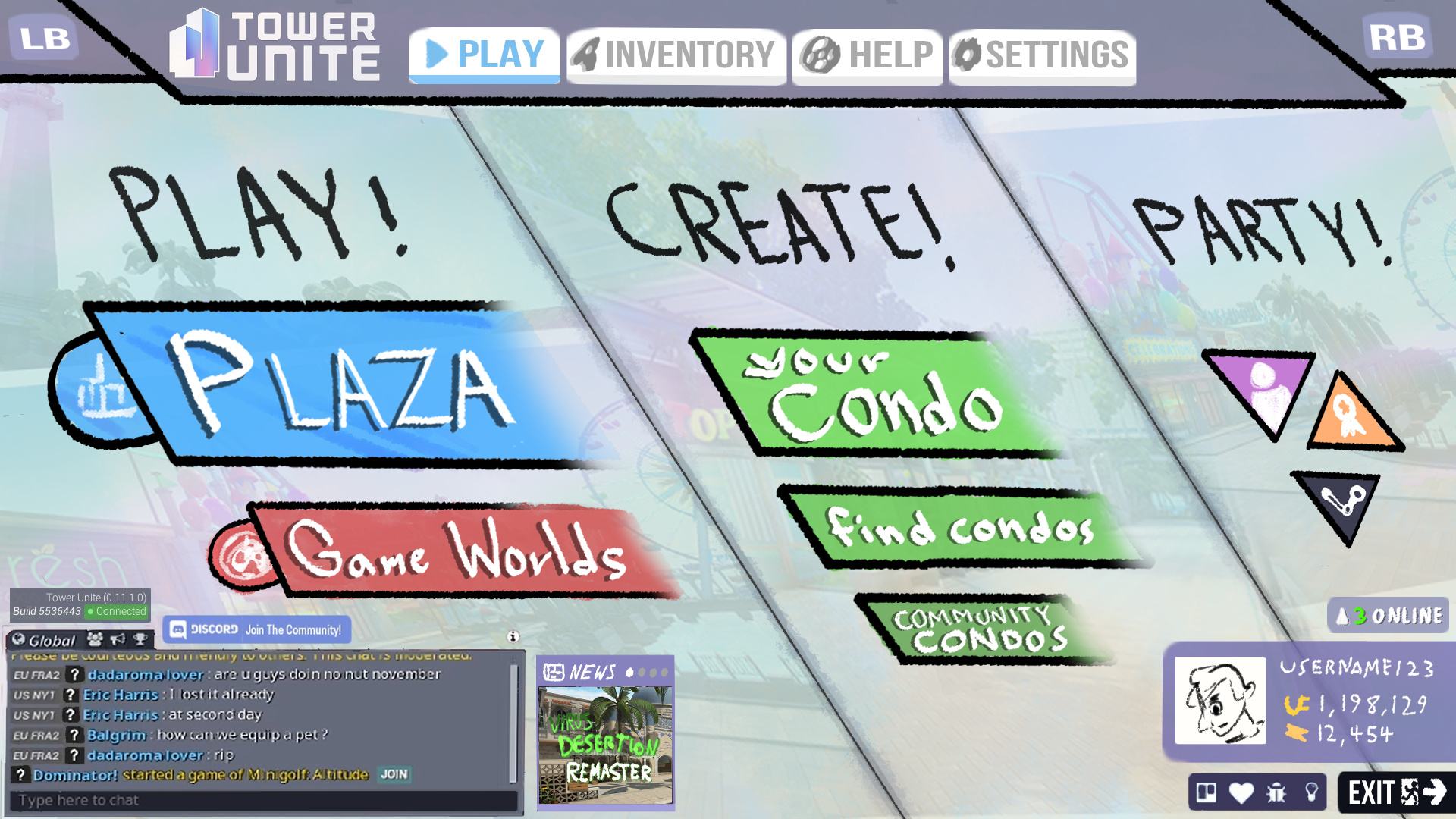
THE PROPOSAL:

What I decided to go with with was a very simple “brochure” design. With Tower Unite taking place entirely on an island, heavily featuring tourist materials such as maps, signs and advertisements, I felt this would be the best way to instantly show off Tower Unite’s indentity – while also being a great way to merge the worlds of style and substance.

(Now keep in mind this was a very quick concept – in a proper “brochure” design, you would be able to throw in so many fun little designs in the design of the background. The text is also very sloppy as well. I didn’t want to fiddle with a bunch of fonts for two hours so I just drew them out.)

I figured that loosely categorizing various buttons and menus under Tower Unite’s slogan, “Play! Create! Party!” while not ENTIRELY accurate to a tee, would still work well to organize each section and create a nice simple tree of things.

The slopes of the brochure folds help guide your eye to the ‘Play!’ and ‘Create!’ options first, as the Condo, Plaza, and Game Worlds are the most information to feed the player first (I imagine).

I didn’t get to make another concept image, but I would imagine that the brochure would “unfold” a bit when you hover over a main button to tell you more about each option, serving the same purpose as the current menu while keeping things visually clean.

A few changes:

The “News” tab is now a square instead of a long banner. I’d imagine new updates would have to have a second quick additional image made to crop correctly, but it really helps to free up quite a bit of space.

The community tabs have been relegated to small buttons in the corner, which I would imagine tell you what each button is when hovered on. (The Discord community button is also placed next to Global Chat in the empty space, which adds a bit of visual interest and puts more of a focus on it.)

The top menu is mechanically similar to how Fall Guys operates, in that a simple bumper press (or mouse click) can direct you to more settings and help options. The big buttons are placed in a simple tree grid, so that navigation is incredibly easy while visually interesting.

The friends menu is now a simple expanding menu that can be opened with a click or press, and it displays how many friends are online at the current time.

(I would imagine a hover or click on the Game Worlds button brings you to a quick access menu to each Game World too, of course.)

Conclusion:

Keep in mind this is still a very simple, very rough concept made in a couple hours. Things are not perfect and a few things are missing, but overall, I’m very happy with how it came out.

I have absolutely no idea what even in particular is not possible in Unreal at the moment (a few things, I’d imagine) but it was a fun side project to illustrate some fun design techniques and give me an excuse to talk about Fall Guys’ clean menu.

And who knows, maybe it could inspire the devs down the line to mess around with various aspects of Tower’s UI design. Thanks for reading! -Z

The main problem with comparing menus with other games is that what works for Fall Guys does not work for our game. Fall Guys is a drop in game and doesn’t have multiple types of gameplay like different games (game worlds), building (condos), or a community hub (plaza). It’s design is also inspired by Fortnite’s menu design. Both of those games are leaning towards website design philosophies.

Controllers can still work with the current menu design with bumpers (or DPAD) changing top navigation buttons and DPAD moving up and down on the left navigation.

Your menu design concept is interesting (reminds me of Smash Brothers), however there’s a few things I noticed:

  • News is square and really small. This means new features can be easily ignored or forgotten about and any events may be ignored
  • Play, Create, Party as a slogan is fine, but Party can happen in Plaza, Condos, or even Game Worlds, so singling out Party doesn’t seem right
  • The buttons in the Party section don’t seem to make sense, what are they for? Are awards about partying?
  • Discord join button is floating and the build information is too in your face
  • Without the friends list, it’s hard to see who really is online
6 Likes

Sure, it’s not perfect but it’s way better than the current menu.

  • News is square and really small. This means new features can be easily ignored or forgotten about and any events may be ignored

That’s an easy one. Just make it longer.

  • Play, Create, Party as a slogan is fine, but Party can happen in Plaza, Condos, or even Game Worlds, so singling out Party doesn’t seem right

Party appears to be all the social features. Friends List, Achievements, and Steam Workshop.

  • The buttons in the Party section don’t seem to make sense, what are they for? Are awards about partying?

Again, they appear to be icons for the Friends List, Achievements, and Steam Workshop.

  • The buttons in the Party section don’t seem to make sense, what are they for? Are awards about partying?

Another easy one. Just move them. Maybe stick them up top or something.

  • Without the friends list, it’s hard to see who really is online

This one is a bit of an issue but perhaps hovering over the _ Online could popup who’s online.

I have some barebones image editing skills. I think I may take a stab at (very badly) editing his prototype.

EDIT: Whipped this up in literally like 2 minutes, so it sucks, but hopefully it gets the point across.

2 Likes

Even if the news box is small, New things won’t be missed due to the large news popup players are given upon update releases.

I do agree that the party section is weird.

The lack of friends list is also a big downside. That’s something that should still be there.

I still do like the brochure design a bit more overall than the current one as the current design just takes up space in very weird ways, especially on my 16:10 monitor which just gives it even more empty space. It just feels bizarre with the way buttons are styled and placed.

I’m obviously not a big hater of the current design, it just feels a big strange.

3 Likes

Yeah TU is a game with so many little compartments that it’s hard to have a catch-all main menu. It’s definitely a tough design challenge and I think the iterations over the years has proven that - I’m definitely interested in seeing people try to redesign it though, as its never had something that felt “fully cooked” in my opinion.
The current one has a big issue which is the wasted space in the middle when not hovering on something - a real problem when someone first boots the game and doesn’t realize they have to hover to get the middle panel to show.

2 Likes


(Excuse the lackluster image lol)

How about something like this? Major changes are removing the tabs from the upper left, moving the player pane down to the bottom section (the Friends list took up a lot of space - now it’s a drawer), and a return to the big panels we used to have.

This time the 3 large panels could be used in a more interesting/compact way, You could select a listed gameworld and the left side of the panel would expand towards the right like a drawer, showing a server browser or the option to create a game (which is already handled in a small window so its not a big departure). The Plaza panel could turn into a little server browser, or expand like a drawer to the right if it needs more space. The middle panel is the least complex menu-wise. Hosting could stay in the separate window like it is now, or take up the whole middle panel when selected to allow other space.
Maybe the 3 panels layout is more cramped for some, and I have literally no clue how that would work on the performance side with all the panels and drawers and such. Just thought I’d give it a go!

4 Likes

I’ll be honest the brochure design doesn’t really fit our game’s style. It gives me major Super Smash vibes, which is fine for a fighting game. It does have some interesting ideas and concepts that could be considered. The chat box also seems really out of place, but that’s always been a struggle for me as well. The chat box is very annoying to design around.


It’s an interesting take and brings back the 3 column concept.

  • To me it’s a lot to take in all at once.
  • The Game World section is a bit cluttered and as more Game Worlds get added it could become a problem
  • The friend list is tucked away, making it hard to see who is online
  • Appearance is hard to spot and it’s one of the main features of the game.
  • It took me a bit to find the quit button. (some modern games have been purposely putting the quit button in harder to reach locations or tucking it away into settings, which I find incredibly annoying but that’s besides the point)
  • Background is covered, making it difficult to theme the menu for special events

I feel a menu shouldn’t blast you with information the moment you start up the game. With the menu currently, the game starts up with what matters - the news and the main options of the game. When you hover over Plaza, it then presents you with imagery and details about what the Plaza is and same with Condos, etc. People will hover over these elements as they need to click on them to actually go to the Plaza or Condos. Then naturally they will discover the additional information/screenshots.

One of the overall goals once we are more finished with the game is to have it start up with a quick one-time intro to the game and what it’s all about, so the menu would show up after that and serve as a way to get into the various parts of the game.


Ultimately the menu is just to serve as a way to quickly get into the game. The Game World section is definitely the weakest of the new menu and I want to spend more time on it. I had to wrap up menu development at the time, so it’s not completely done. Help section needs to be redone, as well as the inventory browser.

I don’t think it’s really worth redesigning the entire menu again for the foreseeable future (I believe it’s now like the 5th or 6th time). I do appreciate people trying out different redesigns. It does help figure out what is most important to everyone and we could possibly incorporate any ideas into the final product. Things can change and we’re not opposed to changing it, but at this point we’re pretty happy with it and there’s other things to focus on.

The menu we currently have was one of 20 or so completely different designs I’ve either tried or prototyped (some with even less buttons on it!). As the game grows it’ll eventually grow out of its need for a complex menu and move more towards an immersive entry into the game.

With Plaza, I want a quick join option to get you into a Plaza immediately (with server browser being an advanced option). I’d love to reduce the need for the Game World menus in some fashion that works well for new users and old users who want to quickly start up or join a match (match making).

We want to do more with the background, have videos of gameplay, update it for events, change it when you’re navigating into different sections of the game (Plaza, Condo, Game Worlds). That’s why there is a lot of space.

8 Likes

This.

2 Likes

I dont suppose you have images of those other designs saved, do you? If so, maybe you could post them, so that we can see what the alternatives were?

Let.
It.
Go.

This wasn’t from TU, But I just wanted to draw for a little bit…

Where I seen that before… :thinking:

Let what go? I only asked to see the other concepts. I like concept art, what’s wrong with that?

1 Like

I don’t feel that’s what it is lol Call me suspicious based on your previous replies

This is perhaps the wildest thing I’ve ever read on this forum. What the fuck does this mean

4 Likes

The grays…, the greys are coming

I was never deadset on getting a new menu. I don’t absolutely hate the current menu. I just think it could be better and it’s fun to speculate. Hell, even Mac said he liked a few things about the designs. And then, when he said they had made some other concepts, I switched gears to wanting to see some nice concept art. I’ve always been fascinated by concept art. Seeing the kinds of things that went through devs minds as they were making a game. It’s interesting.

1 Like

I have no idea what happened in this thread but I love the dev input and all the alternative designs people have submitted. If anyone has any “favorite” UI from games they’d love to show off for ideas I’d love to see it

3 Likes

While that sounds awesome, it’s probably better suited to its own thread in Off Topic since that has nothing to do with TU.

1 Like

I think the designs you’re looking for should be also off-topic because it’s not happening

I don’t think suggestions about how people think this part of the game could be improved should be moved to off topic just because it’s “not happening” or something. Even if the main menu isn’t completely remade at some point in the future, pieces of menus other people come up with could probably also apply to updates of the current menu in the future. Even if a dev’s said that they don’t plan to completely remake a part of their game, that doesn’t also mean they’re not open to other people giving their ideas as to how they can improve it.

(sorry for the essay)

5 Likes