Please, I can’t sleep at night anymore.
Please, I can’t sleep at night anymore.
A broken bottle, a crushed soda can, and a candy wrapper, cost more than fresh oysters
Oysters are subsidized by the Tower Central Government.
Not enough developers have quit yet.
Oh and if it hasn’t already been mentioned, this really grinds my gears when I’m trying to see myself. The accessories clipping inside your body when sitting down.
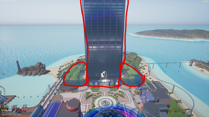
I’m going to throw one more in here, why is the Tower in Lobby 3 so… unintentionally symbolic? Is it just me?
Symbolic of what? Being a tower?
I hope this doesn’t get me banned
Oh, you meant unintentionally phallic
Whoa, watch your language.
This is a family friendly forum.
Don’t you wanna know what’s in there?
i know what you’re thinking, What’s in the canister?
Bringing this thread back cause I’m sure it’ll get a lot of use with the latest update.
The menu changes this update are very nice, BUT…
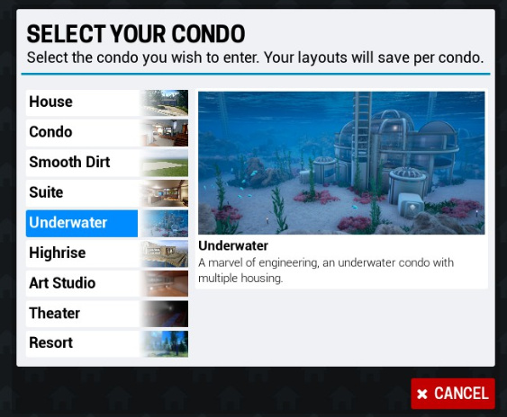
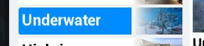
…In the condo menu, you can see a really hard divide between the button and thumbnail once highlighted because it uses a white gradient instead of transparent. This makes the picture feel like a separate element simply layered on top of the button instead of part of the button itself, which looks a little sloppy. I would doubt this was intended either.
One small change, and I think it looks much more elegant, while making it more pronounced and unifies all the element nicely.
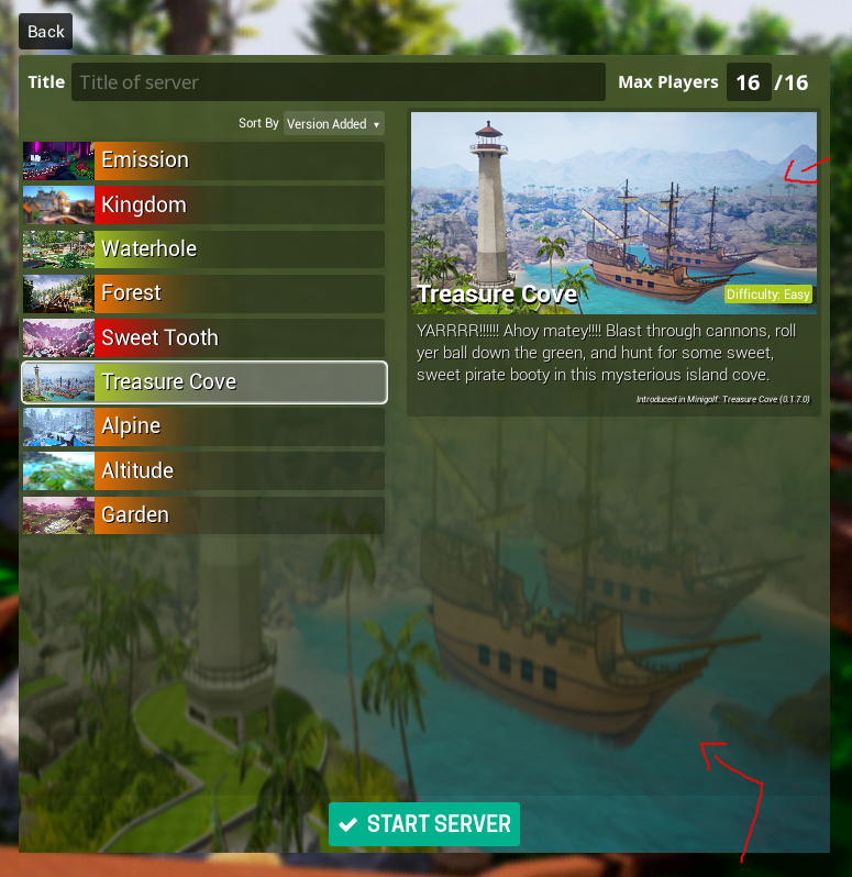
Compare it with the gameworld selection. While it doesn’t have the soft design from the condo menu, it does similarly have a unifying border around the entire selection that makes it work.
Anyway, that’s a lot for something most people probably won’t spend 2 seconds looking at, but that’s why it’s in the nitpick thread.
I think this wins gold medal for nitpickiest lol
These are unfortunately the kind of things that bother you when one has crippling OCD experience in UIs and graphics arts.
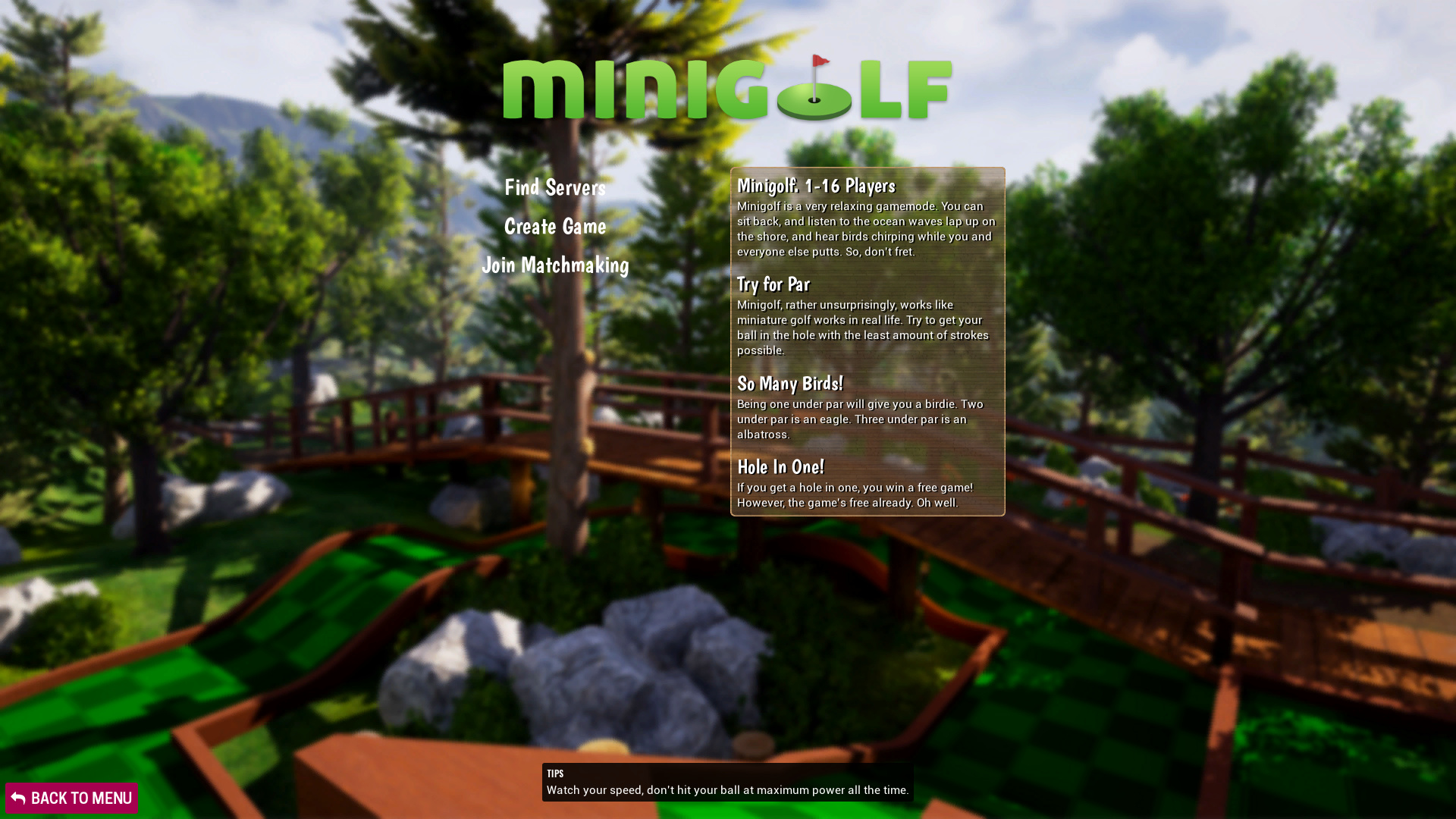
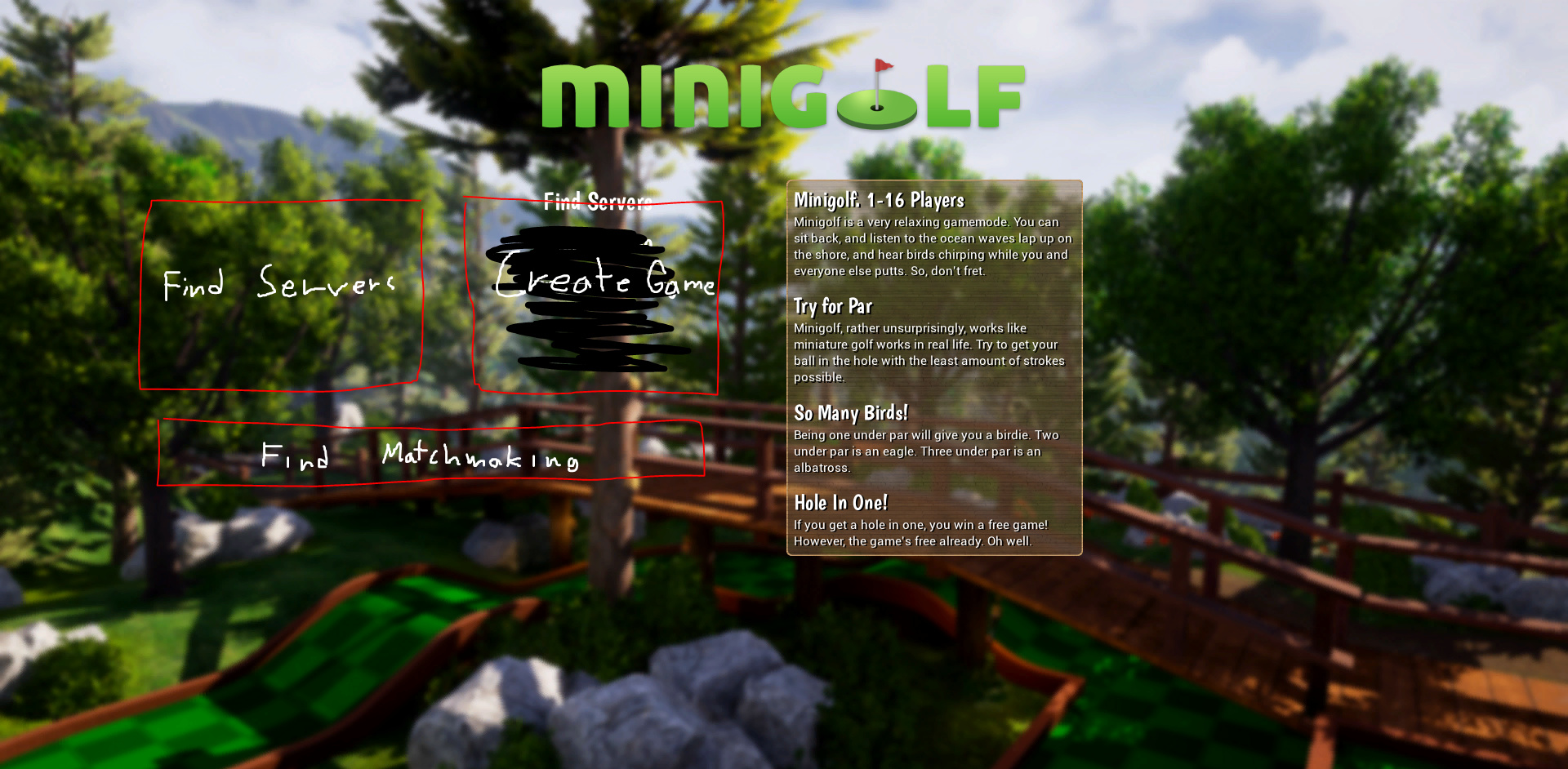
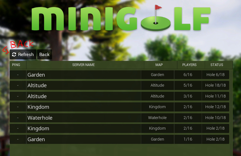
One of the more nitpick-ier nitpicks but I’m not personally a fan of how the new “find servers/create game/join matchmaking” currently works. It feels like it would look a lot better and be easier to find if they were more standout, square or rectangular buttons (sort of like the main menu).
Don’t wanna be a backseat dev or anything, these are just some of my ideas about the UI experience for new and returning players. I’m starting to really love the Virus scoreboard
I felt the exact same way about the Find, Join, and Create buttons. Not immediately noticeable against busy backgrounds.
EDIT: I think golf is really the only one with this issue though.