Finding PixelTail's New Logo

Today I spent the better part of my day looking into rebranding the PixelTail Games logo.

THE PAST

Our old logo was made by Martin Kastelov or ‘engise’ (http://engise.deviantart.com/). He made it for us for free back when we were just starting out. It served its purpose well.


THE FUTURE IS HERE

Fast forward to now. We're close to getting out our own official game. We need to update our logo. Something that is sleek, has a symbol and fits our mentally.

We wanted to keep the red color scheme for sure.

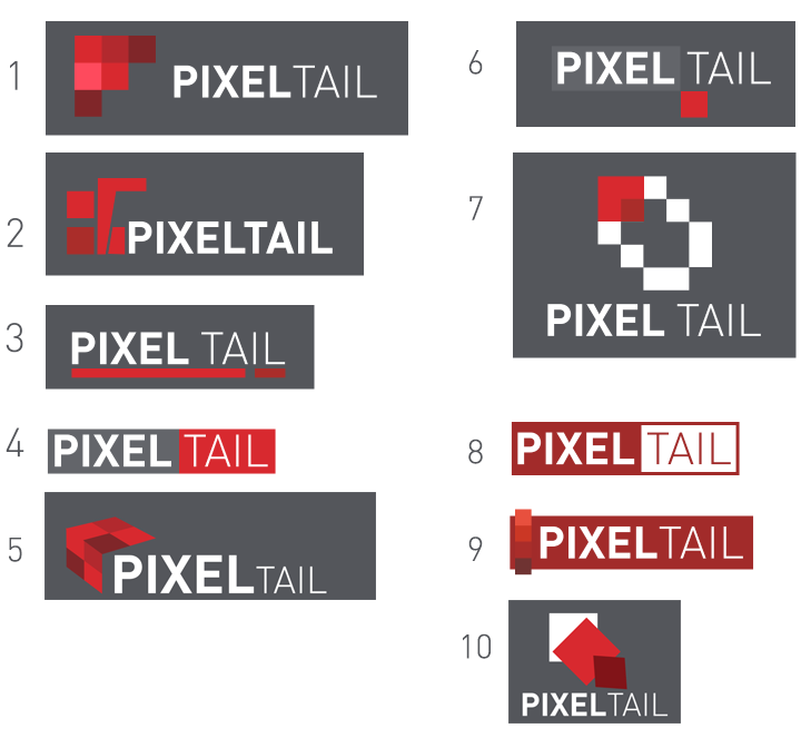
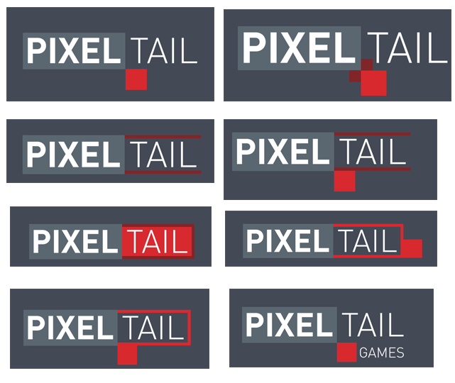
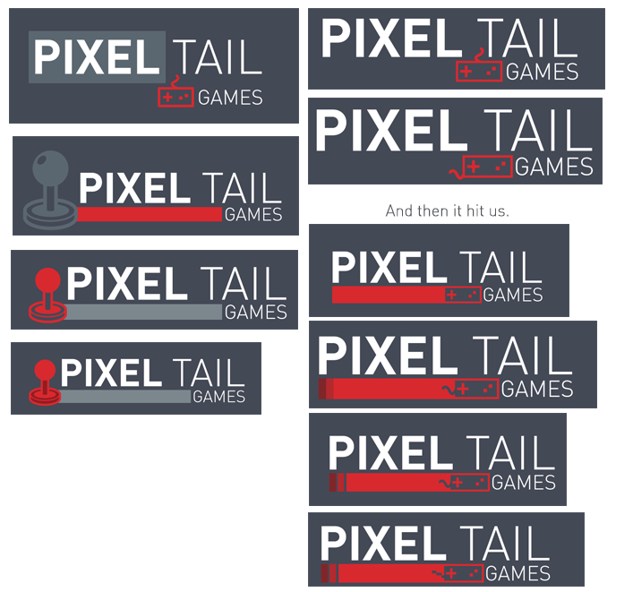
So, I threw some stuff at the wall for awhile. I’ve actually been doing this for awhile now, but this was my best attempt.

I showed my attempts to the development team. The one they all liked was #6.

Then I started to make variations of just that one (some slight hue changes too)…

Eventually we decided it was too boring, we needed something related to games to tie it back into what we do. We make games. So I grabbed some icons…

Yup, lots of variations.


THE RESULT

And I now proudly present to you the final new PixelTail Games logo (until we end up hating it later).


So yeah, just thought it would be interesting to look into a little bit of the behind the scenes of graphic design.

What do you think?

  • It looks great, I love it!
  • Looks okay.
  • Awful, just awful / I like the old one better.

0 voters

11 Likes

Amazing work! I think it’s an amazing new logo for an amazing new company.

nice, i like it.

To be honest, I liked number 4 the best. I’d rather use that one of any.

1 Like

's p goooood

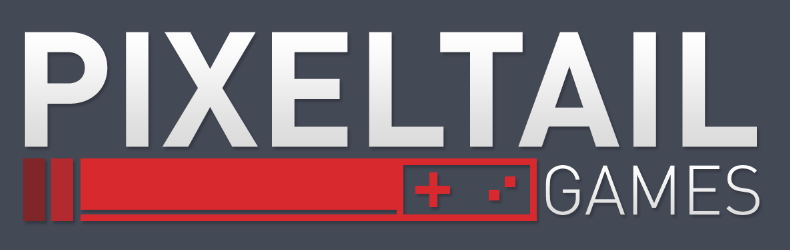
Sleek, simple, and gets the point across. I’m liking this logo. Very nice work with some interesting behind-the-scene work; it’s very interesting to see the thought process behind going from what was a red box with letters (although it was a very nice box) to a well designed logo like this.

I personally like #1 the best, looks nice and simple

All the the logos looked awesome. Great choice, though! :smiley:

Oh god why… that a 10 year thing

You make my viscom class look like the most pathetic stuff

That is one cool logo. I definitely like its simplicity and it was cool seeing how you got to yout final logo decision. :smiley:

I like it, alot! Although I don’t really like simple, this one still turned out good-looking.

I agree with @antieye555 I definitely like #1 the most.

I really like this new logo. Simple, nice-looking and informative. Well done!

You mean #1 of the base logos, or 1 of the variations?

The first base logo looks exactly the same as flipboard, except the colors are a bit different and it has text after the logo.

I like it! The only thing that really makes it a bit off (but I get why you would like it) is the white to smooth gray gradient on the letters and the overall shadow. It’s two things that quite don’t exist in the design of nowdays.

Other than that, it’s really nice! :wink:

Not a fan. The whole vintage controller inflection is extremely cliché to represent gaming and not at all indicative of modern gaming (which makes me glad the analog stick was tossed out). Not to mention, other than the inputs, there’s really no “pixel” influence.

It’s somewhat aesthetically pleasing, I guess, possibly thanks to those amazing shades of reds used.

4 Likes

If there would be one change to it, change that vintage controller to a keyboard.

2 Likes

Exactly. Or a mouse. Or something at least relevant these days.

4 Likes

I love it. It’s simplistic yet gets it point across about what your company is about.

1 Like