These used to be my favourite maps. Now I don’t feel any of that enjoyment when playing them anymore.
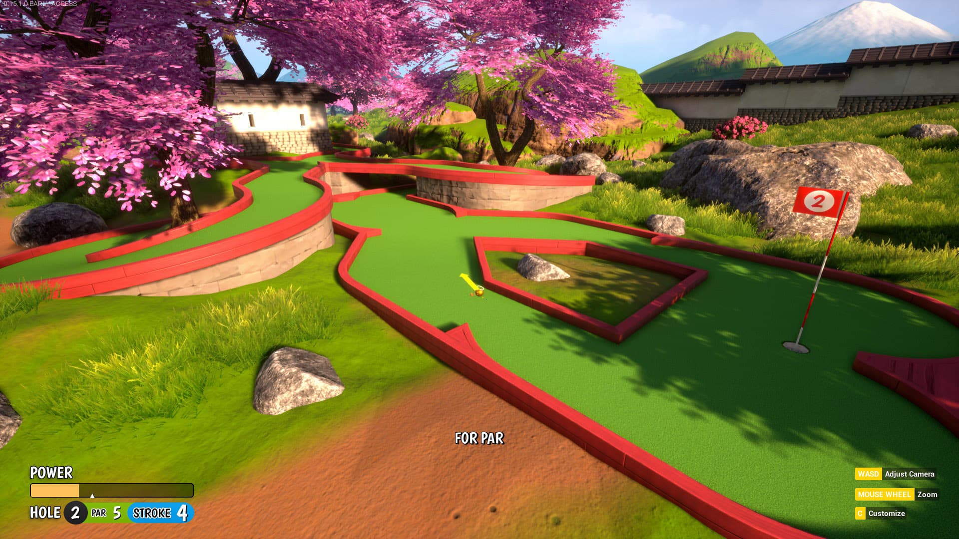
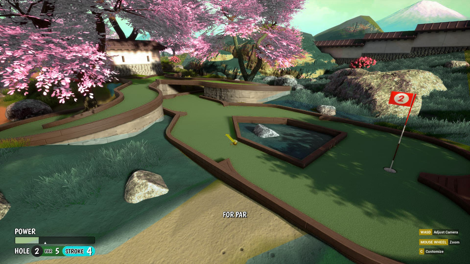
Really, oversaturated colors are never good, and soft pastel colors are so much better pretty much always, aren’t they? Anyway, to show how I feel these maps would look nicer with less saturated colors, I’m attaching the following pics:
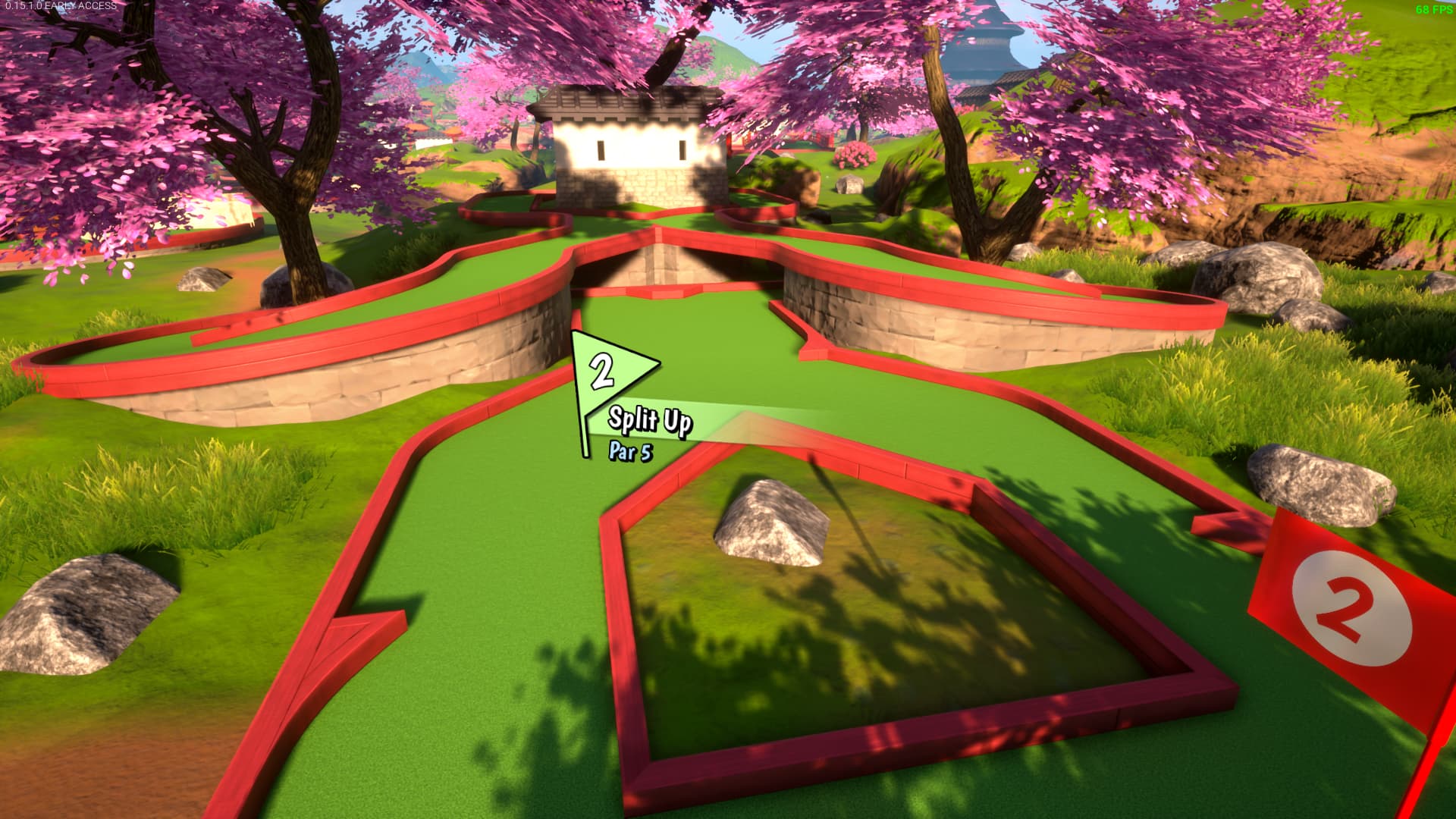
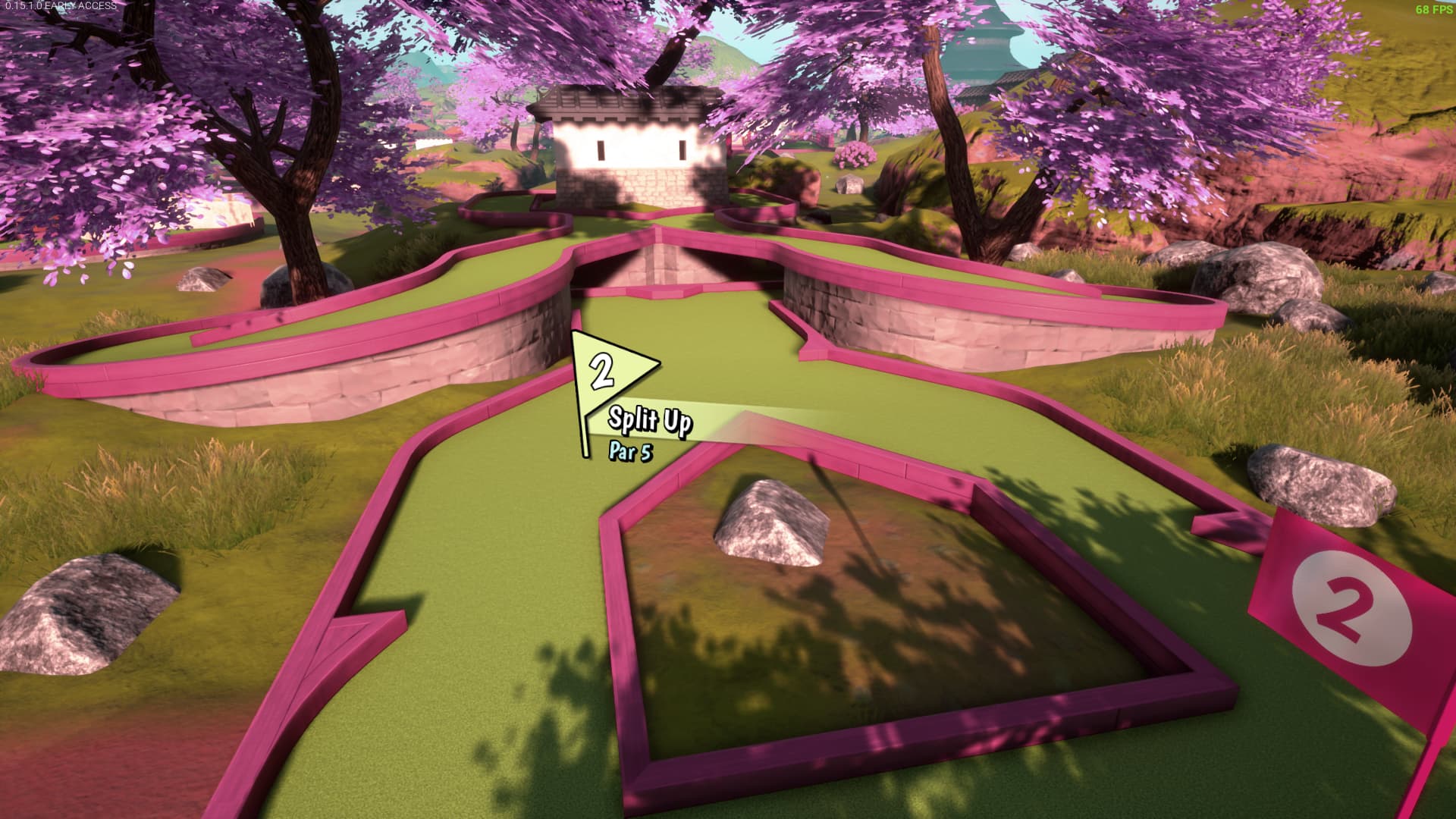
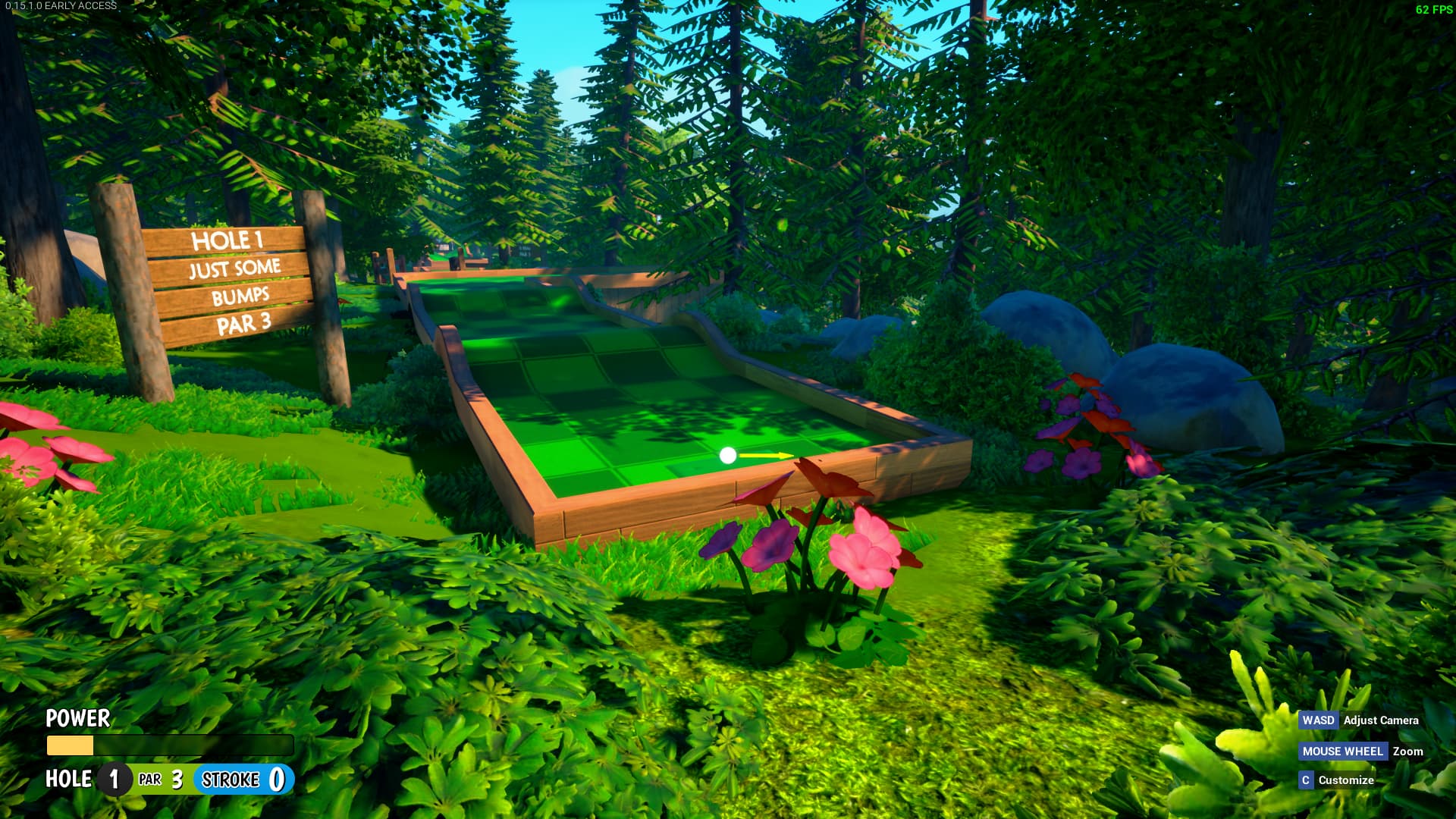
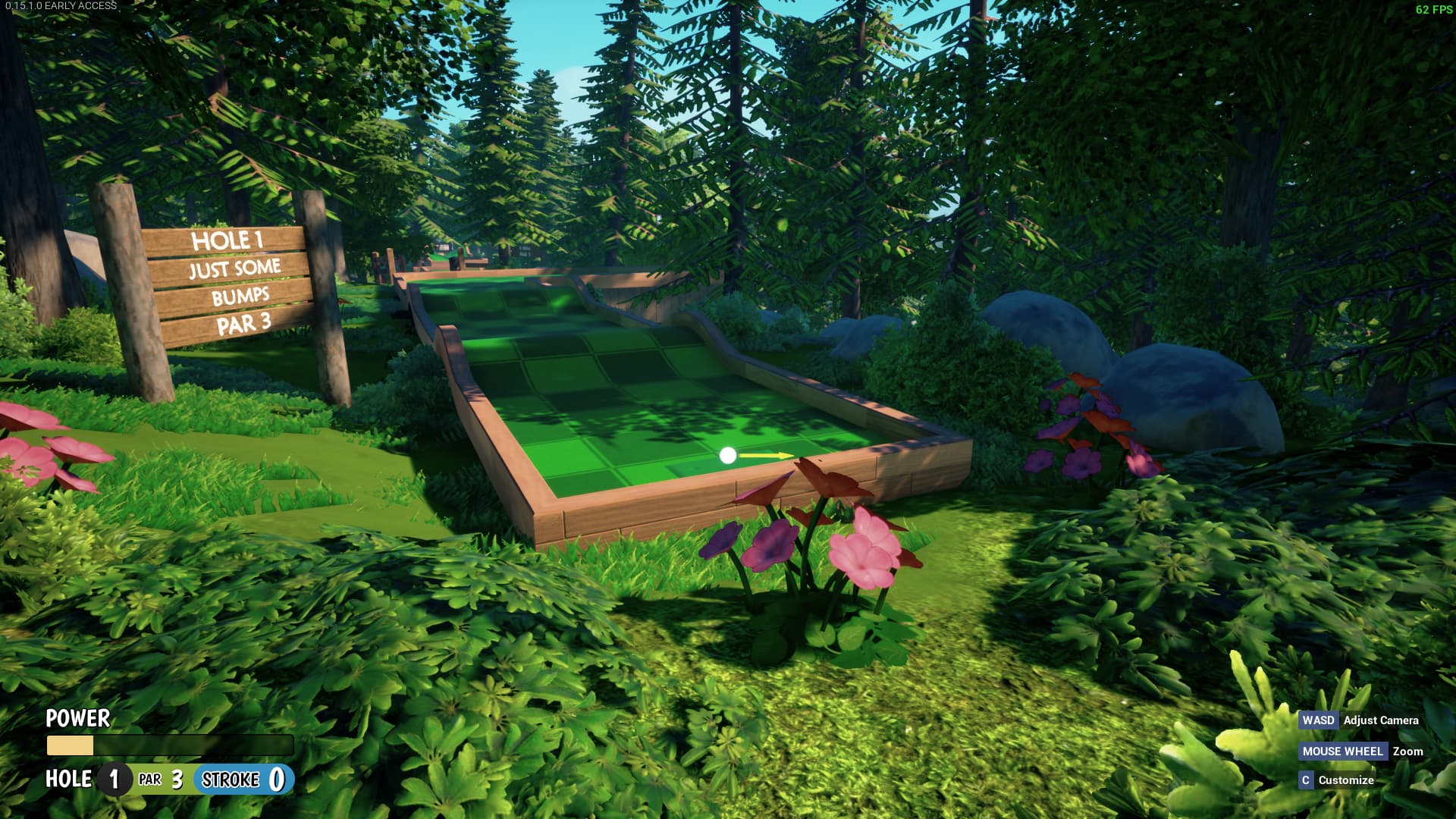
The first pics in each set look vastly better to me. The second set just looks very bland and washed out. I’m a huge fan of cartoony artstyles and I love the direction they are taking Tower.
2 Likes
well i guess i can only hope you’d be in minority cause otherwise I can’t enjoy those maps anymore. Instead of calming nature atmosphere I feel like going through a cartoon trip which doesn’t bring any aesthetical pleasure of that kind anymore. Garden was super beautiful with its nature feel and distant soft bells, but big part of its beauty was it feeling like nature and not an unrealistically bright cartoon
I don’t agree with your edits at all really. I agree that the saturation can make the maps hard to look at but making the maps look like FPS games from the early 2010s isn’t the way to go around making them easier on the eyes IMO. The colors of the course greens for a few of the Minigolf maps were desaturated in 0.15.0.0 and IMO that was enough to make them much more visually appealing.
In the Garden edit, the greens are very dull and the pink trims are really tacky, it looks more like a child’s playset than an actual golf course.
I don’t have much issue with how Forest looks currently and the colors on your edit make it look really bland. Everything just blends into each other.
3 Likes
I disagree with your exact angle, but I’ll just say that I at least understand how you feel. I’m not a fan of the Altitude art pass myself, and I’ve made some pretty recent complaints that are adjacent to yours, so I wanna chime in here too.
In spite of what I’ve said in the past, I actually don’t mind Forest at all. Being a literal forest, deep greens everywhere makes sense, and the tall trees make it naturally shady and darker in a lot of areas anyway. I quite like it as is.
Garden, however, I’ve felt funny about ever since the addition of the red border around the entire map. I’m just not a fan of complimentary red & green, and altitude has it too. I get what they’re going for though; it’s not like there’s a shortage of laquered, red wood in Japan. I think maybe it’s less about saturation and just the color scheme in general. It’s pretty bold. I’d even call it fruity.
At the end of the day, It’s a good looking map either way.
Now if it were me? I would go all ukiyo-e with it, though
5 Likes
huh, thanks for one voice for me
Well… I guess we’re not too adjacent in our opinions. My problem is that both forest and garden have such a bright green in foliage like it’s up to murder your eyes. Or at least kill any natural colors.
That’s why I decreased saturation in both the forest and garden maps. Like that, they’re much nicer to look at and are more like, well, grass and tress to relax in than a bunch of drawings.
That’s why while I’m not a fan of your edition it would still be better than the original Garden to me. To me, though, it makes the pink colours of the trees fit not too well with the rest of the picture, while in mine I feel like they mix pretty well with similar colour of the borders
Between the two edits, I definitely like this one better. I still prefer the original, but I’d actually be ok with this. Especially since I love ukiyo-e art. It definitely fits the theme of the course while still looks somewhat cartoony.
1 Like