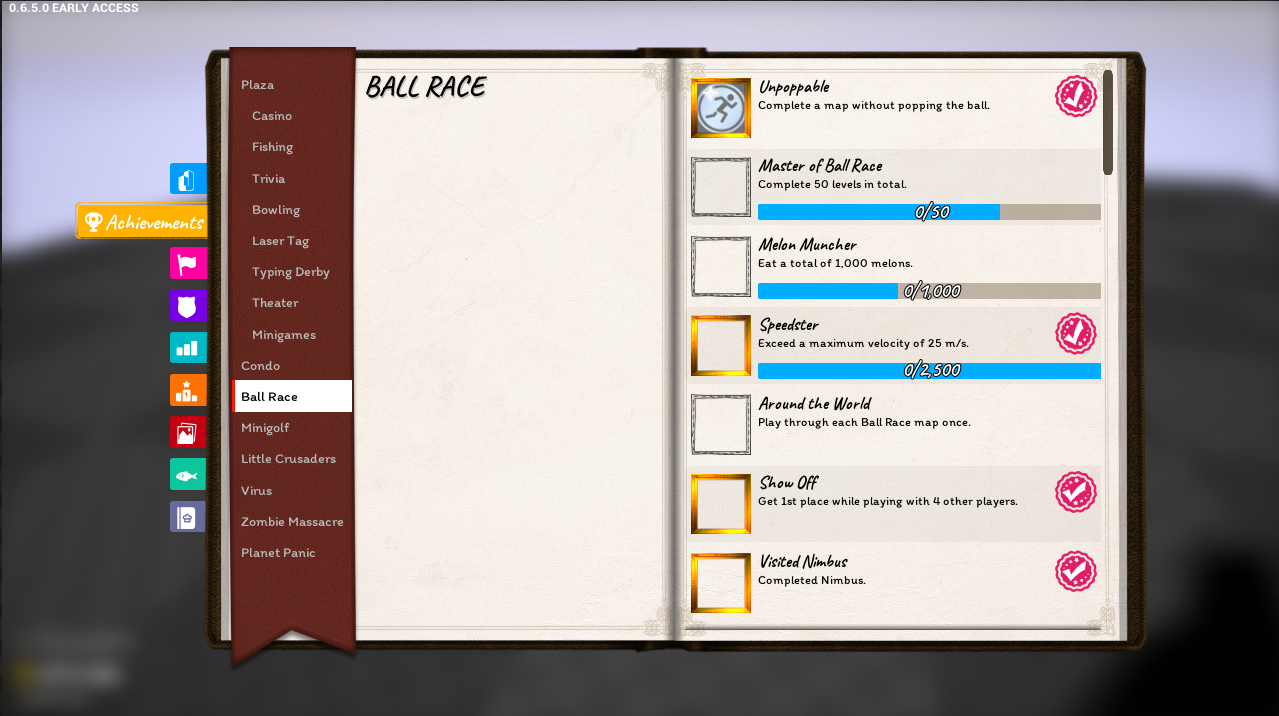
Yeah I’ve contemplated making it actually turn pages and I think that it’s just an overall bad design for this.
For one, I try to design UI with the least amount of hidden information as possible and the page method would hide several achievements from view. Then you have the added “well I think it was on page 4 but I can’t remember issue”. And then there’s possibly tons of achievements which means tons of pages possibly. It’s just tedious UX, which I want to avoid. I know some console games do pages for their UI, but that’s a side effect of controllers. Since we are PC we can get away with scroll bars (controller support could just use the right thumb stick to scroll I suppose or change completely).
Also wow I just realized the trumpet has been replaced with the guitarish piano that is used in quite a few Tower Unite songs (it’s pretty iconic at this point i think)
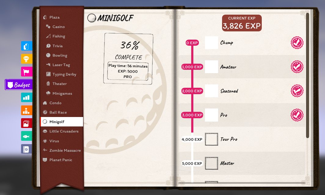
The frames around the achievement icons seem unnecessary, considering that the stamp is there.
That art style clash between the frame and the achievement also doesn’t look very nice.
I agree the stamp seems pretty distracting and clashing with the theme of the UI. Maybe it could do something like steam does and just be a grayscale icon until unlocked?
If not that, then maybe the border be less thick
Notice: All items below are provided without context. There is NO guarantee anything featured in them will be present in the final release. These items are shown from RAW development. Items are in chronological order, bottom being most recent.
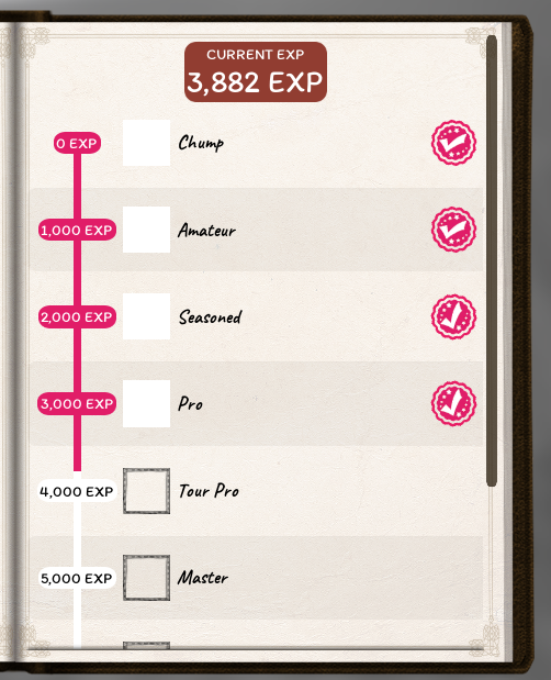
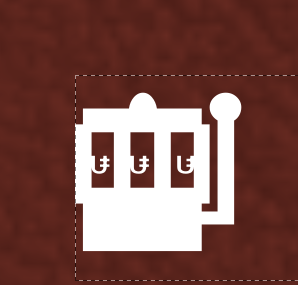
is that first image rewards for gathering amounts of EXP? Cant imagine what that slot machine looking thing is. Maybe some sort of mini slots you can use EXP on?
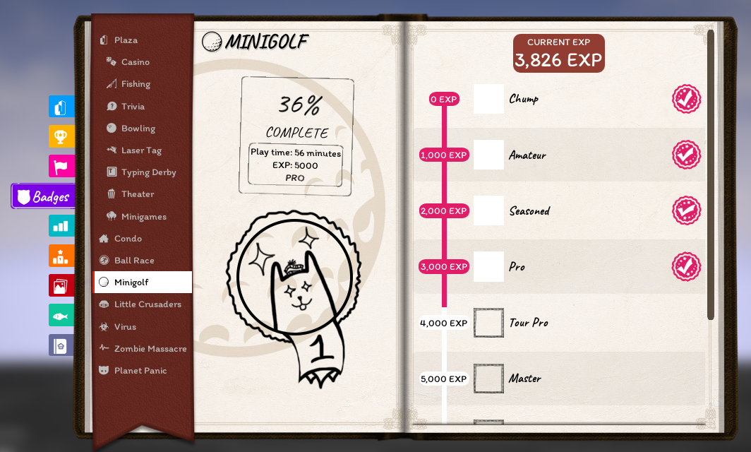
I was thinking that maybe you could use the space on the left page underneath the total completion stamp to display a badge for the selected game? It’d be a nice visual element that changes every time you level imo.