Eh but that might look weird especially in the context of a physical book but I guess the other part has a scroll bar so I dunno
This is neat, but I think the tabs of Fish, Photos, Badges, etc. should be on the outside of the book like in Dictionaries with little images for each.

EDIT: Like this! (excuse the rough art)

18 Likes
When this comes out, I’m bound to play a lot more. Like, a lot more.
3 Likes
That book looks so good. Love skeuomorphic video game stuff like that.
I really like this. It’s kinda what I was going for but I can see the placement is a lot better in your example.
Yeah, I’m trying to figure that out still. I’ve yet to add Arcade, plus we’ve got Accelerate, SDNL, Horror Hill, Bumper Cars, Shooting Gallery, Nightclub, even item related awards like Cooking (which could be just a tab like the fish one). Currently it has scroll bar support, but it seems gross. I could reduce the padding I suppose, but yeah, we have a LOT of games that each need their own section. I was thinking of merging Events/Minigames into one. Maybe Typing Derby, Bumper Cars, Shooting Gallery could be merged into a “Boardwalk” one…
11 Likes
Dang, I’m surprised to see that there’s even a Theater section on there. It’s good that you’re giving it some love! People need more of an incentive to use it.
1 Like
It’s a nice incentive but I hope people don’t just go there for the sake of the achievements. Speaking of which, has achievement rewards been talked? Will we earn units for getting them? Will it depend on each achievement or will it all be the same?
We’ve been working on a backend system just to handle this. There’s a few trophy models that Johanna made as well. So we hope to have Unit awards and some items for certain achievements.
7 Likes
November 28th, 2018
Notice: All items below are provided without context. There is NO guarantee anything featured in them will be present in the final release. These items are shown from RAW development. Items are in chronological order, bottom being most recent.
26 Likes
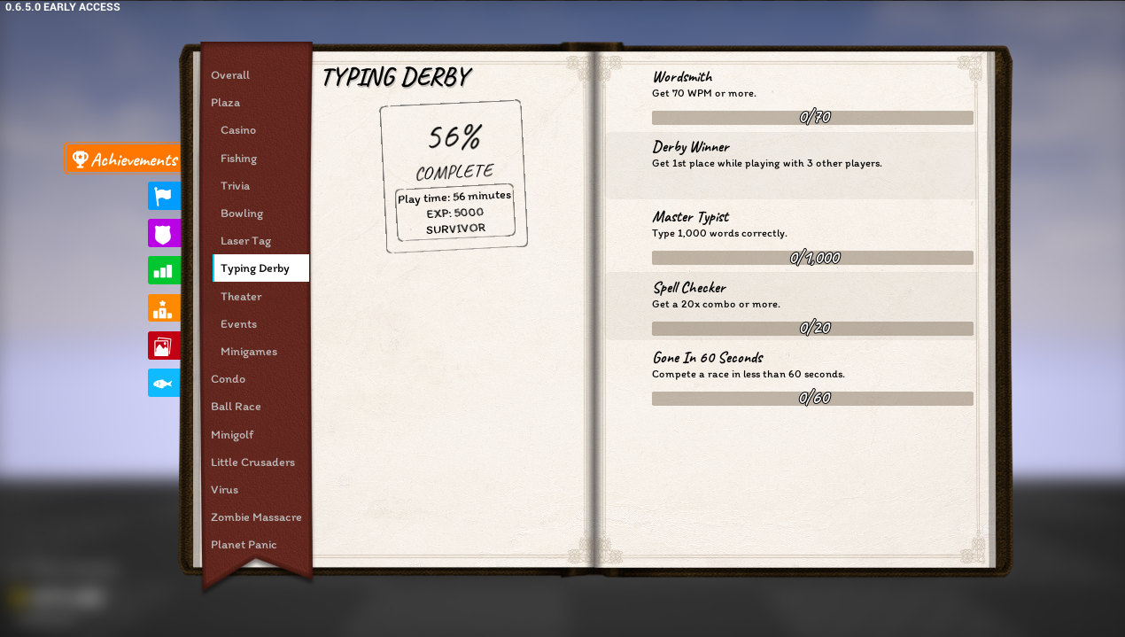
haha im so bad at typing derby that i probably wont get any of these
20x combo? Those are rookie numbers!
Jk, pls don’t make me aim for a 100 combo again
2 Likes
I tried to whip up a quick version where the different tabs are page dividers, lemme know what you think ( I didn’t know what the flag was so I left it out)
Two additional things, I just added two lines on the bookmark cos I thought it would help break up the plaza achievements
(I also noticed that the space left in the achievements might not be wide enough for achievement icons if those are going there)
Also I like the idea of merging the boardwalk games into one category. I think that could work well + reducing padding a bit
Hell yeah, this looks great. Thanks for taking my suggestion ;3
3 Likes
I see what you’re going for, but I personally think this is a little too crowded and the sideways text is hard to read. In a digital medium we don’t have to make sacrifices for physical constraints, so I like the idea of tabs sliding out when you hover over or click them to read the label.
2 Likes
I know this is a nitpick, but I think it’d look better if the little bookmarks went into the pages themselves.
Also, in my opinion, a good way to avoid the big ribbon thing altogether would be enabling players to go from page to page (to turn pages) and include a big list of contents at the very beginning. Said list could include clickable links to quickly get to specific categories, and there could be an additional bookmark/“ribbon” that would take you back to the list from any other section.
I love the book themed UI overall, though.
1 Like
This is actually a great idea and in my opinion would be better.
I’ll play devil’s advocate to @Vaibhav_Agarwal here, and say that I would not prefer this. It might look nicer sure, but you sacrifice a bit of intuitivity and ease of access. I don’t mind some unrealistic scrolling if it means I can access everything very easily.
4 Likes
yeah i agree with M2TheT
like yeah design is good and all
but i do prefer to have easier navigation
and with achievements and such i think people would only be quickly popping in this to quickly go and look at progress
and without that navigation constantly there i think it would get more irritating
i don’t think people are going to pay loads of attention to the design and more to the practicality when using it
2 Likes
Loving the look of the Achievement Book. One suggestion i have is instead on the scroll bar on the far right. Have on the bottom right (or maybe top right) of the page a corner folded over and when you click it goes to the next page showing you the rest of the achievements. Something like this picture
The above posts are describing just that.
Although, I gotta agree with some of the others here and say that feels like too much of a sacrifice for design over ease of use and “efficiency”. Just feels like it’s going too overboard on the book design for a UI that’s meant to be accessed swiftly and infrequently
2 Likes