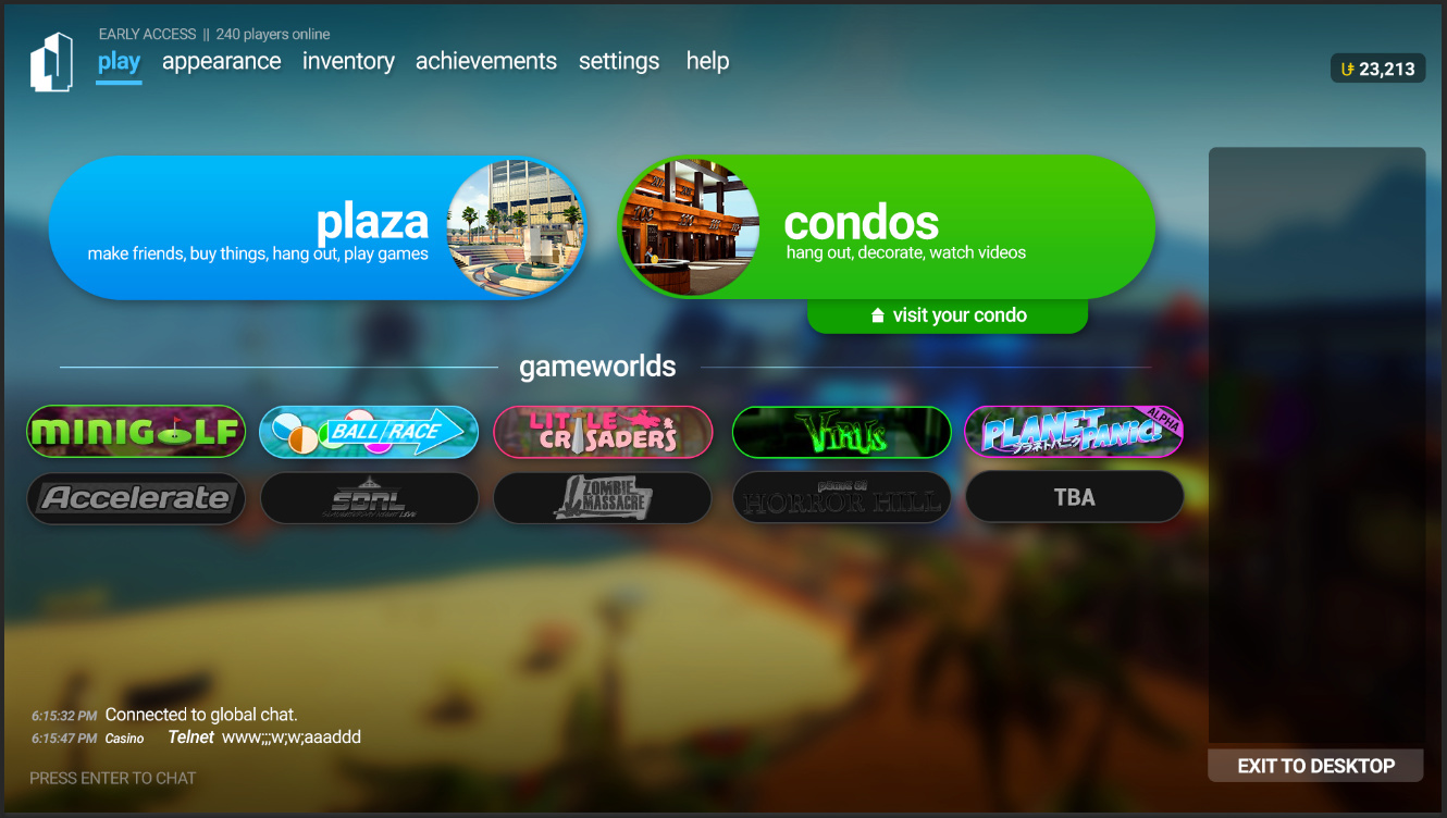
Yeah… honestly I kind of want to scrap this and start fresh, but I don’t know where to start. In fact, I don’t even really like the design of the four section buttons anymore, but I don’t know what to replace it with.
If you want to see my responses to Mac's critique, click here.
I was gonna add a ‘Recent Gameworlds’ section on the menu that showed your 5 most recently played gameworlds, but it seemed cluttered to me. I might put it back on for the next iteration (if i ever redo it).
I was gonna put the news section as well as item playground (and forum links) near the bottom-right corner of the menu, I just haven’t done it yet. Should’ve clarified. Oops.
I’ve been thinking about it lately, and while I do agree that while slimming the friends list down does look nice, I do feel the bigger right-side variant makes more sense, especially since this is a social game.
Fair point. I’ll put the text back next to them next time.
I was going to do this for consistency, where you can access gameworlds and condos in all areas of the menu, but thinking about it, it does feel a bit cluttered to have it everywhere.
I was never really good at equal padding. I just kind of eyeballed it. (I really should get out of that habit, huh?)
Me too. It makes WAVES of difference once you remove the unneccessary bits.
I’m probably going to work on this again soon to make it a bit more bearable. (No promises, though.) Thanks for the constructive criticism, Mac. ![]()
EDIT: Okay, so, after thinking about it, I feel putting all the gameworlds on the main menu does make sense. My only complaint is that… what if TU eventually has more than 10 games? Will it? If so, will they all fit on the menu? If not, where will they go? I’m just curious as to what you will say.
EDIT 2: Here’s another preview of the revised concept (STILL A WORK IN PROGRESS, mind you):