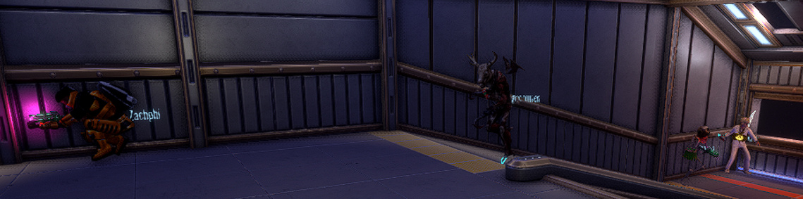
I personally don’t find the new Virus tags visually pleasing and they’re incredibly hard to read when you’re not standing completely still. Most people I’ve spoken to prefer the old name tags, so I wouldn’t mind a new solution to fix them getting in the way.
I have a few main issues.
Temporal antialiasing completely destroys any readability they have
Names clip into other players when people are grouped up
Text position doesn’t seem to change depending on the size of your model (meaning the text will most likely clip into you as well)
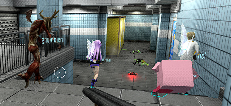
Plaza/condo name tags could work well as an alternative?
The old name tags constantly got in the way of the action, as every time you would go to aim with people nearby, they’d pop up and distract and block your aim. They were also more expensive to render. I’d rather address the issues of these name tags than go back to the old ones.
I think one thing you can do to make the names a little bit more clear is to make the font a little bigger. I remember back on GMT the font for name tags were bigger.