Some things from House I feel should be tweaked

Now, I understand that the new condos still have some work to be done, as said by Caboose. But these are some things I feel need to be tweaked, changed and so on. Many of them are small, and some are reasonable concerns. Regardless of that, they add up.

No textures on the side of the sidewalk

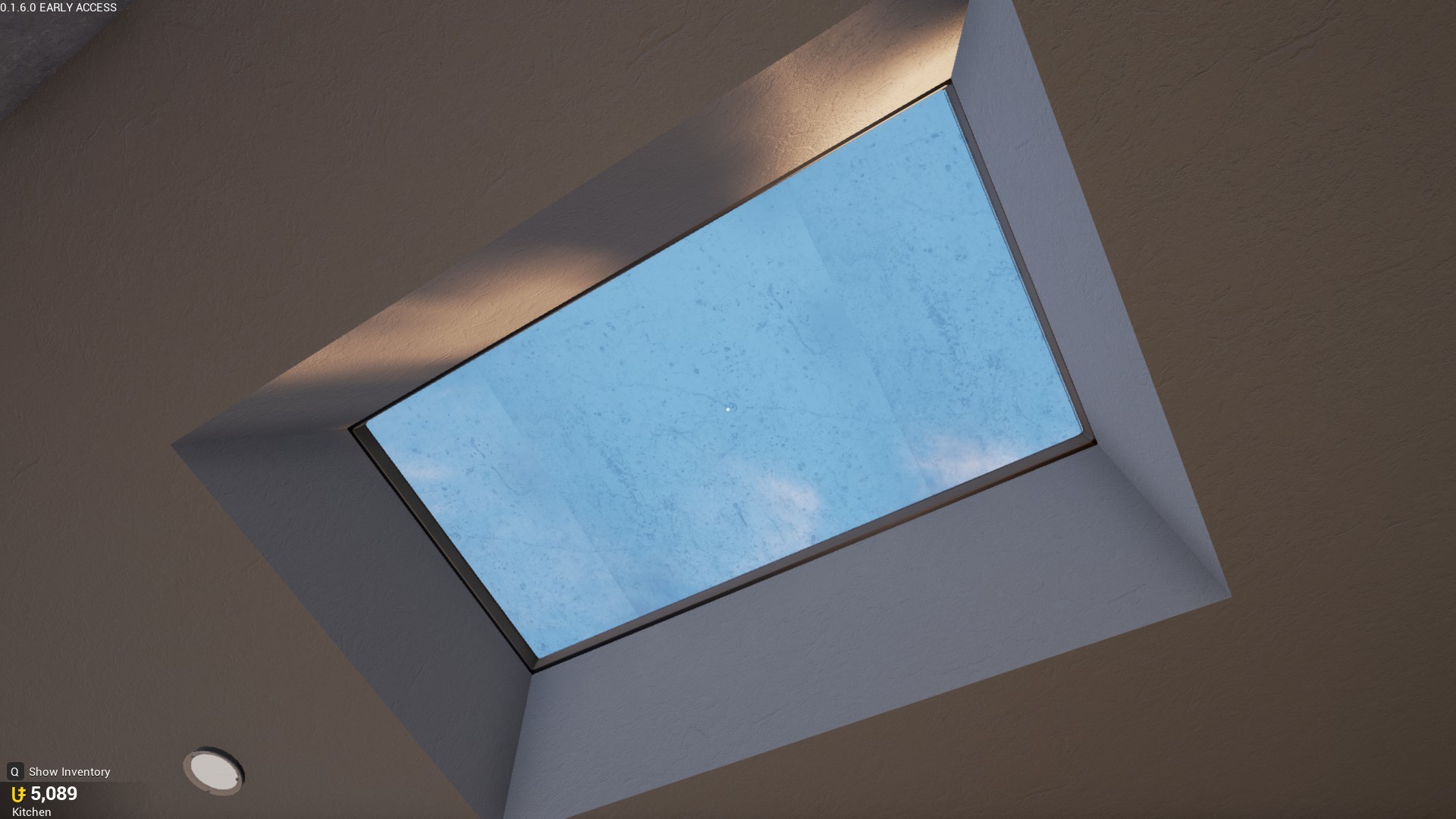
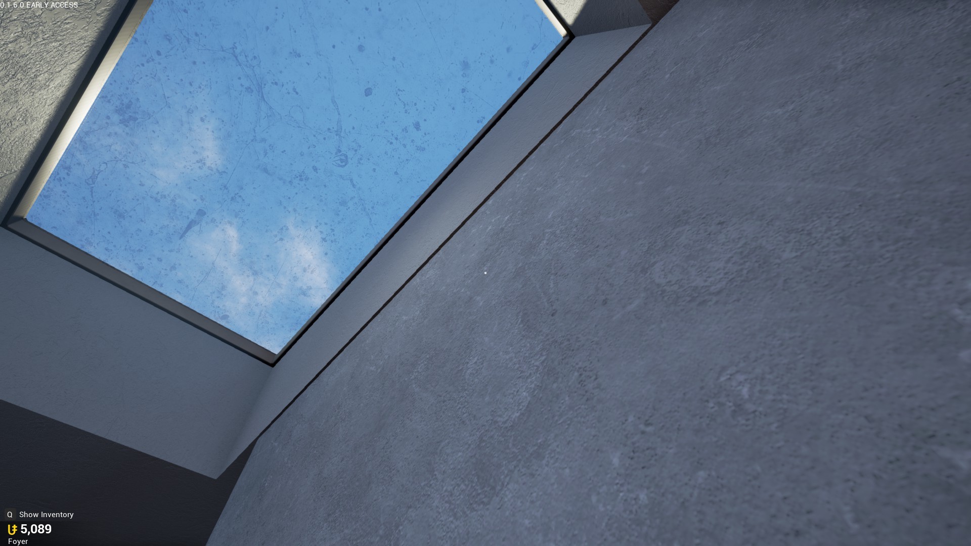
Skylight texture repeats

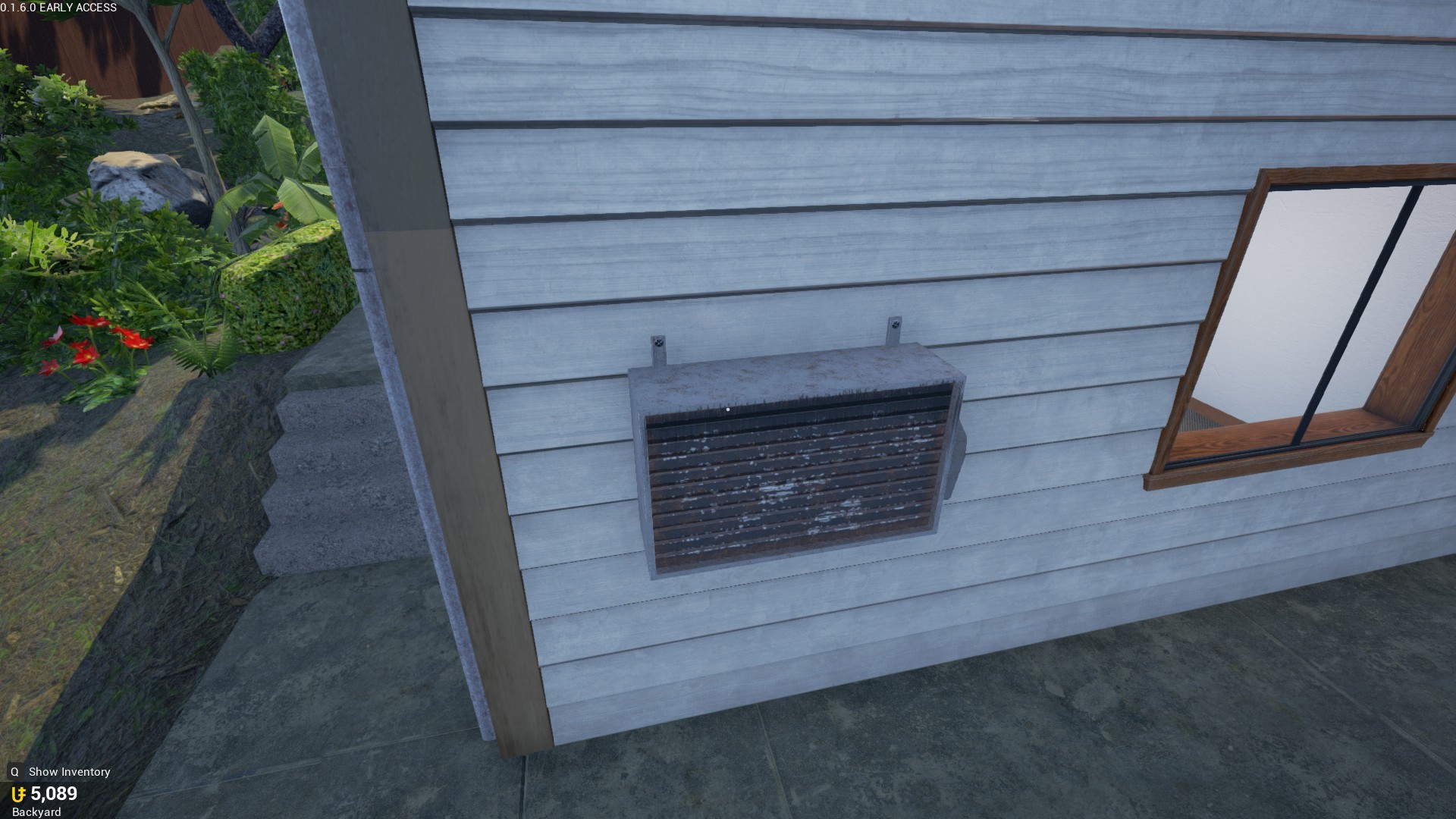
Low res texture compared to everything else
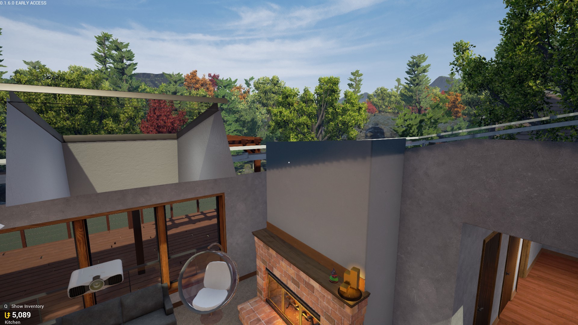
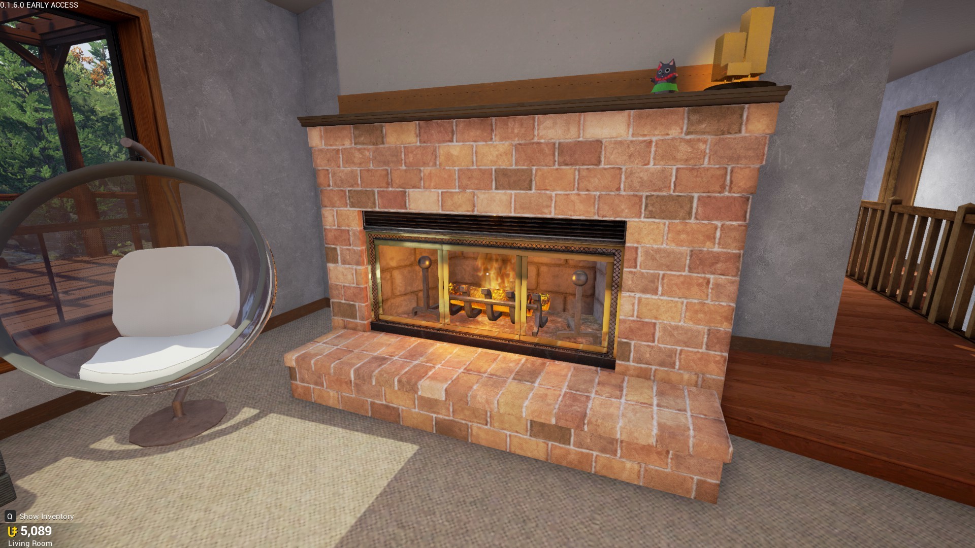
No chimney

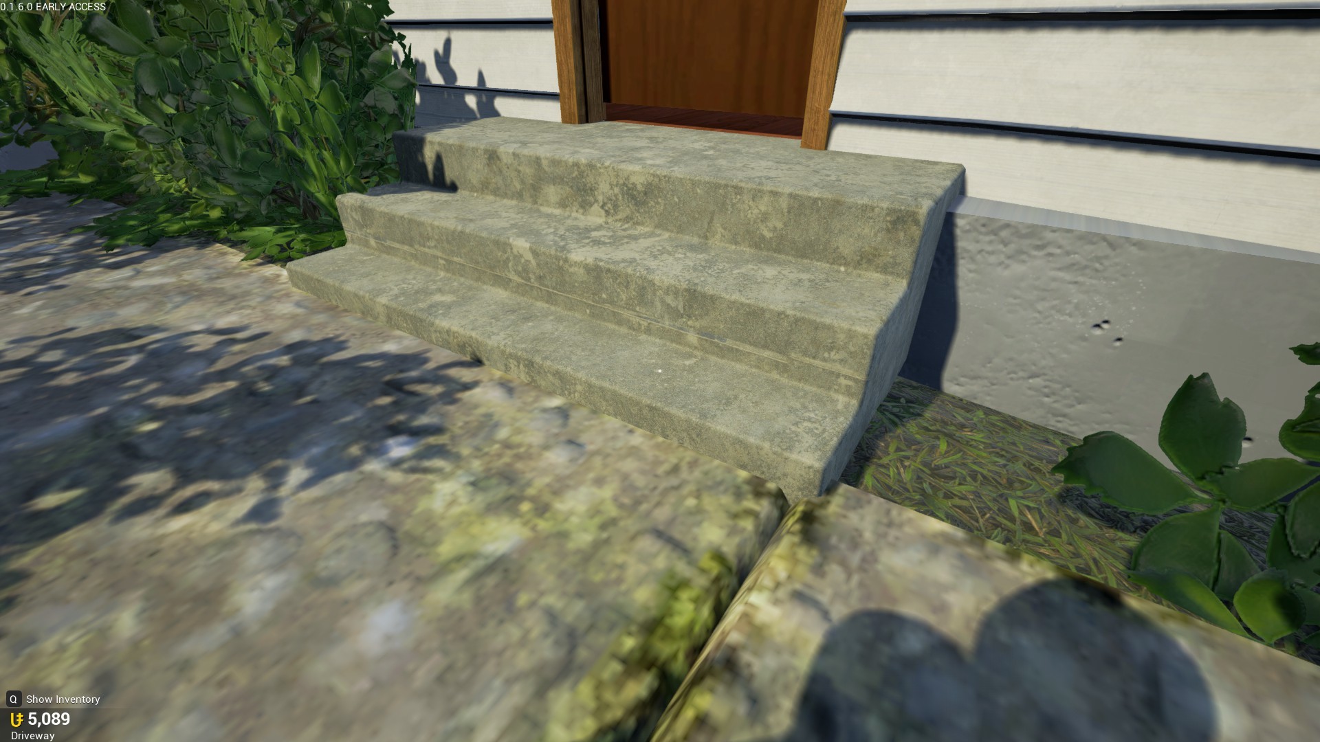
The grass is a bit too glossy, and it doesn’t “blend in” well with the cement. It just has an abrupt end. How I feel this can be solved is by placing some kind of brickwork along the edge. Or do some kind of fiddling and perhaps come up with tufts of grass going along the sides. It just feels too unnatural as it is right now.

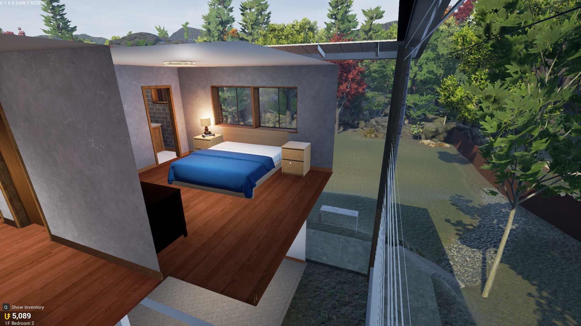
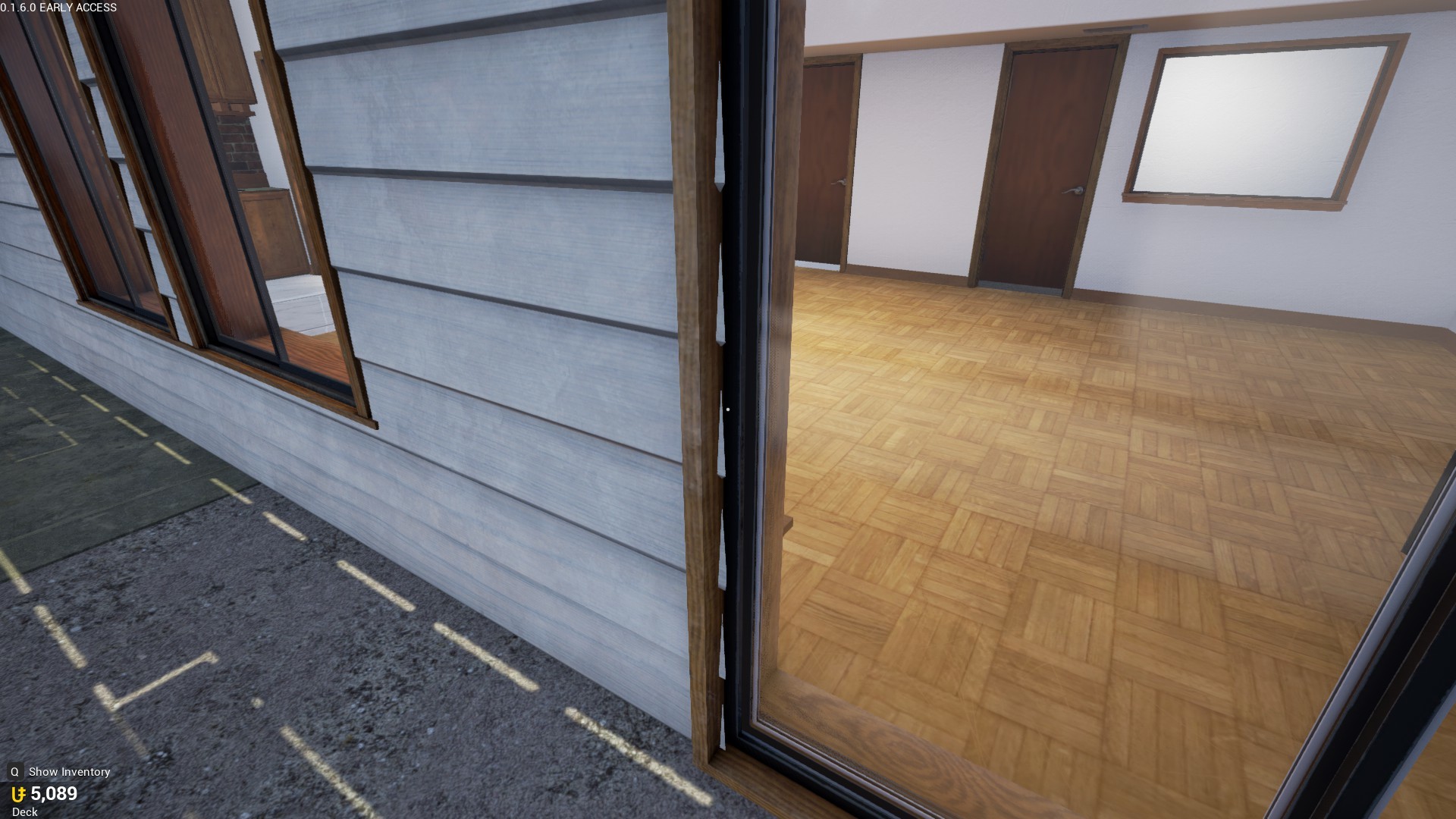
The house feels a bit too cramped, not extending the master bedroom to the end of the house certainly doesn’t help.

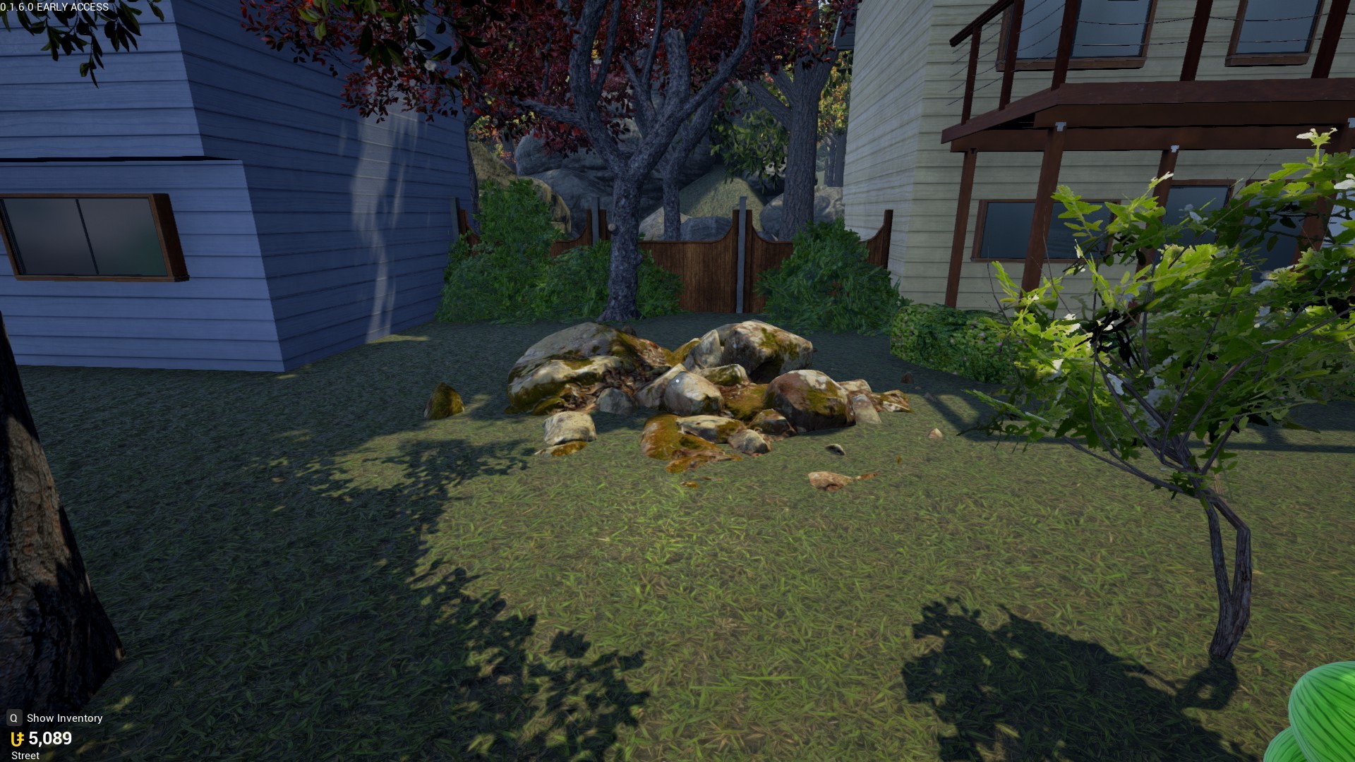
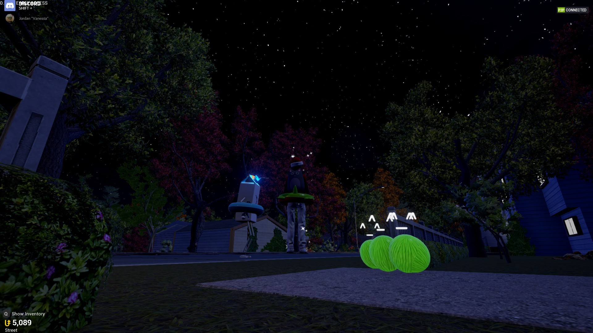
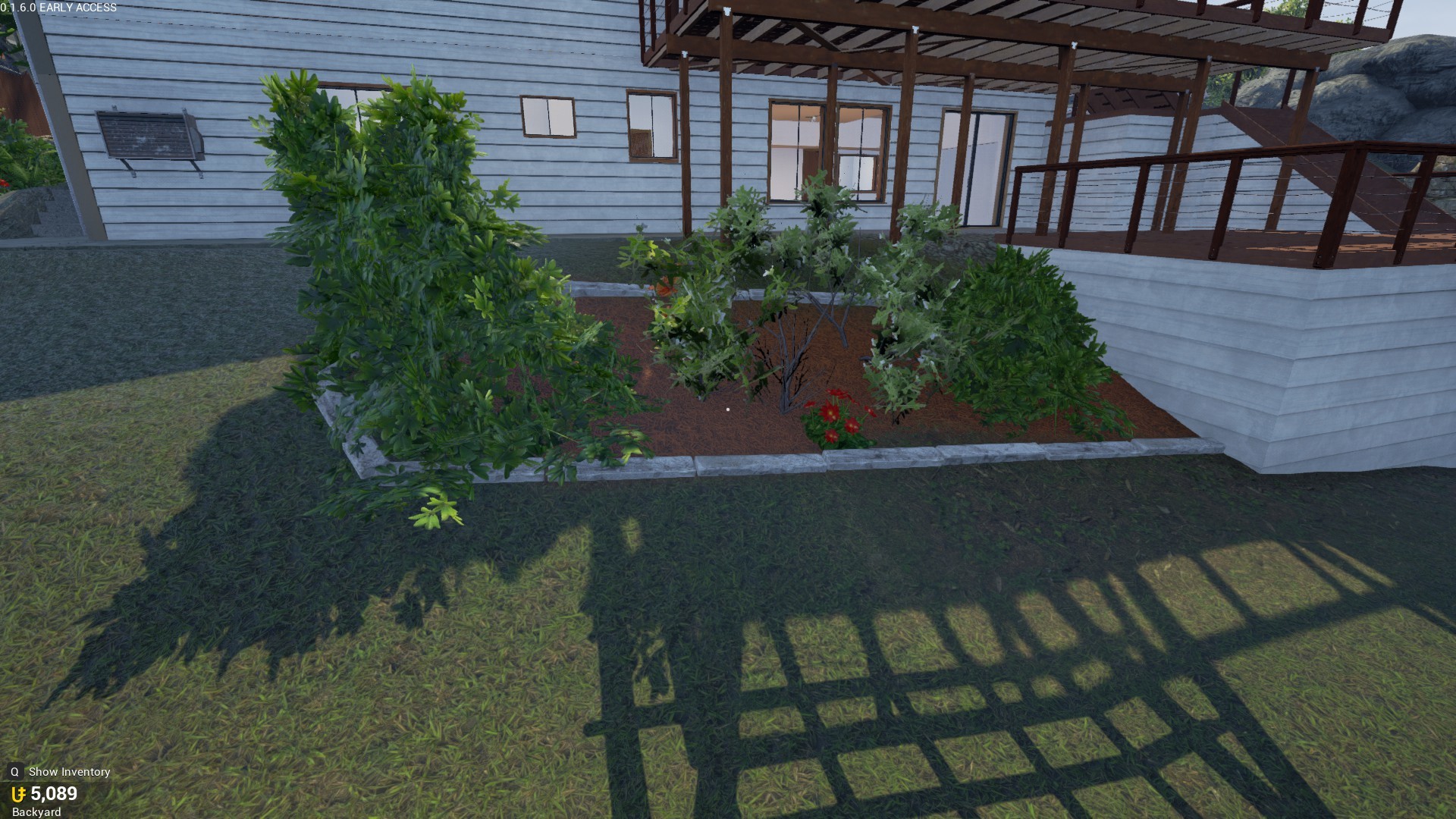
I’ll be honest here, it looks like both of the neighbors didn’t want to settle on an agreement to pay for a landscaper, and this happened. This just feels so out of place.

This is self explanatory.

Same goes for this one.

Please make this corner bit here useful, perhaps some shelves or a cupboard.

The brickwork could be a little better, and the display is just a little sad to be honest. Could be more lush with plants.

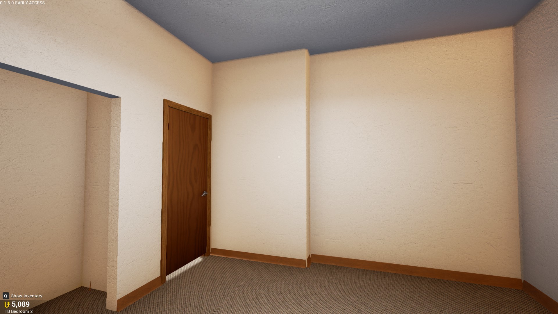
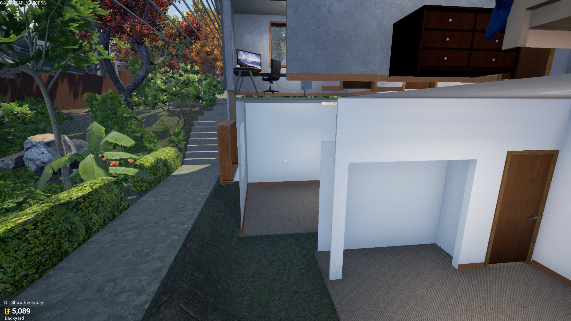
What are these rooms even for?

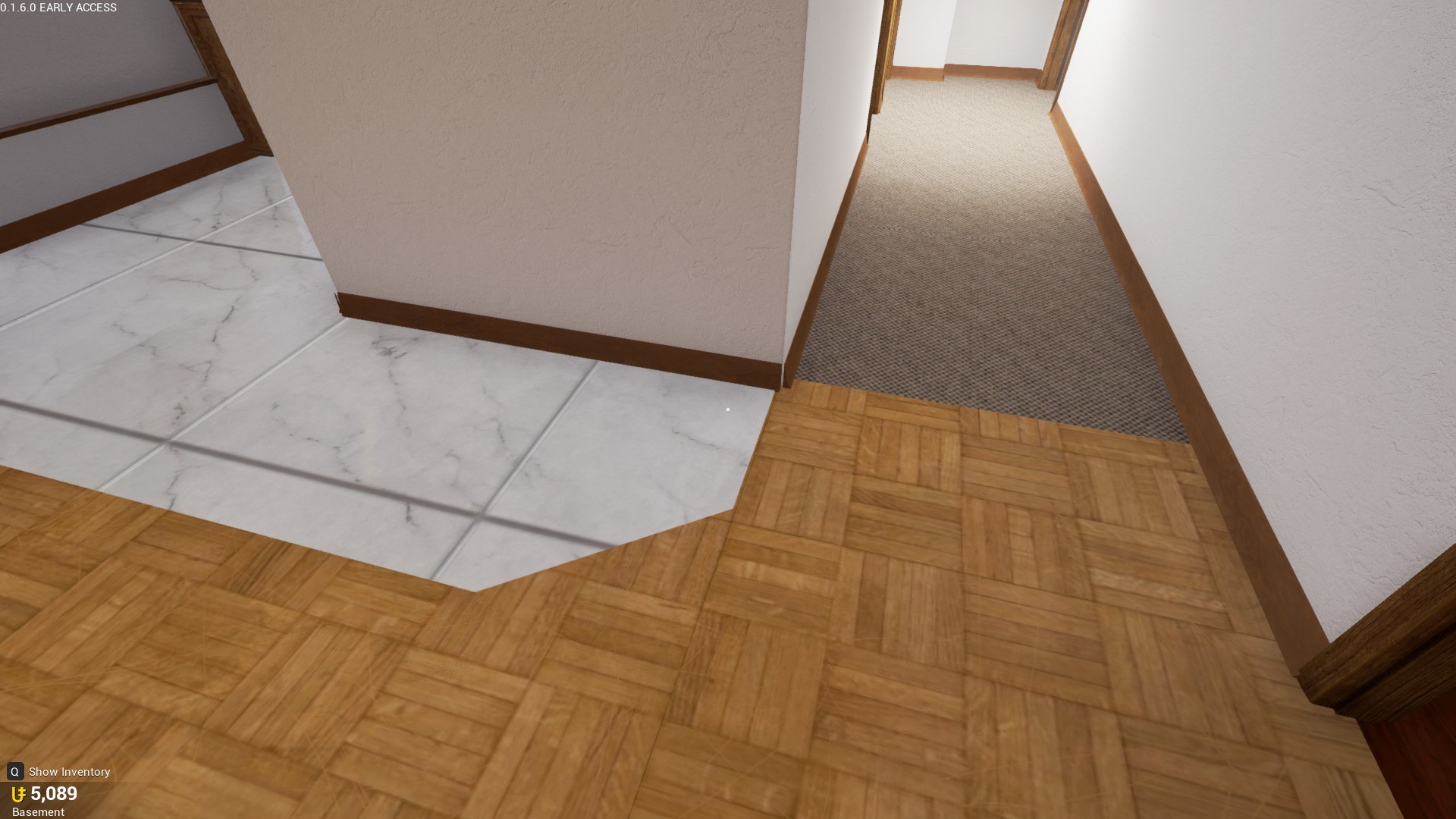
The lack of a metal floor divider is a non-issue, but it still bugs me a little bit. But that’s just me.

An unnecessary angle.

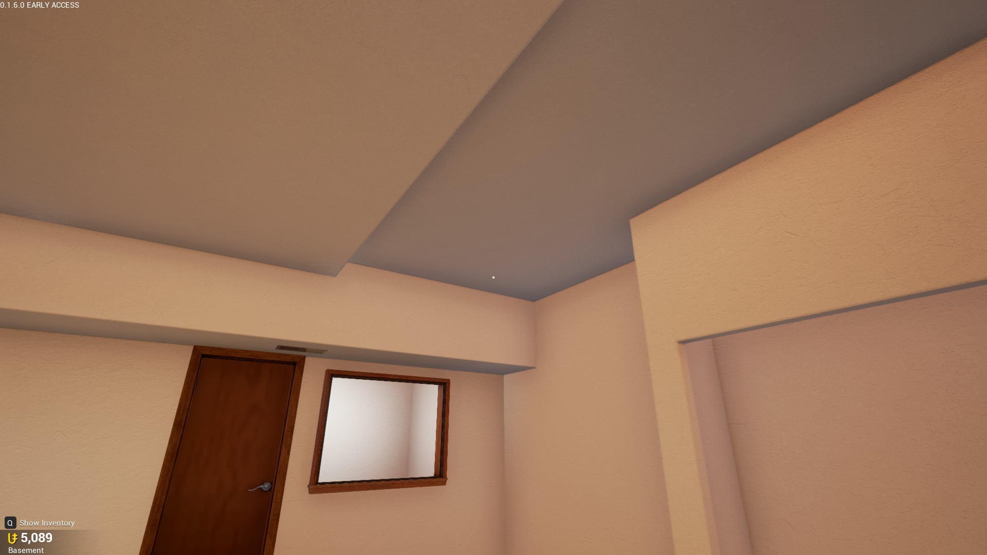
Seems like some more weird angles and use of space to me. Could just be a flat ceiling.

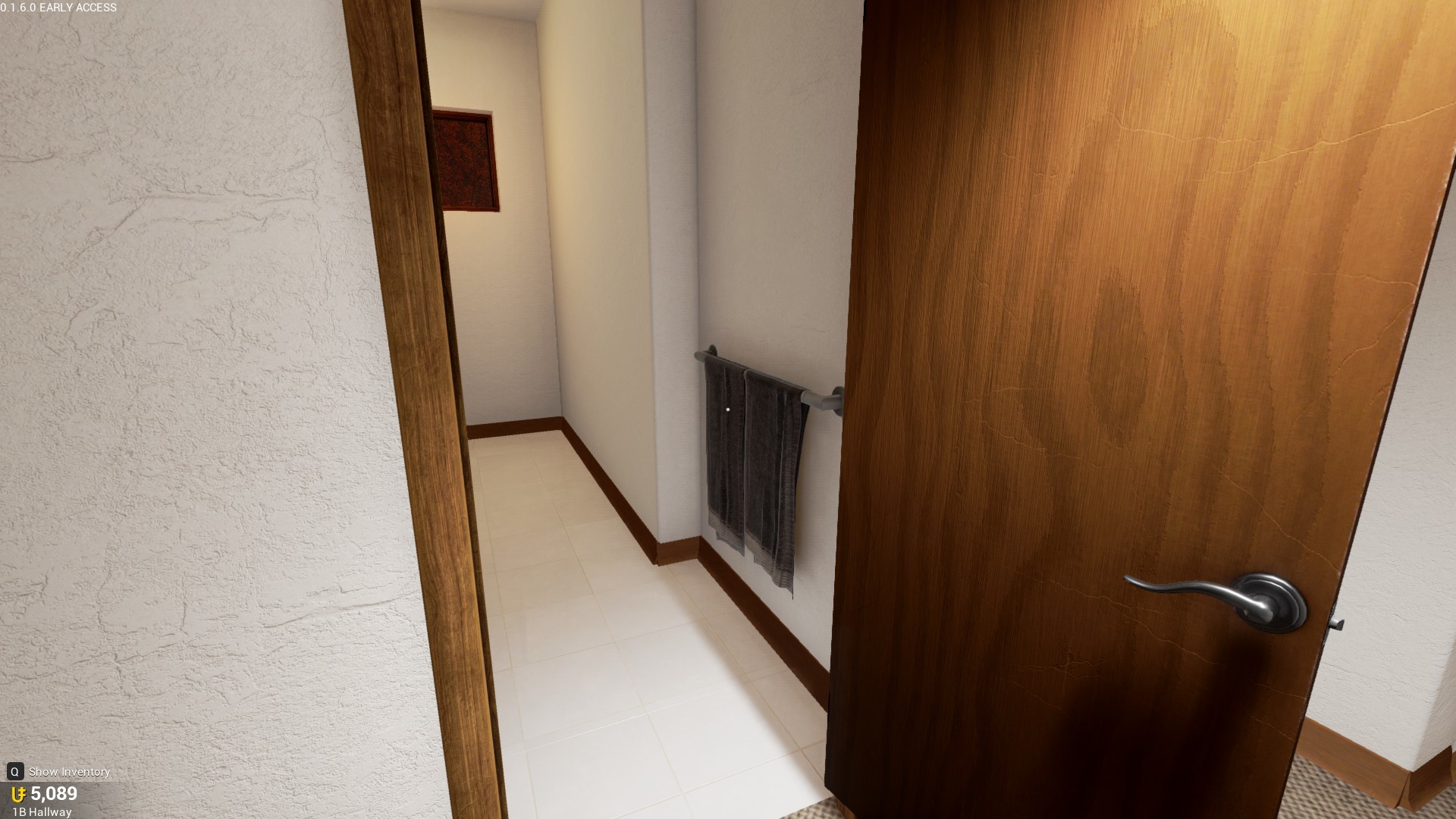
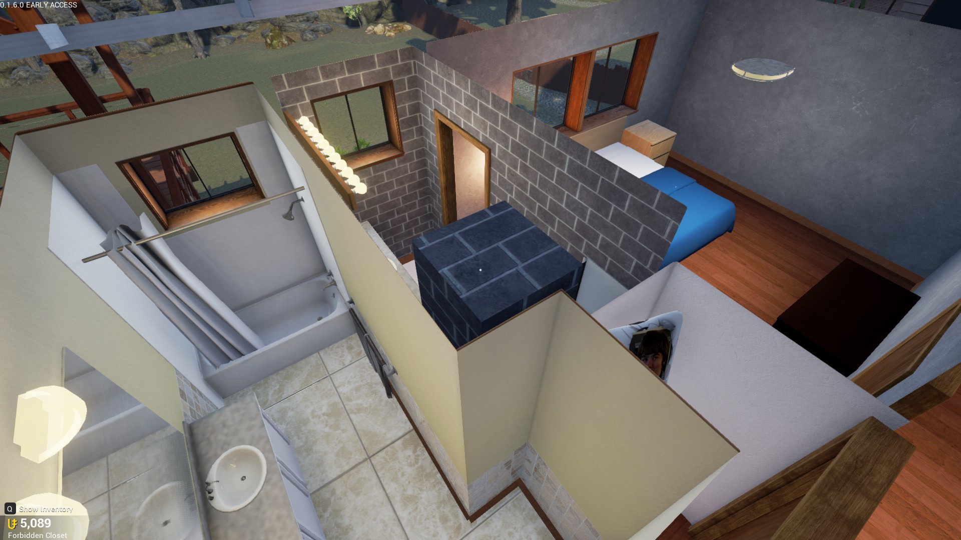
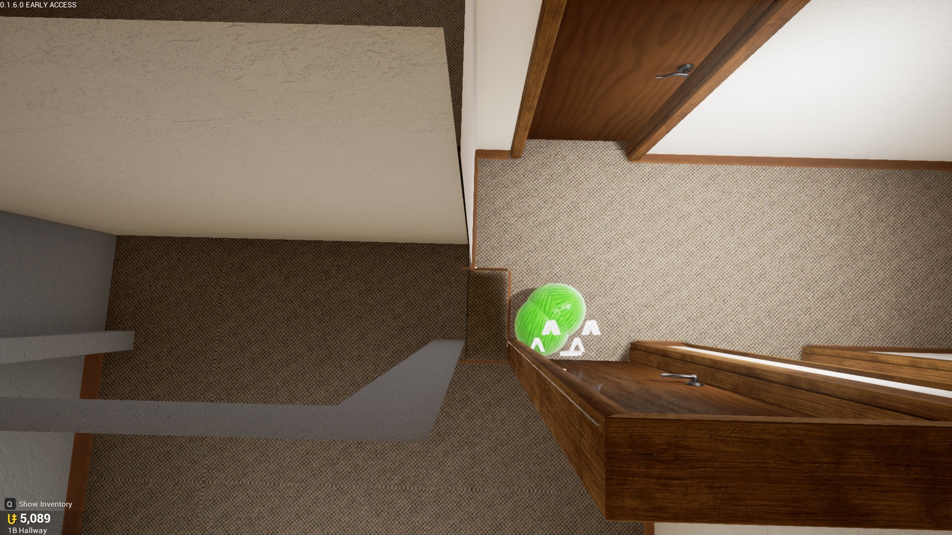
Another unnecessary angle, who spends more money just to put a towel rack there?

Not entirely sure what this window is for, just weird how out of place it is.

Self explanatory.

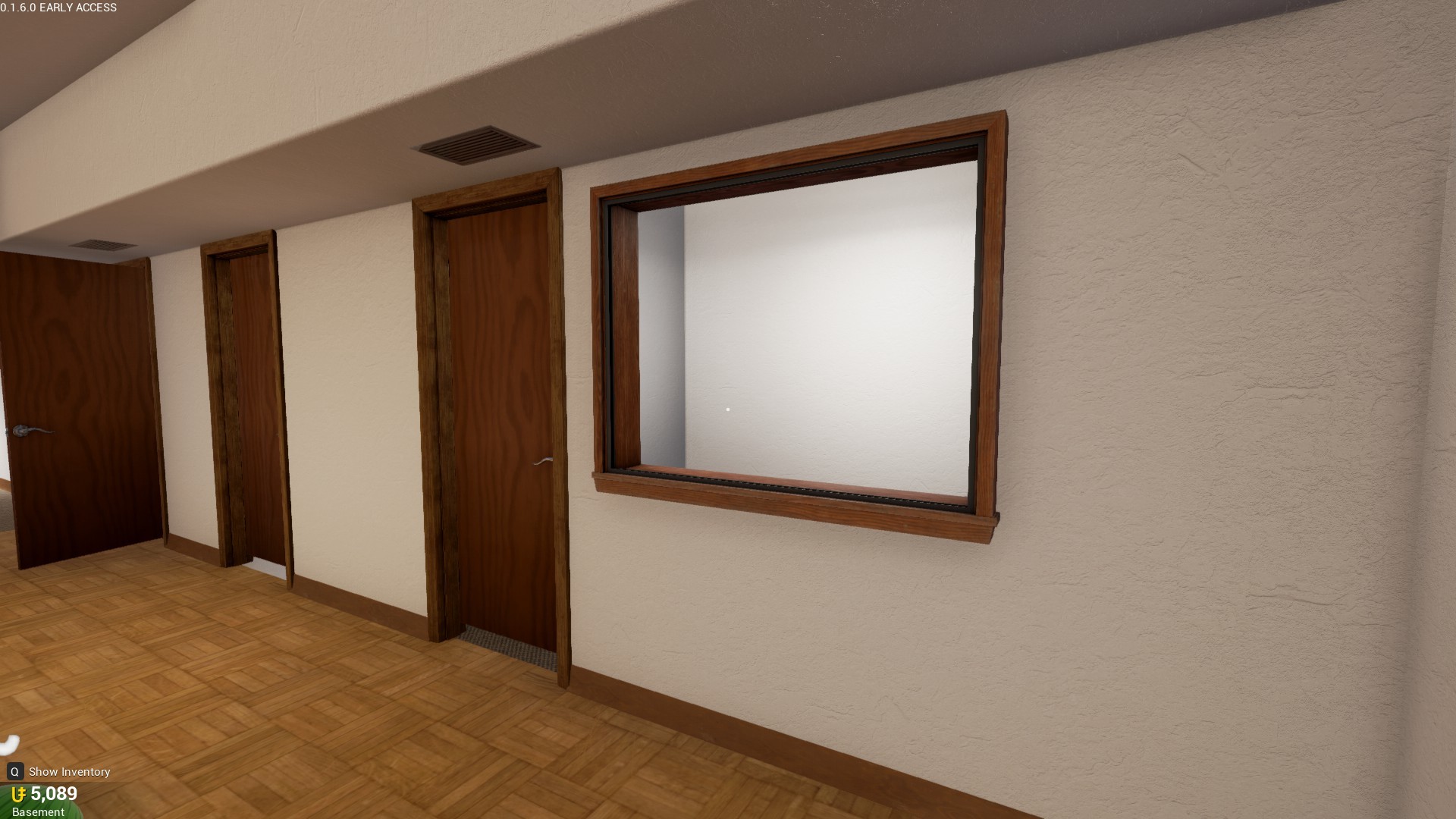
A little from the left, and put it onto the right. Can this please be even?

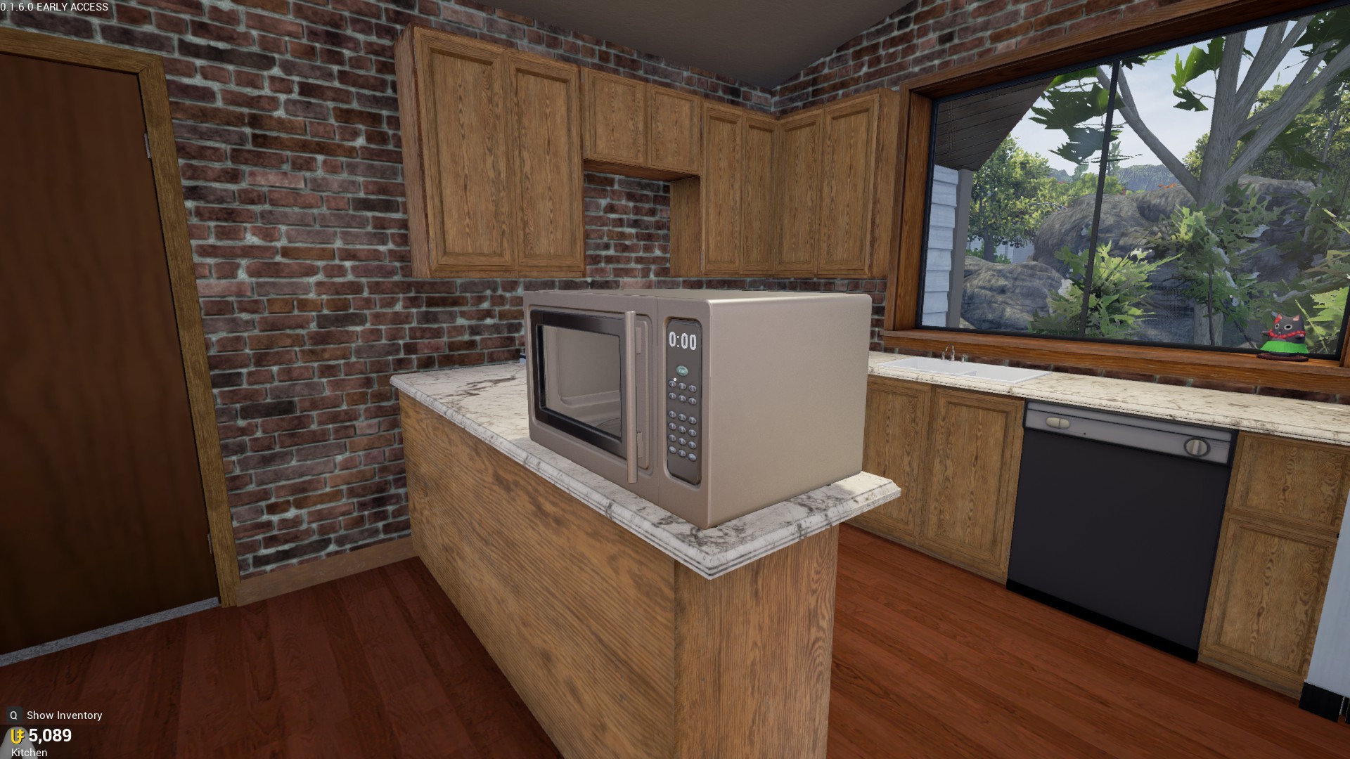
Just enough counter space for a microwave.

Another odd use of space. Probably better if you just open it up by removing the block here.

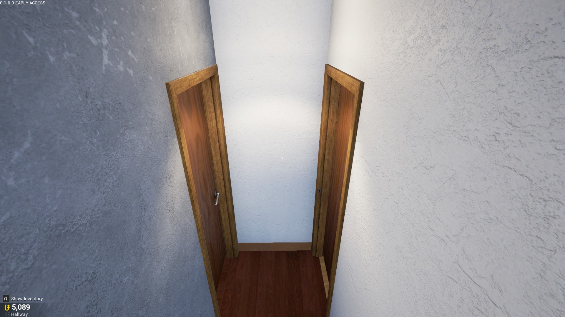
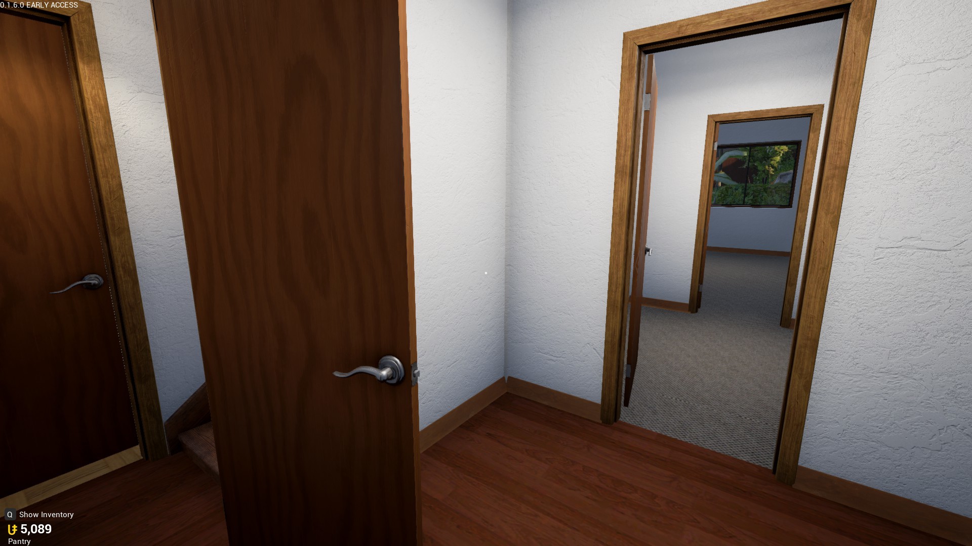
Having 2 doors at the bottom of the stairs doesn’t feel right, is there any reason that it can’t be opened up?

This doesn’t make much sense either.

This hurts my inner perfectionist, this should be lined up with the wall.

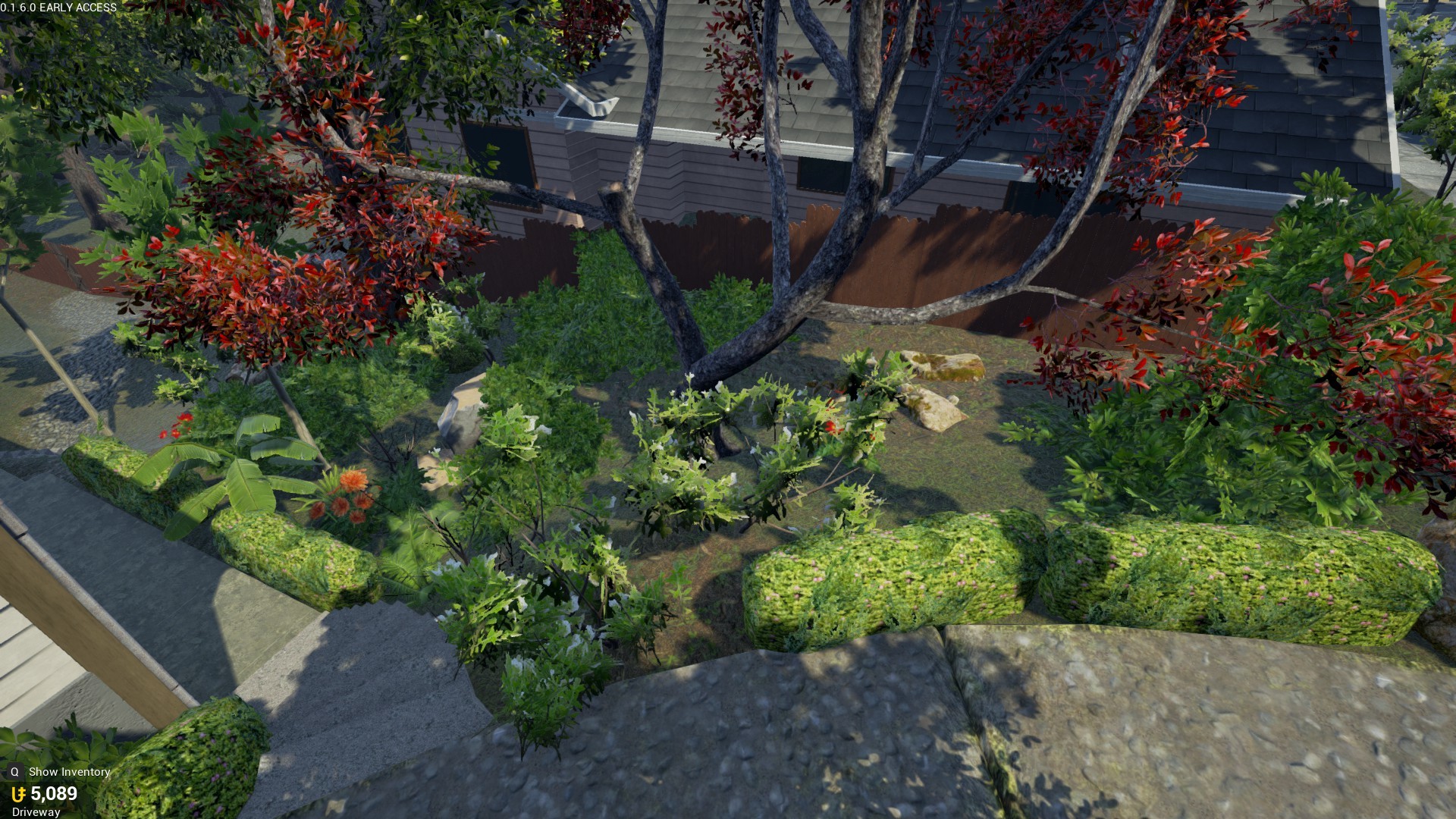
The plants feel a little out of place, probably due to the grass. Everything else is very green, but the green is a more dried out color.

As I’ve said before, I know the new condos are still having work done to them, but these are just some things I feel should be changed before they stop working on the house.

16 Likes

I agree with just about every single one of these. Please change this map, it’s got quite the list of issues.

7 Likes

My biggest issue with House is that because of the huge amount of small rooms, the whole inside feels like a maze. Lots of rooms to which the ways feel incredibly narrow and crammed.

4 Likes

There should definitely be less rooms in my opinion. By reducing the amount of rooms, you’d have more space to make bigger rooms which would fix the issue of the rooms feeling almost a little claustrophobic.

2 Likes

I agree! I spent a few hours yesterday playing this just to get enough units to buy it! Once I bought it I was very disappointed & wish I never bought it. The entire house feels very cramped. The upstairs has one decent room then a few rooms that are way too small. The basement is very confusing, it’s like a maze of tiny, useless rooms. Basically everything stated in this post already is exactly how I feel.

3 Likes

The House’s layout is being modified to combine a lot of the smaller rooms. The result should be less but larger rooms to build in.

13 Likes

I’m voting this up just because I’m impressed how you picked apart every single little imperfection. Even if I did notice these things I wouldn’t have had the patience to take a screen cap of every little thing and post it. Lol

2 Likes

Hooray! Thank you!

1 Like

The house condo reminds me of my dad’s place. It was custom built in the 80’s by someone and also has a ton of questionable and tacky architecture decisions: Shit like that indoor window between rooms (except ours doubled as a fishtank), and two small rooms that shared a narrow closet on opposite ends.

I definitely won’t knock it for being unrealistic, but I do find it to be quite unpleasant to navigate. I think that either the living room or the basement need to be expanded to have a larger entertainment area.

1 Like

Here’s a fun fact: you actually are completely correct. It’s based on a real house I had access to that was built in the 70’s. The Big Misstep we made with this layout is that we probably shouldn’t take architecture plans and then just make them 1:1 in TU. That weird dumb window into the office is 100% real and it’s confused me to no end too.

5 Likes

I can’t remember where I heard it from, but I think they said it was your house. Is it actually? And yeah, I took 3 drafting classes, and I think it’s safe to say that whoever designed the house needs to get another job. Having those extra angles is just a waste of money. Money that could have gone to not having those angles. :𝗉

And also, since you had (or have) access to the house, what are those small rooms in the basement used for?

2 Likes

I also had a few concerns, but stay tuned to the end because I believe critiscm shouldn’t come without praise. (I, for one, did not feel wasted out of 150k units, as a starter, but the house needs more improvement in my eyes than showcased in the OP.)

Shall we begin?

All my stinkin’ images broke. Whatever, here’s the same content in an Imgur album.

4 Likes

I hope this is just me, but all of your pictures are broken.

3 Likes

I cant see any of these images.

What the hell, dunno why they all broke. Worked fine for me when I uploaded and edited them. Maybe it was because that was my first post here. Oh well, I took the time and put them somewhere more accessible, on Imgur

Here’s a link.

2 Likes

I haven’t yet gone through all the images you posted, but I just wanted to mention that the trees are very optimized. There’s LODs on them and they only have a lot of polygons when you get close to the tree, but from a distance they are very simple.

3 Likes

Okay, good to know. I wasn’t entirely sure on how the trees’ level of detail were handled so I just threw it in there just in case.

1 Like

I agree with almost everything except I love the amount of rooms but they need to be bigger. I’ve found a use for every room but a lot are so small. I used the room with the window as a recording studio of sorts. The purpose of the window was for the person of the office to look out. The wierd pop outs on walls were most likely for ductwork and things in real life. The wierd basement ceiling is due to the fact it was mostly likely built with an unfinished basement that the owners later finished off and had to build the ceiling around pipes and other things. The basement stairs are a bit wierdly placed. I don’t know of any house with that layout and era to have a staircase to a once unfinished basement open and in the hallway like that.

I think the two small rooms that lead to the B1 Bedroom should be merged together.