Well, I pay a lot of attention to detail, especially typography. And well we all know (us designer nerds) the font Roboto is the new Arial, Helvetica, etc.
I love Roboto as a font, it looks slick and fits everywhere. But why is Roboto become so popular? Android. Google hired Christian Robertson so they could work on Roboto.
Aight, but why are you almost crying?
On the 25th of June, 2014, Robertson along with Material Design team released a new version of Roboto. A version that looks more strong, more simple, more new. It's currently being used in Android. Here's that version, the latest version of Roboto. The most beloved one: https://www.google.com/fonts/specimen/Roboto
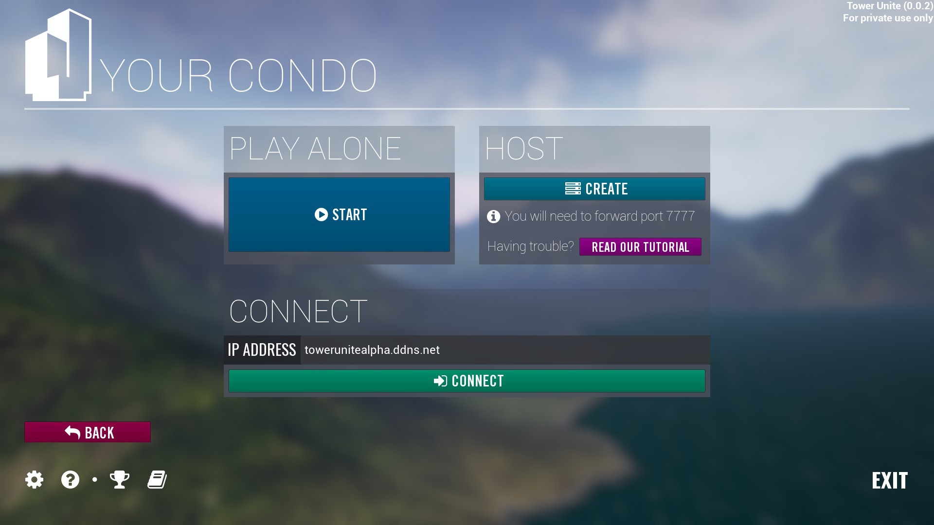
Now the devs behind Tower Unite are using an older version of Roboto which was released back in 2011. I’m not wanting to be mean in any way but pretty please, can you use the newer version of Roboto? Not the older version. It’s sad to see new stuff by Google not to be used.
Please don’t be mad at me ; 3 ; I’m just saying my opinion. Thanks. <3
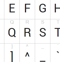
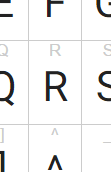
If I had to be abhorrently OCD, I’d say the R looks dumb because all the other letters are sharp-ended, whilst the R has some stupid wiggly bit on the bottom right.
And well the newer font by Google has the same license as the older one. It’s open-source. It’s weird though how Unreal doesn’t have the latest version of the font.