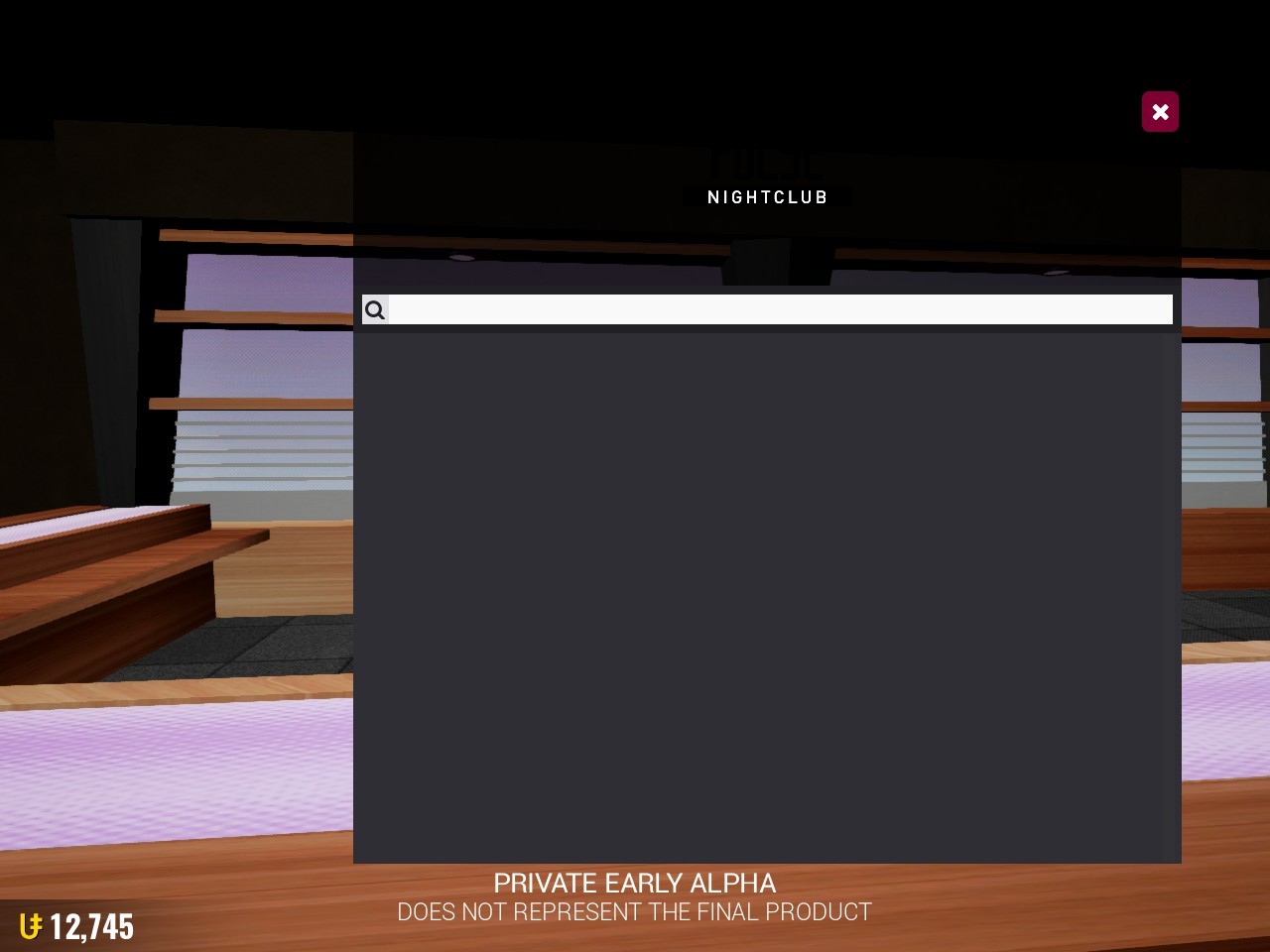
I think it’s too dark for the nightclub
3 Likes
Pretty sure it’s a placeholder anyways
1 Like
i think its a good logo 
2 Likes
It’s as good of a logo as Rollercoaster Logo™

3 Likes
@Link @spongeyperson I think it’s a good logo too! I just think it’s too dark.
1 Like
@TheAwesomeGuy it needs to be Bigger too. Nightclubs usually have nice big simple and fancy lettering for their signs
1 Like