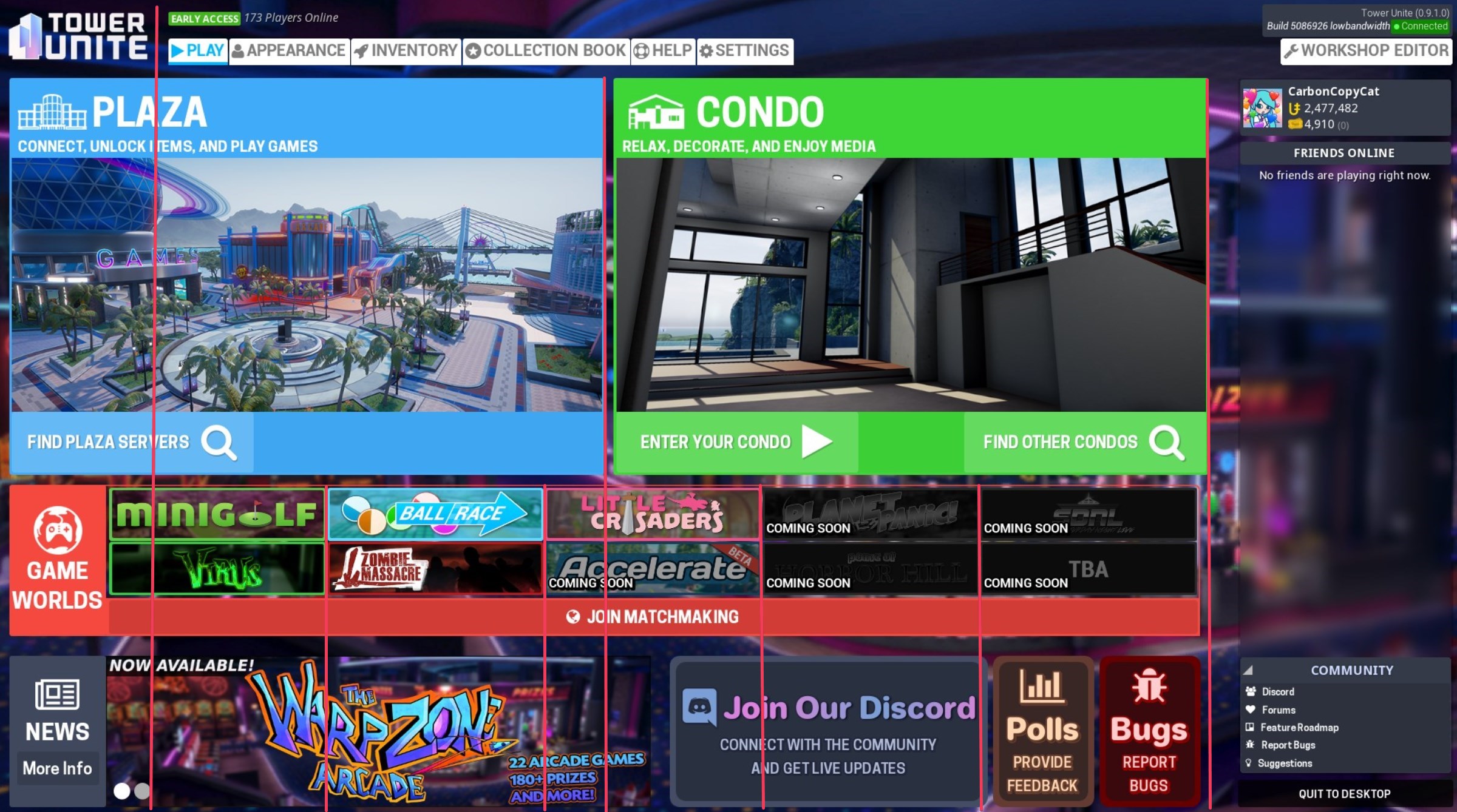
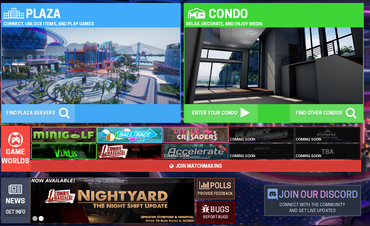
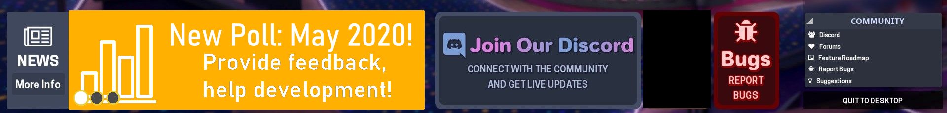
Not sure if another main menu UI change is in the works, so just ignore this if that’s happening to make things more consistent.
Currently, the new buttons completely clash with the theming of the menu.
First main issue is the font for the titles. I did see it being used in some other menus (waiting for players, I think?), but the round text doesn’t match at all with the square-er text used in all the other text fields.
Even when just looking at the new buttons, they still clash with the subtitles (e.g. “PROVIDE FEEDBACK”), which still use the same square font in all caps. Making the subtext lowercase (such as “More Info” under “NEWS”) would make things less sharp, and at least match that theming, but the main issue still remains.
Second issue is the borders.
When compared to the other boxes, the edges are much more rounded, making things inconsistent. Reducing the bevel on the boxes to match the other boxes would help in this case.
Additionally, the outline on the boxes are quite large, at least in my opinion. I’m not opposed to having an outline there, since it makes it clearer that it something you can click on, but the outline should be reduced to match a reduced bevel on the boxes.
Last is the color scheme. I’m not opposed to the actual colors used, but they do stand out.
One issue is the colored text, which differs significantly from the more minimal white text used in all the other text options.
Another issue is the drop shadows. For the “Polls” and “Bugs” buttons, the drop shadows are brighter
than the background, rather than darker, as is in every other case, making them more of a drop highlight. Their angle is also different (light source from top left, vs. straight left in every other drop shadow in the menu). The titles also use drop shadows, while the other titles in the menu (“PLAZA”, “CONDO”, etc.) do not.
Last minor gripe is that they don’t click when hovered over like the rest of the buttons, but that just seems more of an oversight than a design decision.