It could use some prettying up but I don’t agree with all of your suggestions. If the buttons were all static and started to slowly, gently pan around when hovered over, like you mentioned, it would be preferable and avoid any dizzying or visual overloading of a bunch of icons moving around.
Edit: also, I don’t think this should happen for the game worlds. They’re too small for that. Maybe if the logo panned forward a bit to get bigger when hovered over, shrinking back to normal when unhovered?
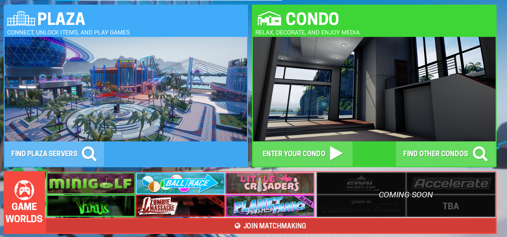
I wouldn’t mind different screenshots for the plaza and condo tabs, but short videos like that might be excessive. The background image is fine and I’d only want to see that changed for things like seasonal events.
I appreciate the effort, but I think something more gentle would be more fitting, like a sloooow, drone-like, single shot looking down at the main circle.
I want to list all the maps vertically (and on the right show a thumbnail with a video playing) and add some sort options to short by difficulty or name. I also was gonna integrate some achievement and stats on the map select so you know which map you’ve been playing. Also showing the latest leaderboards.
I’d like to have each game world menu have it’s own unique feel. It would be nice to have buttons for upgrades, show your EXP, and later down the road show any daily challenges.