Kalleira’s in-game depictions always have some sort of inconsistency in design, and it keeps bugging me. Could be passed for stylistic choice, but still worth bringing up.
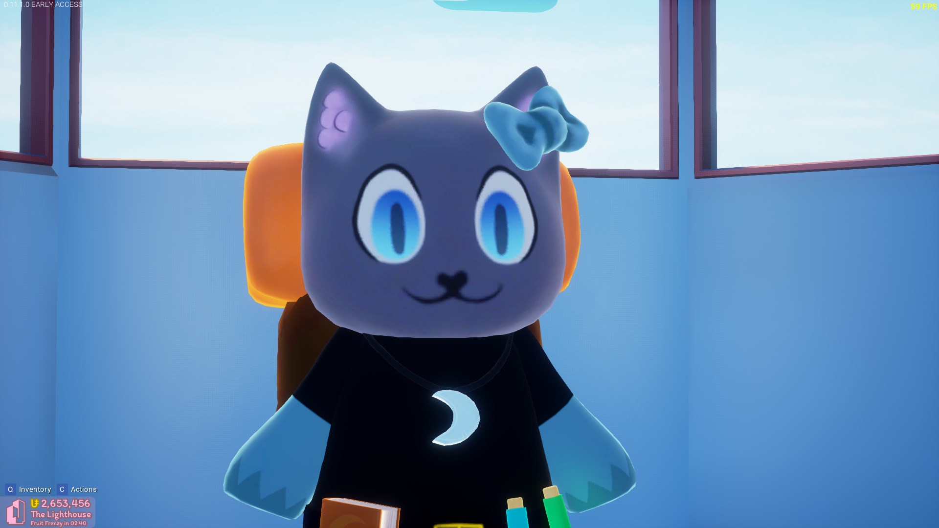
Original: for comparison
Steam Trading Card (Note: WIP, could be scrapped for all I know), from the 4/13/20 Dev Log
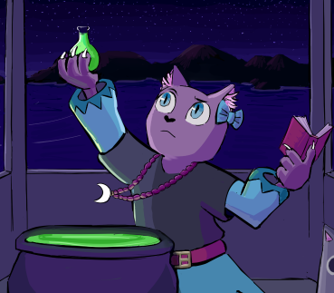
Eye shape is fine, eyebrows are excusable (for expression purposes), bow is intact. However, her moon necklace is clearly hanging from the side, instead of at the top. Only other gripe is that her irises are a bit small, but it’s fine as-is.
Clearly marked as WIP though, so not really a problem.
Accelerate: Moon Power
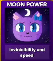
Anime eyes instead of more of an almond-shape, plus what seems to be either the top parts of the eyelid or eyebrows. Excusable as style, but also, whiskers??? Plus, once you use the item, you see the original design Kalleira instead, which is a bit jarring, and I don’t think the other item icons are really that stylized.
Plaza Advertisement
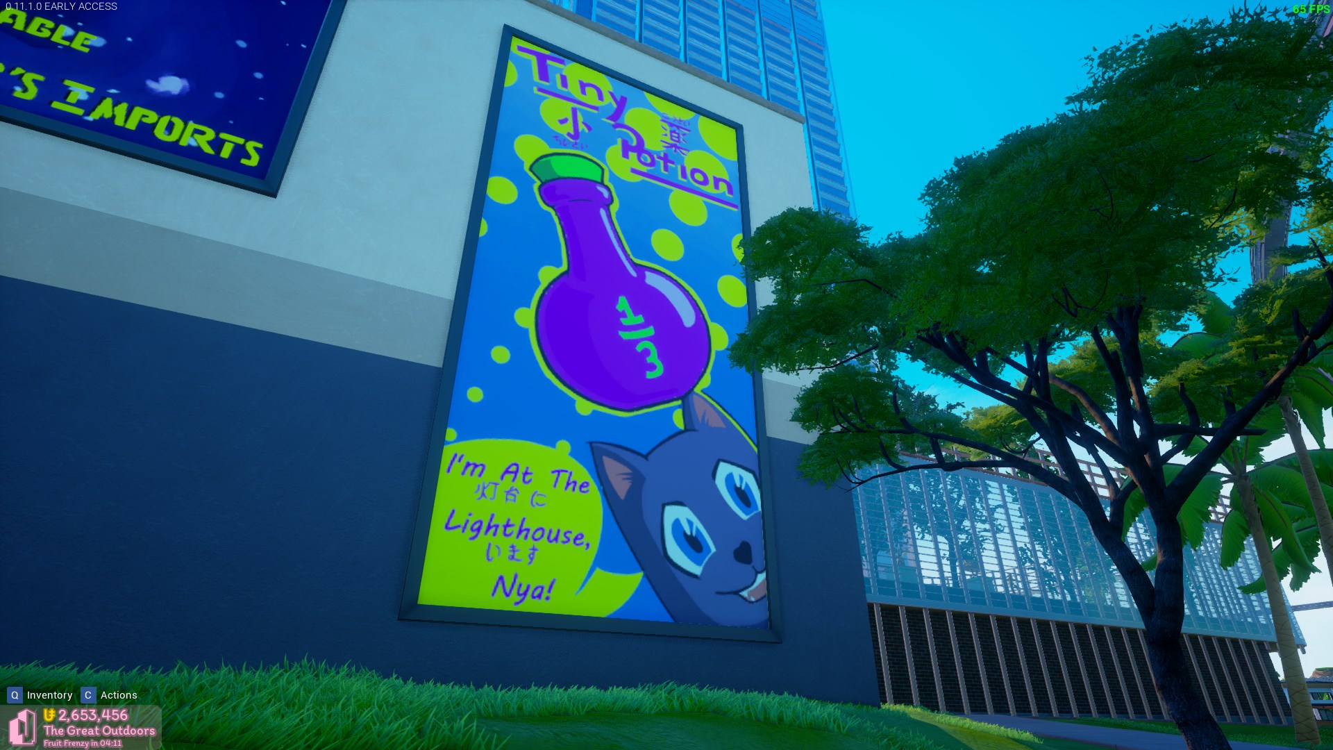
Pre-recolor, but design is identical. Biggest issue is that she’s entirely missing her bow. Eyes are kind of almond-shaped, but also really angular too? It also doesn’t seem like she has her cat-eye pupils either. Don’t know if it’s just the bow or the other features too, but personally not that recognizable as Kalleira.
(Also annoyed that it uses a generic potion bottle instead of the much more recognizable in-game tiny potion bottle. It’s not even red, and it has 1/3 written on it instead of the big T on the in-game icon.)
Not really too big of a deal overall, and I get people have their own different styles of drawing, but given it’s all official in-game art, there’s a higher expectation of unity, at least in basic design characteristics.