I guess it’s high time to give some explanations/rebuttals (Though this is all clearly subjective).
(I wrote a lot here, feel free to just skim it if you don’t care much)
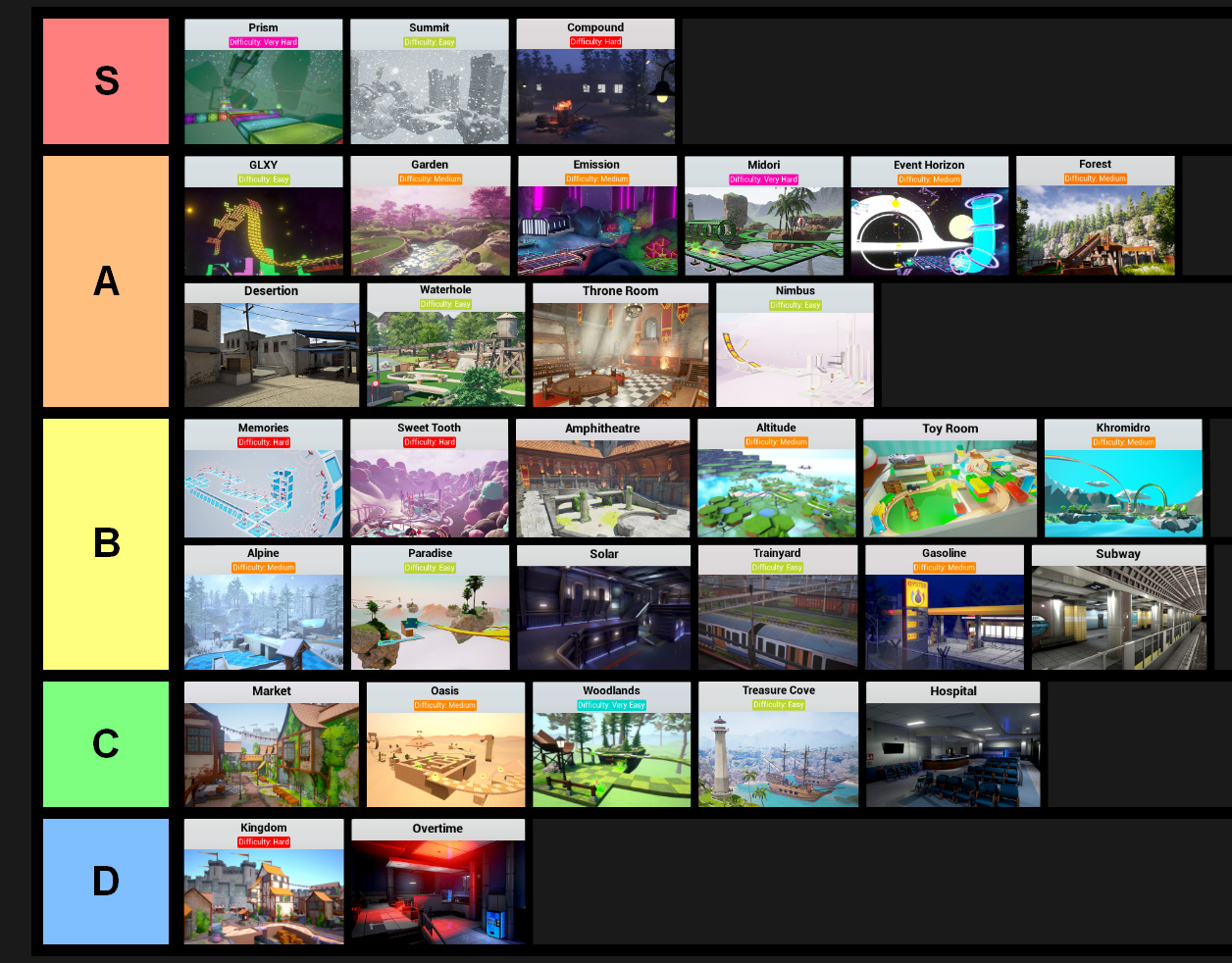
Kingdom: I felt bad putting it as low as it is, because I know it doesn’t bother most people, and is objectively okay, but that doesn’t change how I feel about it. The “timing/precision” elements feel borrowed from Sweet Tooth, except less fitting, and it is overall often unnatural and unintuitive to play. The path forward isn’t always clear, and is often janky.
GLXY: Definetly a great map, but doesn’t have much novelty or particular focus.
Market: For Little Crusaders maps specifically, the main gameplay styles it can serve are more simple one vs. all combat, and a more strategic game of cat and mouse/hide and seek. The problem with many LC maps is they try to have it both ways, being too complicated so they get in the way of core combat, but not complex enough to actually support a sneaky play style. Market is a good example of this problem, and the whole sewer area is generally problematic (Lots of spots where knights can score easy kills on the dragon, so dragons just don’t go there, and those spots/passageways are left unused and wasted).
Nimbus: Although it’s basic, I bumped it up from B to A at the last minute, because not only is it a well executed example of a simple yet open map, but the mechanics and levels it has feel so natural to Ball Race’s gameplay. Simple things like platform tilting, downward slopes toward the goal, and spicing up linear sections with moving/opening platforms, it just feels really well designed (I will admit the difficulty can be off at times, e.g. hammers).
Overtime: As my “worst map”, I should probably have good reasoning for this. Mainly, the camping spot is bad. Camping as survivors is core to Virus’ gameplay, nothing wrong with that on its own, but certain spots (In Overtime especially) are quite badly placed/designed. Problem 1: it’s in a corner. This means a lot of the map is restricted or unused, because everyone is huddling in a corner, camping spots should be central in the map, or have a variety of exits/entrances. Problem 2: The exits/entrances. Two of them are long hallways very unfriendly to infected, 1-2 (Depends on how you count them) are tight passageways with no visibility, which are very unfriendly to survivors (This just results in all parties feeling screwed). Problem 3: Bottlenecking. If TNT wasn’t already bad enough at making the game a boring tower defence (Just kidding around, don’t worry), the tight stairways to the elevated camping spot funnel infected through them, might as well give them a “queue here to be shot” sign. Problem 4: Claustrophobia/infected spawns. On top of all this, the camping spot is really tight, especially with a full lobby, there’s no room to stake out a unique spot, just a mass of players all clumped together. This isn’t helped by an infected spawn on the platform, which may seem like helpful balance, but since the spot is still worth using despite that, it just, again, makes all parties feel screwed. Beyond the camping spot itself, the result of a corner spot also makes the rest of the map underutilized, and even taking the map as a whole, there aren’t many interesting passageways or complexities to be found, it’s pretty basic and linear. The cherry on top being that Overtime doesn’t feel much like an office, just Solar with vending machines, there are some office areas, but it feels mostly sci-fi.
Solar: I will say distinguishability and comprehensibility are definitely weak here, though I feel it makes up for it in other areas. The camping spots are pretty spread out, and it gives you a lot of agency in terms of viable ways to play. When things start getting hectic, the open layout allows for an easy escape path, and the corridors are pretty easy to navigate when chasing or being chased, despite the overall layout being a bit complicated. Obviously the verticality is a great factor of novelty too. It’s not amazing, thus the mid-low B tier, but I think there’s something to appreciate.
Midori: It’s definitely one of the best basic maps, and executes its difficulty really well, but it doesn’t have the novelty or fast paced fun to compete with the top 3 Ball Race maps.
Toy Room: Honestly, its bump down is mainly due to aesthetic reasons. I respect the interesting theme, but to me it’s always been an eyesore. Gameplay wise, the map is really solid, it aims for combat more than complexity, and the use of verticality is really good. I will say there are some unneeded passageways, obstacles, and extra space about, but on the whole it’s solid.
Hospital: It suffers from similar problems to Overtime (Corner camping spot, long hallways, bottlenecking, etc.), though not nearly as bad. The reception area is actually a nicely broad spot even if it’s in the corner of the map. My main issues come with the over-complexity, and to some extent wasted potential. The grid-like format of identical looking hallways and rooms makes the map labyrinthine (Complete with dead ends), and generally annoying to navigate, further hurting the isolation of the camping spot. It’s just big and empty, with lots of rooms it doesn’t need. The theming and style is nice, and maybe if the main spot was more centralized the rooms could be made better use of, but it’s poorly distinguishable and comprehensible as it stands.
Compound: This is definitely a really weak S tier, and is helped by its mediocre competition in the ZM map department, but it is a consistently fun map to play at any time, which deserves some credit. It’s got a lot of path variety and choke points, while being more comprehensible than a map like Trainyard. It has a lot of complex dimensions and design, which is very unique among its peers. Obviously just because the rest of the ZM maps aren’t great doesn’t mean it deserves S tier, but being the un-debated best map of a game world is significant to be sure.
Sorry if anybody actually read all of that! Just wanted to clear up my stance a bit better.