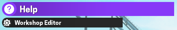
looks nicer to me, top image is before the adjustments
this would also make the workshop editor button look less weird next to the others since there would be no obvious cutoff