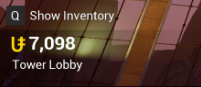
Right now, the UI for all of your units looks like this:
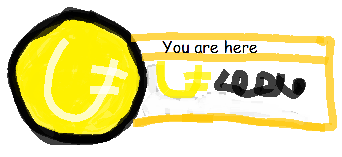
But, I think it doesn’t look very great. I also miss the UI for GMC in Gmod Tower, so I thought that the UI could look like this photo I made with a professional art program I had to pay a monthly subscription for:
The design in the OP features the unit symbol twice, I don’t think that redundancy is necessary.
Also I’m not sure if we need to remind the player who he is and what he looks like. If we choose to display that information, we could change the UI into some kind of ID card.
The GMT UI showed the GMT logo, we could replace that with a miniature icon showing where in TU the player currently is. I could imagine a house icon for the condo, a slot machine for the casino, the players bubble for ball race and so on. Maybe let it wear the TU logo as a little hat.
I don’t mind the current HUD, but I also don’t mind change. I personally wouldn’t want my Steam avatar (or my Steam name, really) all over my HUD. I already know what they are so adding them to the HUD feels like a waste of space to me. I’d personally replace the icon with a headshot of your player. This way the HUD is more interesting and colourful, and the newly used space actually serves a (slight) purpose if you play the game in first person.
I tried to incorporate the Inventory prompt and the “gaining/losing Units animation” into the HUD as well.
I realise the padding/spacing isn’t even, but it’s a concept.
BOTDan’s version is the best out of all here IMO, though I’d still prefer it to be a box rather than a fading surface.
(It also doesn’t show your name or profile pic in it, which is completely useless.)
The current UI doesn’t show your name or profile pic either. I mean, how often do you forget what your name or profile pic is, that you need it plastered on screen?
Ok but my point is that you said Dan’s is completely useless without the name and profile pic, despite looking, by far, the best out of them all. The current version doesn’t have the name or profile pic and it’s certainly not useless, so why is Dan’s any more useless than what we have now.
Check what “useless” is targeted at. I described showing your name and profile pic in the HUD as useless, not the design. I get that I probably structured my sentence improperly, though the “also” should have made it more clear that it’s still on the positive side.
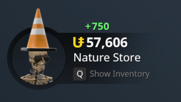
I know this is for the unit count but this could be up in the top right corner something like this, I just quickly put this together in Photoshop, by it could display what server you are on with the unit count and display your steam picture.
I don’t know honestly I was debating putting steam picture in but it would be possible to do it without