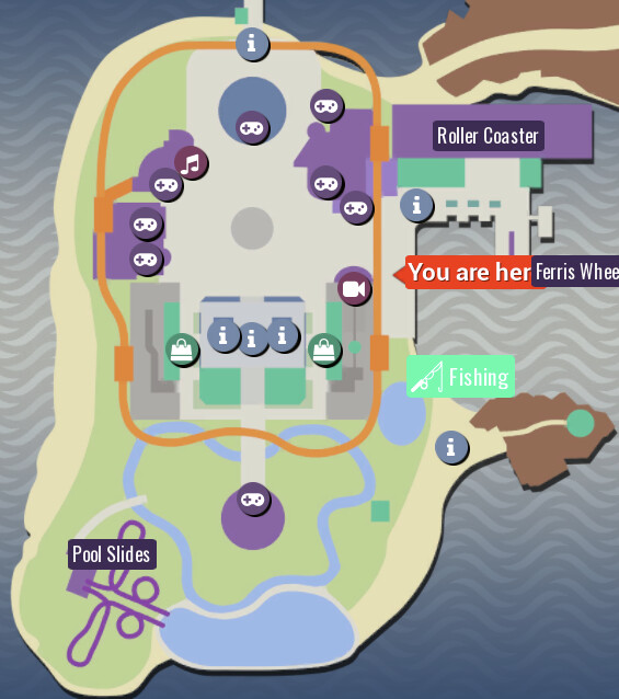
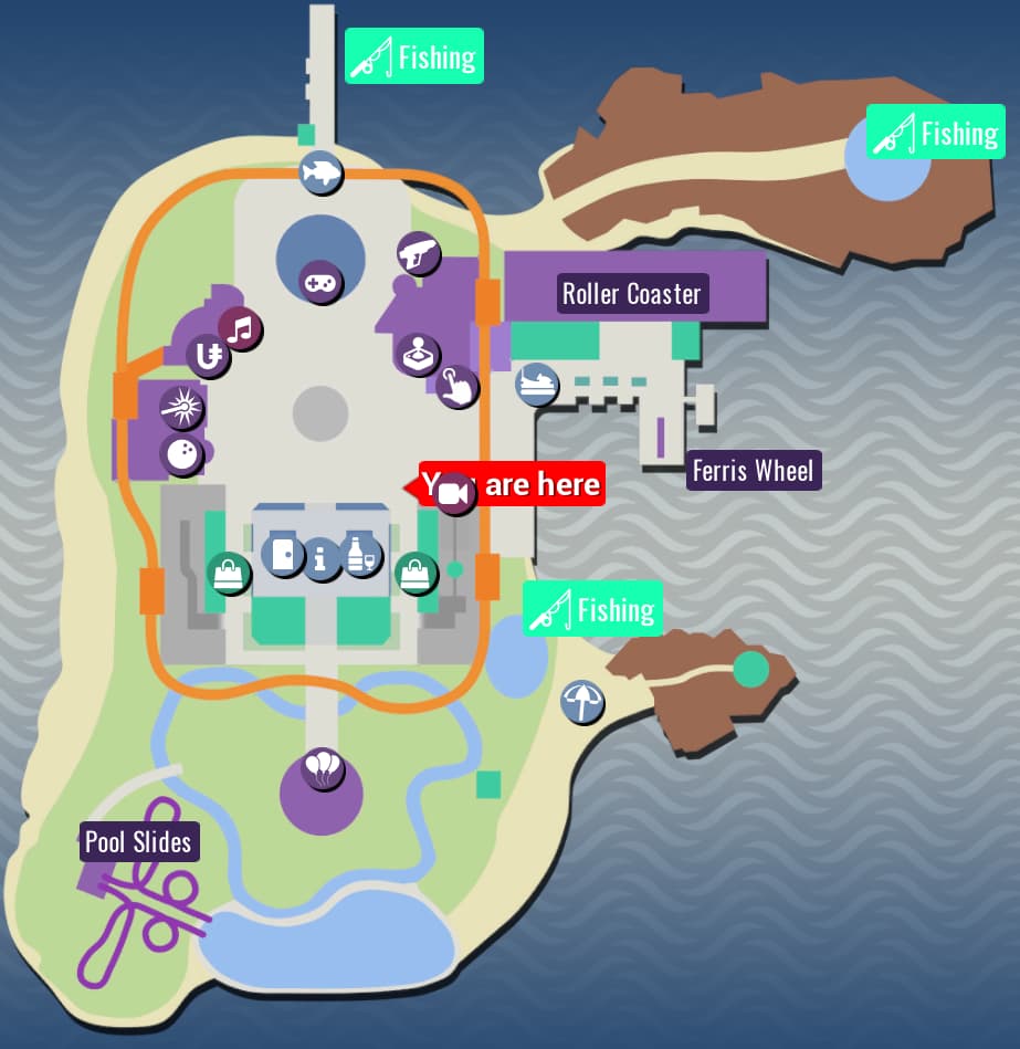
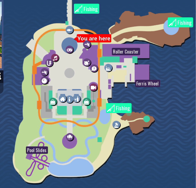
I think the map icons, at a simple glance, don’t convey what their place represents, think of it like this:
You’re a new player, can you tell me which place is the Arcade and which one is Trivia by simply looking at it?
So I wanted to suggest changing most of the icons for something more accurate, to this day I accidentally teleport to Laser Tag or Trivia when I want to go Bowling or Arcade lol
Casino: Unit sign
Laser Tag: Laser Impact
Bowling: Bowling Ball, or Bowling Pins.
Condo Hub: Door?
Central Fountain: I think current is ok.
Project 12: Bottle and Glass
Minigame Area: Balloons
Beach: Parasol
Docks: Fish. I thought fishing rod would be repetitive.
Game World Ports: Current definitely is ok.
Dark Voyage: Either a Laser Gun, or some Cogs could work? This is the one I was the least sure.
Arcade: Joystick
Trivia: Hand pressing button? Either that or question marks could work?
Boardwalk: Maybe a Bumper Car, or Cotton candy.
Yeah I dont use the map too super often but everytime I do I have to slowly mouse over everything to find what I want because Im bad at rememebring whats where
The more unique icon types is one thing I appreciate about say, Pokemon SV. Sure, all the food shops have the same icon, but delibirds and chansey are different, and other categories as well. So its a lot easier. Something similar in TU would be very helpful.
I would consider myself semi-regular I guess? I dont play all the time but I play at least during holidays every year and sometimes other times. I still have troubles despite having had the game for years so itd be nice!
I really like this suggestion. Yeah, I agree that the map is a bit hard to read for new players. We wanted to do another piece of artwork for it, something like a theme park, but it’s quite a bit of work!
I tried to make the icons be based on a typical map you’d see at a mall or theme park where they use similar icons for similar activity types.
I think your icon choices are really good and I’ll see what I can do after our break.