I appreciate the softness, but that one actually hurts my eyes much more. It’s just so bright, and all of the colours blend together. I guess there’s no winning when it comes to colour and light balance, everybody experiences it differently.
Though Toy Room also hurts my eyes, and I’m clearly in the minority there, so maybe my eyes are broken.
1 Like
this fit you better? huh?
2 Likes
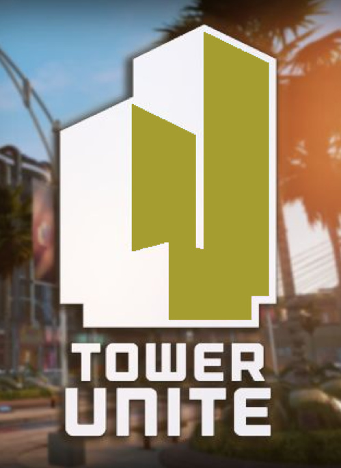
and here my friends, is the magmum opus, #a59d30 tower unite, in all its glory
1 Like
I completely agree. The shadows between white areas and the… soft coloury bit are really important.
1 Like
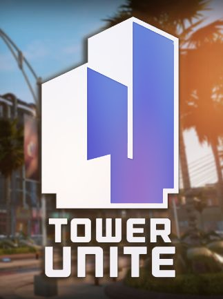
While we’re here, I’d like to nominate #3d41bb:

1 Like
the aesthetic is very nice
That’s actually pretty damn nice.
BUMP
I decided to add my own A E S T H E T I C to the TU Logo:
5 Likes
 a e s t h e t i c