I’ve had this concept sitting on my hard drive for a little while now, and recently I’ve decided “FUCK IT” and decided to finish it up a little. It’s still not completely finished (as you can see by the friends list and quit buttons), but this is what I have so far:
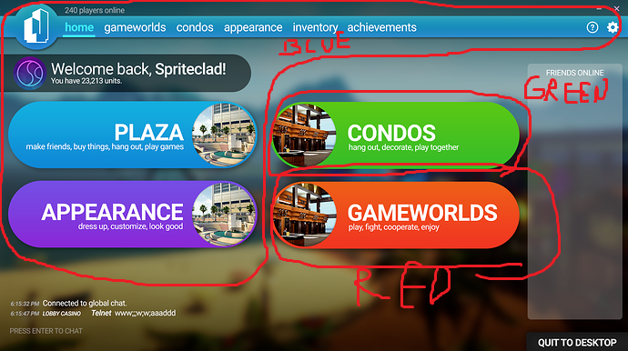
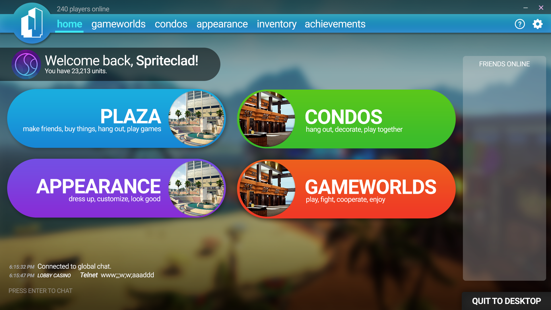
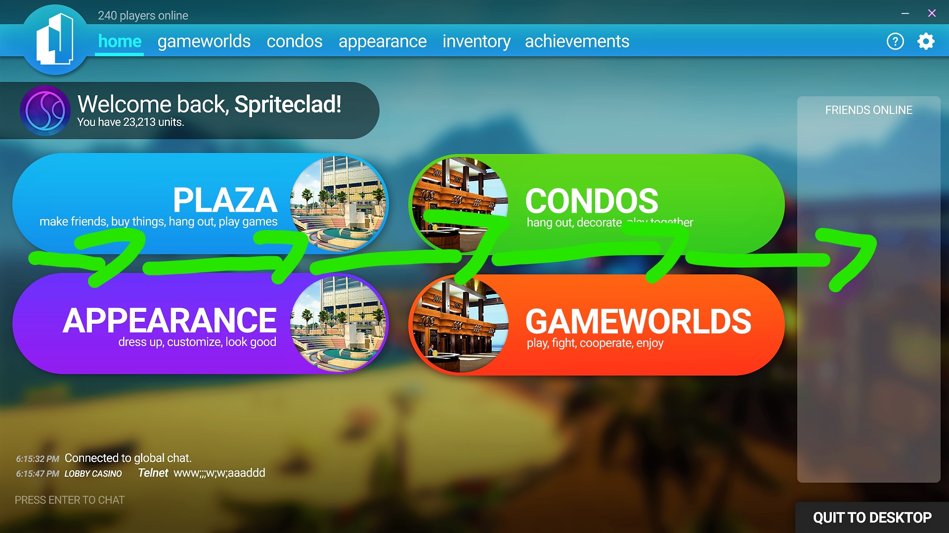
As you can see, the main four sections of the game (plaza, condos, gameworlds, and appearance) are now sorted into four Amazon Dash Button-lookin’ things on the main menu for easy access. The global chat is in plain view right below them, as well. You can also access your inventory and settings/help through the top navigation bar.
Let me know how I can improve this concept. I’d love to hear what you guys think, as I’m currently trying to think what would look better than this. Thanks!
Where’s the Item Playground?
In all honesty though, I like the design. It’s sleek and not as “bloated” as the current one. As for some actual criticism…
a) I’m not sure the global chat, with all its tabs and stuff, would fit where you put it. Especially if it’s a busy day and the chat’s getting bombarded with new messages. You want some more vertical space there.
b) Instead of the “You have X units” message, I’d prefer just the number and the unit symbol. Maybe also make it bigger/move it above the “friends online” box?
c) The plaza doen’t have its own tab on the top.
d) More of a “me” thing, but I don’t like how the “plaza” and “appearance” buttons are very similiar in color, yet the “condos” and “gameworlds” buttons break the monotone blue/purple theme the menu has going on. Now, I’m crap at matching colors to make stuff look good, but I think that the buttons should either all share the same color palette matching with the top bar, have different colors with none of them matching the bar, or have their own palette not matching with the bar.
Actually, you know what’d be cool? If we could set our own colors/palettes.
e) Lastly, I think you could snuck in some more stuff, like a time display or a message-of-the-day thing. On the other hand though, you might want to keep it more simple, I guess.
And, my last but certainly not least idea, the top bar looks kind of, clunky/outdated. It just doesn’t look like a smooth, clean, and flat UI. Which is a big requirement if you want it to look nice and professional.
here is what I mean. This is tower unites current top bar UI:
The thing is, people like, clean, simple, easy on the eyes, and sleek UI’s. I think if you can redesign the look, and style of that bar, it would change it for the better.
Well, anyways, I hope I provided some help. And gave you some ideas.
@Antlion Good call on the online friends list design (and the increased saturation). I’ll definitely put that into the next concept iteration.
What I don’t get, is what you mean by ‘clean, simple, and easy on the eyes.’ Do you mean get rid of the gradient and whatnot? I know what you mean, but I need some help figuring out what you mean by this. If I could get a more verbose description of what you’re looking for, I can possibly whip a concept with what you’re thinking in mind.
Also, the reason that Plaza doesn’t have a tab is because I’m assuming that clicking on the Plaza button will autojoin you to the nearest lobby. It doesn’t really matter, since all the lobbies are gonna be connected together soon anyway. (Though I’m assuming the game will allow you to change your preferred lobby location in the options, so.)
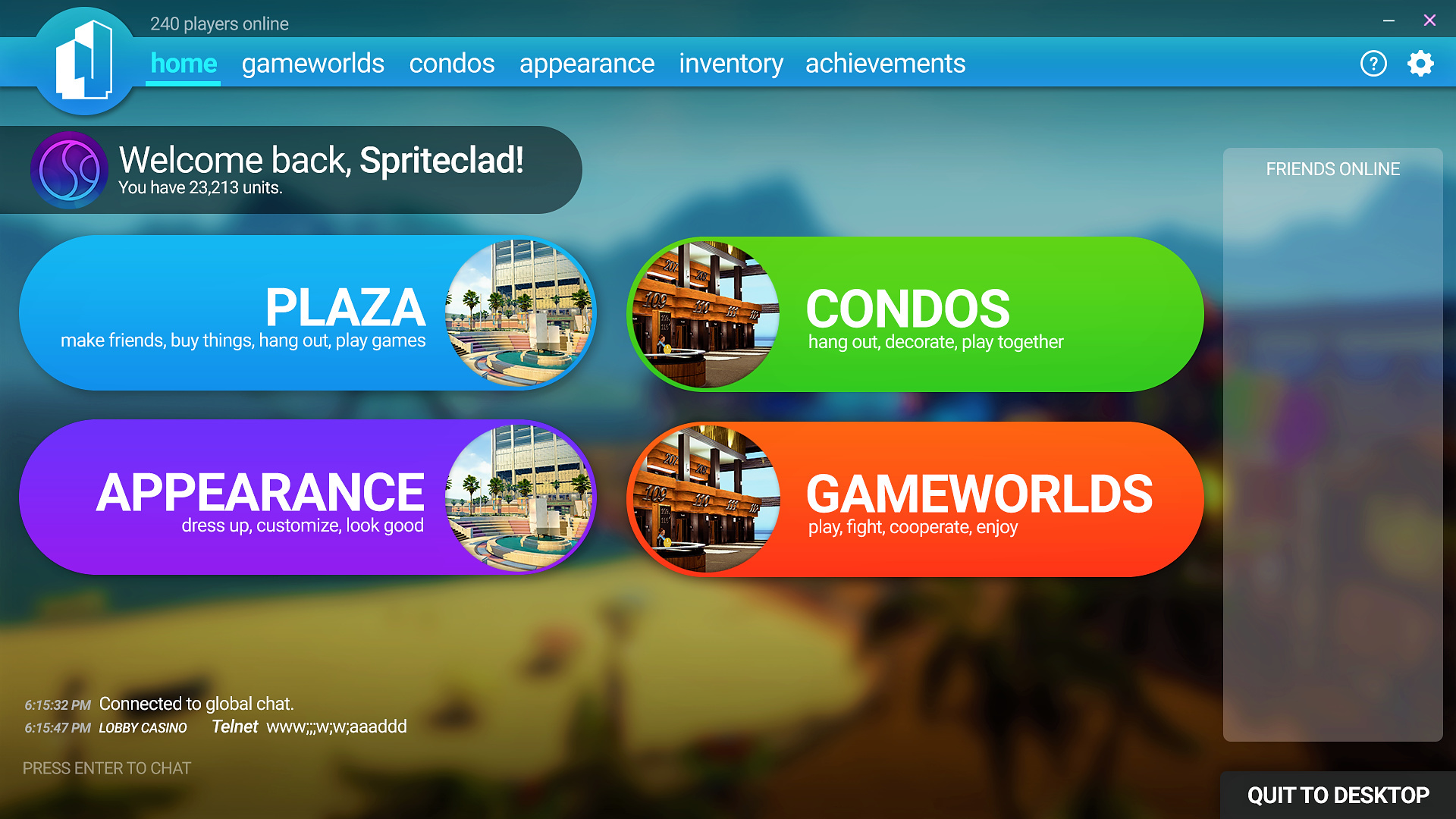
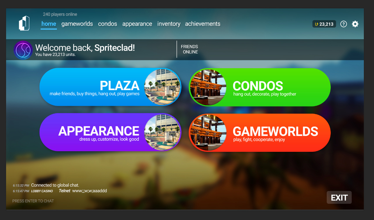
EDIT: Waaaait, I think I know what you’re getting at now. Here’s a low-res preview of the next version of my concept:
Not bad, This might just be me but the lowercase text for the top tabs don’t really look like they fit in as well with the other text because the rest is in all caps.
just gonna give my 2 cents to that, which is keep the gradient. It actually makes the thing look more polished, it doesn’t have the obligation to look like a mobile-friendly UI with monotone colors and flat everything.
As for the non-blue color shades for condos and gameworlds, just go for pink shades, as purple is sort of used by the left side already.
I was a bit iffy on that since this concept is WIP, but since I haven’t touched it in a week, I might as well give it a shot for the time being. I’ll revert it back if either a) people complain or b) it doesn’t feel right to me.
Great work! However, I would like to politely say that I find our UI superior to yours because it is more convenient.
I’d rather have a less fancy UI that would save me more clicks.
It would be great if you can enter your Condo straight from the main menu.
What is the point of displaying your unit information twice? The unit information below the welcoming text feels like a filler to make it less boring.
The new friends list is a huge downgrade. This game is about socializing and you traded out our bigger friends list for the looks. It looks like either it would display less friends (which then you would have to scroll, if you were planning on adding that) or less information about your friends.
Having to click at least once more to browse other Gameworlds is less intuitive.
I do like the global chat being displayed here. It does look the menu more alive, but to encourage people to stay in the Lobby, I’d rather not have them in the main menu.
My initial reaction is that the menu takes away features that work well with our current menu. There’s no quick way to enter your condo or enter into Minigolf/Virus.
On to some things that I personally have opinions on:
Large concerns:
Game Worlds are now obscured and hidden away
There’s two appearance buttons, I would get rid of the big one and keep the one up top
The news section is gone
The help button is too small and easy to miss
The settings button is too small and easy to miss
The friends section is really small
Units is showed twice. I would remove “you have X units”
Nothing really tells me what this game is when I see this
I don’t see a reason to have game worlds and condos repeated at the top bar when they are big front in center already
Item playground is gone
Early access text is gone
Links to our forums are gone
Smaller stuff:
Help and settings buttons don’t fit in with the rest of the buttons and don’t have labels
“Welcome back” message is a thing of the past and you don’t typically need to have your name large and taking up that much space
Some buttons are curved with huge radii, others have small radii.
The padding is weird. The TU logo is padded on the left a lot, but the chat is not as much. This also applies to the exit and the settings icon
The exit button is way too big
Using the word “home” makes me feel like I’m on a website, infact, the entire design feels like it’s a webpage
Middle buttons (“PLAZA”) are in all caps but top bar items (“inventory”) are not
The word play is used three times in the descriptions (plaza “play games”, condos “play together”, game worlds “play”)
It’s pretty bare
Complements:
The global chat position is nice
The top bar seems concise (I am very glad you removed the gradient top bar background)
It seems easy to navigate if you know the game
Background is good
Granted, I am aware there are some of these issues in our menu, but it’s been evolving for awhile now and will continue to.