![]() I feel like the look of them looks like something found in the UI and as a new player I would wonder what are these?
I feel like the look of them looks like something found in the UI and as a new player I would wonder what are these?
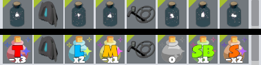
I actually agree. While I think having cartoony things in TU isn’t bad, simplistic 2D icons just look weird next to more detailed 3D models imo.
2 Likes
I’m a bit on the fence. The icons are definitely jarring compared to the other items, but they also serve an important function in letting the player know what they do at a glance. It’s easy to distinguish which of the three copies items, which stashes them, and which scales them (ignoring all other options, of course). If these icons were to be changed to look more cohesive with the rest of the items, they’d still need to somehow retain this clarity of information. If that can happen, then I’m all for it; otherwise, I think it’d just be better to leave them as is.
1 Like
I quite like the current icons, but I am up for a change.
Maybe making the icons look like the condo tools do?
I’d like if these tools were simply not items like they are, and more part of the basic UI As was suggested.
1 Like
One could argue that this contrast actually helps to visually separate the tools from other things that don’t work in a tooly way.
whew you’ll like the upcoming potion icons then
1 Like
oh no, i forgot about those, they make me sad
1 Like