There’s a couple things still that need to be sorted out (and some more features to talk about), but it’s a lot better than our previous website and going live now lets me add more to this website over time.
I would really appreciate feedback on the website as well as how it looks and runs on your browsers and mobile devices.
Yeah, that’s literally all this post is about. Check out the new website!
The right sidebar section (with the “NO MICROTRANSACTIONS” bit and stuff) just feels… kind of empty. I’d suggest putting some icons over each line to fluff it up a bit.
The “When is TU coming out?” question in the FAQ should say something like “The game will be released under Steam™ Early Access in April 2016, with the full release coming sometime in late 2016.”
I feel that there should be more screenshots/videos under the MEDIA section, or have a separate page for the rest of them (like the FAQs).
The “CONNECT WITH US” section just seems bland with a gray background. Maybe put a night shot of the ferris wheel there?
I feel the TOWER UNITE logo on the black nav header feels too tight around the top/bottom parts. Maybe make it a bit smaller in that regard?
And this is more of an optional thing, but could there be a video of the lobby instead of a static image on the top section of the page (the ‘home’ section) in the background?
Adding on to this.
You don’t need to tell us that we can run, jump, crouch, sit, or stand. That seems like a given.
The rest of the sentence (and paragraph) is fine, though.
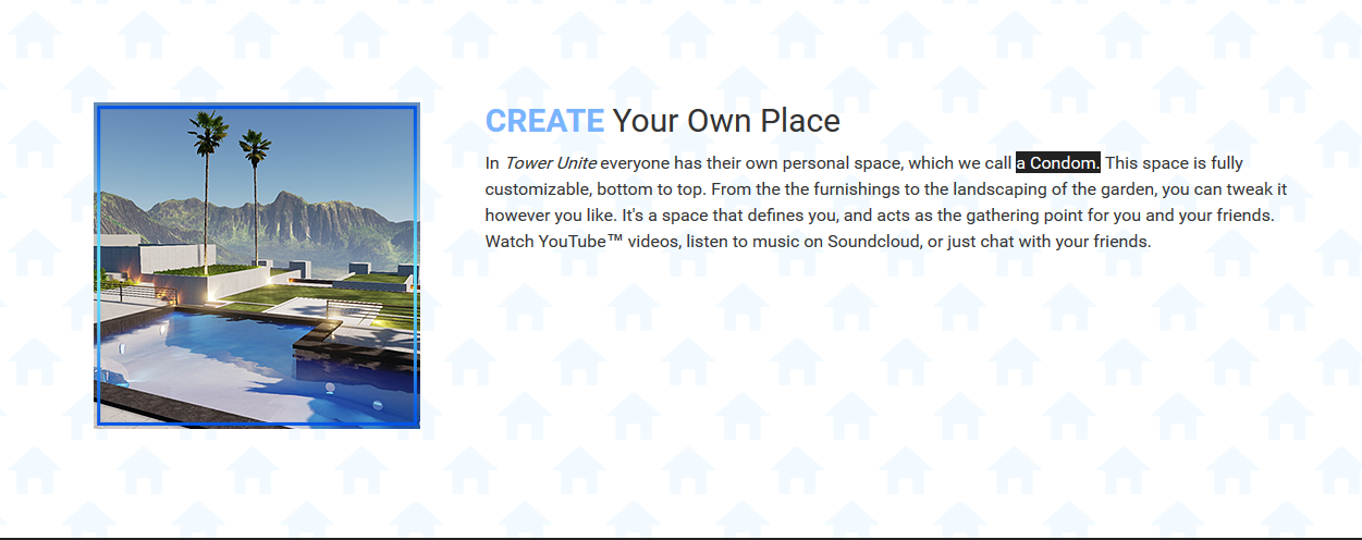
I swear cloud to butt is the best chrome extension because you always forget you have it until you encounter it again, and the amount of times it changes stuff is rare enough for you to forget about it until it smacks you in the face.


 )
)