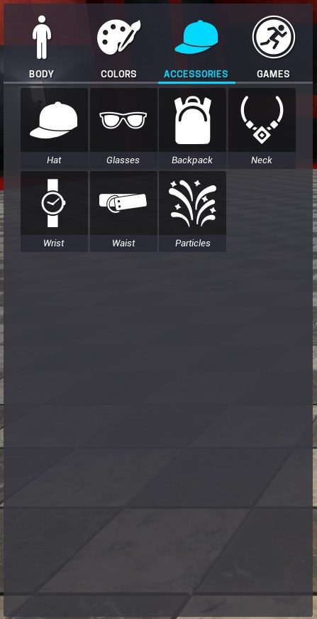
The accessory menu. S’alright. It does the job. Just a buncha tiles though, and lots of empty space.
But what if it had a little more form…
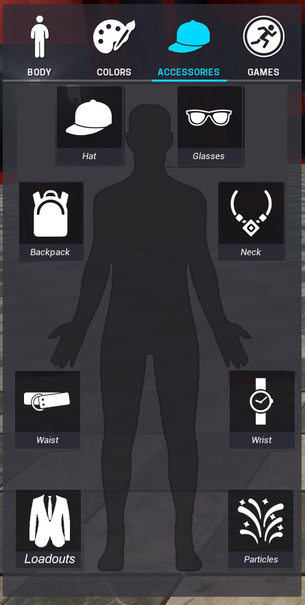
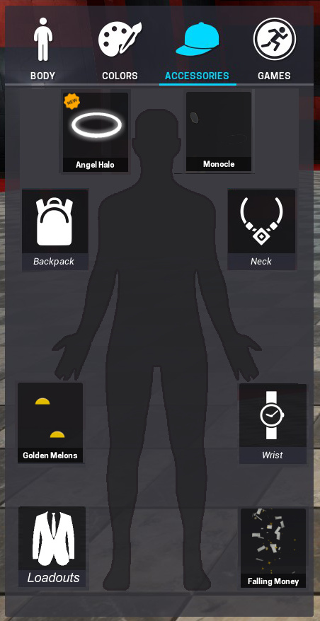
And maybe the default icons could be replaced with an item’s when that slot is in use.
Also, toward the end of making this post, I realized my brain probably subconsciously ripped this off from Deus Ex 1’s aug menu. Regardless, a lot of other UI’s in the game are starting to take their own shape, so just throwing something out here too.