Bring back the Legacy Mode for Text Hats (with support for hiding via F5)

haha

this is by far the dumbest thing i ever read…

THE WHOLE POINT OF A BLACK BORDER MAKES IT MORE LEGIBLE TO THE HUMAN EYE

This isn’t even mentioning the fact that the old one couldn’t be colored, and if you were in a light room, especially a white room, it was more difficult, if not impossible to read!

I swear we must be talking about different games, the text on the new version scales with the players nametag, which means it gets BIGGER as you get farther away.

The old one was really small actually, the size of it depended on your playermodels scale, I believe, often times it was actually blocked by the player’s name, which also made it harder to read!

The font is the same as the one used for the player name above their head, and it always has been last I checked. The old font was literally the most generic white font you could find. It fit the game stylistically in the same way that having a sun and a moon fit the game stylistically. As in… it was generic.

I’d say the older text was WAY uglier than the new, more fitting text.

3 Likes

The large text was way, waay easier to read and see from an large distance which is where it’s usefulness came from - Now you need to get right up to someone’s face to read it

I would like to add that, getting close to someones face is not necessary to read the current text hat, as it does not change size. The opacity does fall off, but from a very far distance, and if you are a builder on the condo, you can hold Q to show all nametags and text hats at full opacity.

(Please forgive the crude editing and low resolution, but you can see here that the three squares I made next to the text hat from different distances are all exactly the same size)
TextHat (1)

You can also correct me if I am wrong, I didn’t verify this one, but if the text hat is attached to and acts just like player nametags, you can adjust the opacity settings in the HUD settings
image

The user interface scale can also be bumped up in the graphics settings if the default text size is too small! (I tested this just now and it does resize all the text for usernames and text hats)
image

5 Likes

Unrelated: you’re the real MVP in this thread for actually getting a visual representation of this. The amount of work that goes into this is super helpful

1 Like

joewari da

2 Likes

I mentioned that I wouldn’t be participating in this thread anymore before, but honestly, seeing the amount of weak arguments made, I’m not sure if it’s an good idea to ignore it still. Something tells me that the people in this thread are a bit dumber than they appear - Well, some of them at least. Legacy text hat being uglier and less readable than the current one has got to be the best (worst) joke I have heard in an while with close to nothing to back it up - That’s for one thing. Let me start things off with a few of the current arguments that seem to gather attention here: The new, more “fitting” text isn’t true at all, because you are kinda comparing apples to oranges there - Both are fruit and grow similarly, but they taste different, look different, etc. The new font that apparently is the same one as the chat one works for chat - Not for pets or text hats. Being in chat and typing there is very different to these other two things when you consider under which circumstances you will typically see the chat, an text hat and a bunch or a few of the pets. Moving on: How does the font being generic make it worse exactly? This is an argument without any sound to it that people kinda just keep repeating here. It actually did fit the game better, considering the overall theme - The current font does not achieve that. In fact, that generic, “uglier” font, would have had worked much better for the game with an black border than the new one ever could, if we are saying that this actually helps people. The new font being the same one as the chat one, used as an argument for the new font being more fitting does not make any sense here. Is this that hard to understand or even see? I would suppose so, for some on here. But I won’t keep repeating that point, since it will never get across. Next - To quickly take out the whole objective/subjective debate out of the way too: I do suppose that Goop was right - I’m not exactly the best at making proper use of those terms. Moving on from that, there is one thing I was not aware that they did though, and that was the user scaling thing dependent on distance with new text hat - I guess it’s nice and partially solves the problem, however it still does not work in favor of user’s choice and freedom for specific font type and size. And last thing - Trash, I genuinely think that your earlier suggestions for how to achieve an compromise were much, much better than making use of the user-interface scale setting. Doing so would only inevitably take away from player’s freedom of choice for how they want to appear, and, here’s the real kicker for you: Just as many people that were annoyed by the old text hat being “obnoxious” and too large, there were just as many that loved it and found it much more appealing that way. If you could tell me, why shouldn’t font size be an separate setting in the text hat itself? For an game that is meant to enable people their freedom in many a ways, that kind of approach would make the most sense, maybe with the setting you mentioned working a bit to correct everything and make it fit better on the screen. The old compromises being mentioned right here in this thread by multiple people, Kirby herself included, just for the sake of limiting player’s freedom of expression isn’t really an good sign of an healthy community surrounding this game - Which is an problem that many games with smaller communities tend to get much faster and than the ones with mass appeal and large, worldwide communities as well anyway. The typical symptoms of that are what we can clearly see in this thread (if one cares to pay it any attention in the slightest): Because the current majority of the existing playerbase agrees on one thing better than the old one, great compromises that would work in favor of both sides equally, rather than just satisfying one of the sides tend to be actively ignored and swiped aside as bad ideas/suggestions. This kind of small, fairly closed to itself community, even if spread out across the game itself, forums, subreddit and an Discord server also inevitably lends itself well to closing itself together on the only arguments and ideas that the majority of people in the community want to hear - Not the ones that take into account the preferences and different perspectives. So basically, do what we believe is best for all of us, while happily ignoring all of the different voices that loudly disagree and protest against being ignored and just shoved aside.

I think this is where I will now ultimately stop - If any of the developers or Mac themselves want to join up on the offered compromise ideas, rather than taking sides, I might have an interest in looking here again, but until then, not really.

This is now fixed.

3 Likes

Being genuine for a moment? The only person in this thread being dumb is you. You have had two users offer help with the issues you were having with the overhead text (i almost thought to contribute to this, but it seems you already decided you wanted to waste everyone’s time). You change your goalposts when somebody demonstrates you are wrong. You ignored other’s requests to have a civil discussion. You call our arguments “weak” when all you can do is avoid our points and hurl insults at others. You falsely claim subjective matters as objective ones so you can be lazy and ignore all opinions that aren’t your own. You pretend to be disinterested in the conversation when you continue to write paragraphs of unformatted text on the subject. You never came here for a compromise. You just wanted to hijack this thread and throw a tantrum until you got your way.
I’m not going to bother reading the rest of your post because I’m sure it doesn’t get any better past this. Go ahead and call us stupid all you want, I’m sure it will really make people want to listen to you.

4 Likes

I’d like to leave this thread open for further discussions on the topic, if people want to continue discussing it respectfully, so please refrain from name-calling and insults in future replies.

5 Likes

I am here once again to tap my own post and comment-
Acting rude and insulting people is not a good way of being listened to. It’s actually a good way to get ignored and marked irrational and unreasonable. Your real intentions get overshadowed by frustration, even if you are making REALLY good points. You’ll be remembered for being rude rather than what you were actually talking about especially when nobody else is bringing that sort of energy.
Cooler heads prevail.

11 Likes

While I do agree that some font size settings and other styles would be nice, I think the real issue here is finding a balance where players can effectively express themselves with the text hat, while not taking away from the experience of others. The current text hat, in my opinion, strikes that balance better than the legacy one. The main issue with the old text hat isn’t necessarily the font, or the fact that it had a few bugs, it was the way players had the ability to oversize it, how bright it was, and it acting more like an accessory than a UI element. The current text hat acts more as a simple addition to player’s usernames in the UI, while the old one, in my opinion, had the ability to be a little too in-your-face.

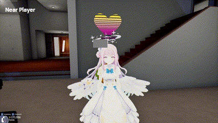
Self-expression can be a good and bad thing, depending on the person. While most players use the text hat to write something about themselves, or some other fun text, some players can write some less nice things on their hats. While the text usually isn’t anything hurtful, it can sometimes be just plain uncomfortable. I don’t love walking around plaza and seeing giant floating text with sexual comments or edgy jokes stuck on my screen. Its a lot easier to ignore if its more subtle.

At this point you could block the person if they make you uncomfortable, but what about in other situations, like players that display socials or youtube/twitch links? Some players feel like this could be considered an advertisement, and a lot of players feel pretty strongly about ads in games. It could even feel a bit exploitative if, say, a player is streaming and someone else pops in with their twitch link on the screen. It’s pretty much the same thing as hopping into someone’s twitch chat and pasting a link to another stream without permission. If the text hat is oversized and super bright, it becomes more and more obstructive for the other players. While it will probably not pull viewers away or anything, it’s just not a nice thing to do if the player didn’t want to see it in the first place. Blocking the player is a bit extreme in this case, and could even escalate the situation.

SUGGESTION: It might be a good idea to add a moderation setting that allows a player to disable a specific player’s text hat from their view. That way, if someone is using it in a way that is problematic, you can just silently turn it off from your end. The hat still keeps its functionality, and the players who do not like it do not have to be subjected to it. And, the player that turned it off can still see the other text hats that they are ok with. In cases like condos, maybe a permission or location volume setting can be made to allow host to disable text hats in certain areas. We can already disable voice and text chat for moderation purposes, but players can bypass this with text hats. Yes you can turn off all nametags with location volumes, but it would be nice to be able to keep nametags on still.

If this setting is applied, then it would be a lot easier to be more lenient with the current text hat. If we can choose to hide it on our ends, font size/style changes and brightness changes wouldn’t affect players negatively. I still think, however, that it should not be too obnoxious. Even though people would be able to turn it off, it still doesn’t look good for tower for new players to pop in and potentially see giant text hats of who knows what.

5 Likes

Tackling on to this suggestion, perhaps it could be something like how we have blacklisted and whitelisted URLs. For example, you could locally blacklist anything that has .gg/* or .tv/* where * is a wildcard for any text afterwards. I think that would help a lot since it’s basically a content filter for text hats you don’t want to see—especially for just general inappropriate text hats

2 Likes