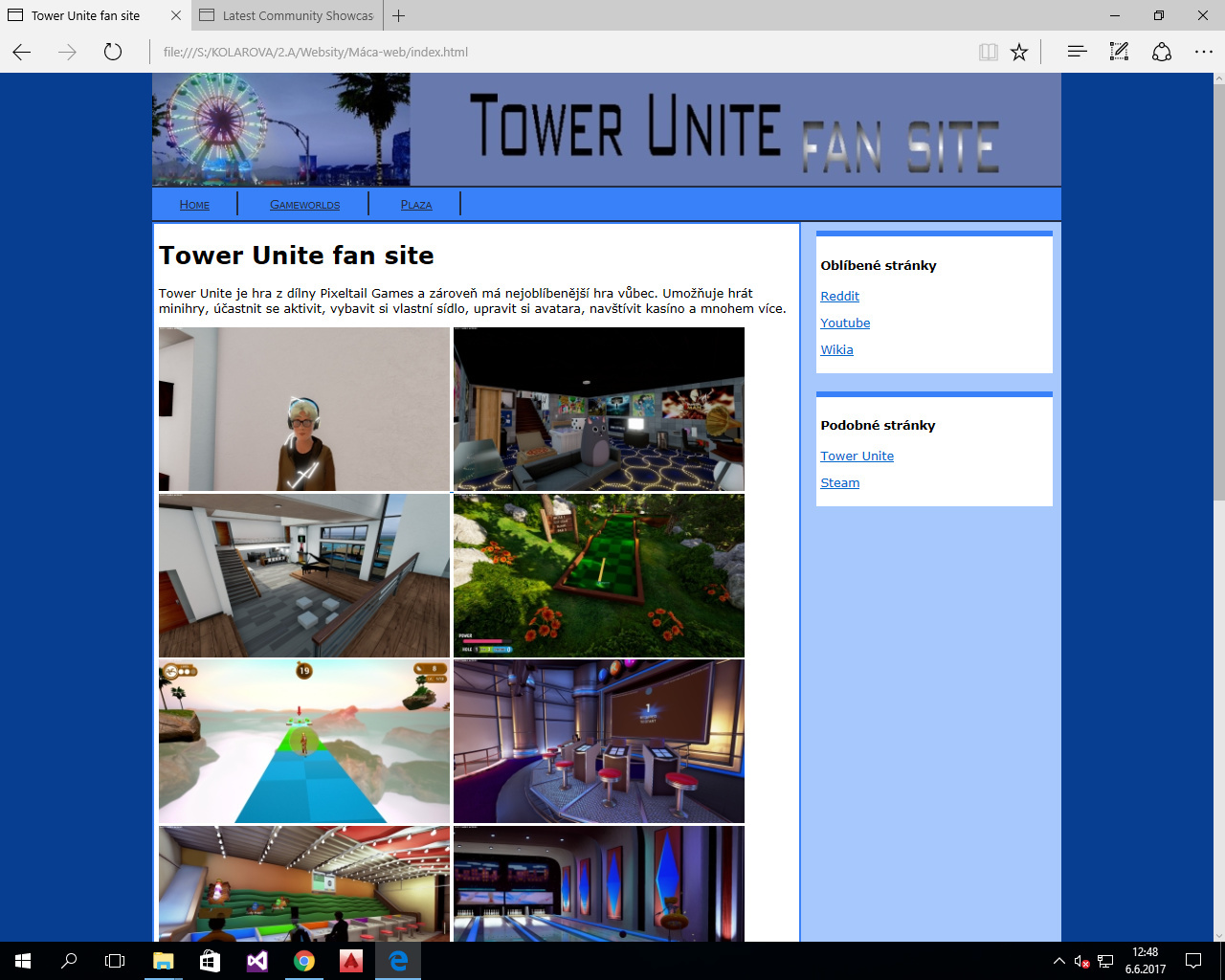
The other two tabs only contain information (on the plaza and the gameworlds). It’s basic, and I only followed the teacher’s instructions the entire time, but I’m still pretty proud of it.
C would still be pretty generous IMO. Compared to, you know, actual websites, I’d give myself a D or worse.
Still, for the purposes of the class, it’s enough
You two are too harsh. Keep in mind that you’re thinking of websites designed by experienced professionals who invest multiple full days into making their website, not to mention that many are likely developed by teams instead of a single individual. Sure, this website looks a bit dated, but I’ll be honest it’s probably a lot harder to make something like that than people think.
I believe that “it’s propably a lot harder to make than it seems/it wasn’t made by a professional/for someone who just started it’s good” aren’t valid points when comparing things.
The website IMO looks pretty bad and basic and I am willing (more than happy, actually) to accept that. Perhaps one day I’ll make a better one, perhaps not. It’s still really… meh when compared to actual sites. Telling people their creations are good for what they are (when they’re not) is just sugarcoating.
Nothing personal, just wanted to express how I feel.
I wish my school had any useful IT class, unfortunately it’s way too small to be worth it
this website is alright for an IT class project developed by one person
How are you able to grade the website without seeing the source code?
If your graphics don’t have alternate descriptions that’s one grade less. If there’s no Doctype, another grade down. Not valid HTML by any Standard? There goes another grade. I could go on, I have high Code Standards…
idk if you are open to suggestions and i don’t know what kind of aesthetic you are doing for but try adding a slightly blurry image for the site background and white text for the header for a more modern look. finding a high res wide image and cropping it to fit the header space would bring in that nice tower unite feel to your website. i don’t recommend taking my suggestion as demand or command. you do you.