Any minor things that annoy you should go here, I made this because I dont think it’s a good idea to make a thread for every minor annoyance i got.
Here’s Mine:
Catsacks are on display on the Toy Stop despite not being sold there.
Project 12 says it sells Beer on their menu despite not selling it in the store.
The Cash out Sound in Double or nothing sounds very underwhelming when dealing out large amounts. The Double and Nothing sounds get more dramatic the higher your Multiplier is, so why not the Cash Out sound?
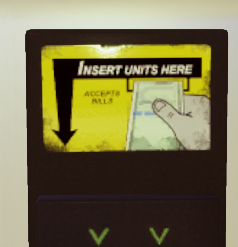
The “spending units” visual is underwhelming and doesn’t change to reflect the amount spent.
The Horizon condos store isn’t very prominent.
The posters in Hospital are very boring to read. (compared to, let’s say, Subway’s)
This luxurious Tower resort thingie has a very limited selection of foods and beverages.
Casino’s “winning units” effect includes coins and gems. Nowhere else in the game are gems used to represent currency.
Most of the casino’s machines have no slots for inserting money, some even lack ones for dispensing it.
And my biggest and at the same time tiniest nitpick…
THE PHYSICAL REPRESENTATION OF UNITS ISN’T CONSISTENT AT ALL
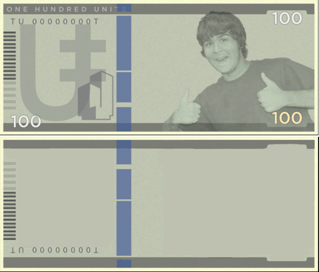
First of, you have the bills item. I have no problem with it, as it’s the only instance of bill-based units and so is consistent with itself (weeeell, except the tiny images on the vending machines).
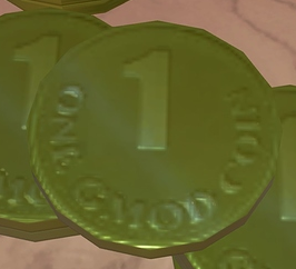
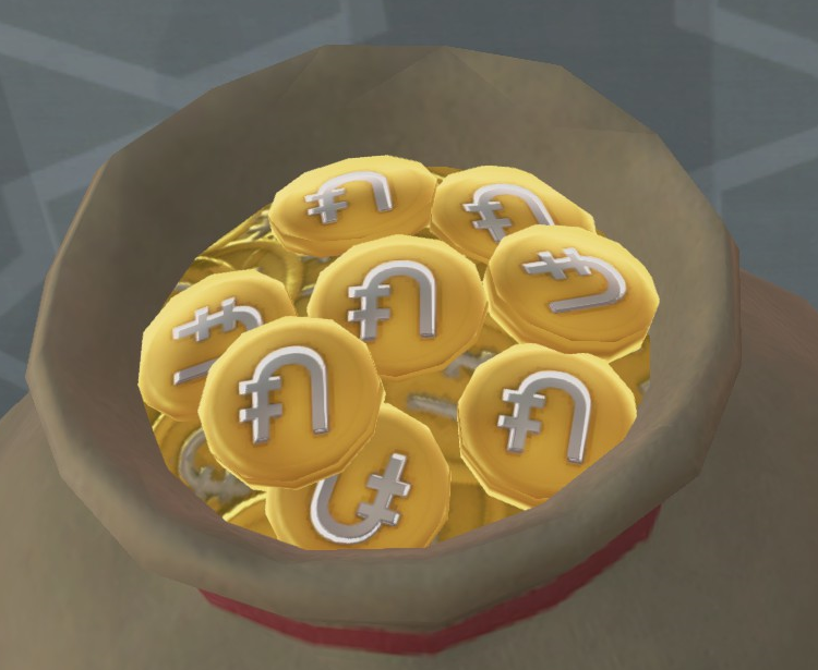
Then you have all the different unit coin designs. The one in Treasure cove, the one in the “spending units” and “winning units” effects, the one that physically dispenses from some of the casino’s machines, the one in the Treasure chest o’ units item, the one in the Bag o’ units item, and possibly the one in the Pile o’ units item (haven’t seen that one yet).
As someone who’s into everything currency and token-based, this triggers me greatly.
Alright. I’ve been silent about this for a long time…
It’s time we address one of the most paramount issues in the game.
(Rant below.)
THIS CARPET TEXTURE. THIS F***ING CARPET TEXTURE RIGHT HERE. DO YOU SEE THIS? IT’S NOT SEAMLESS. LOOK AT IT. I WANT TO USE IT ALL THE TIME BUT IT’S OFF BY JUST A FEW PIXELS. THERE’S ONE LINE THAT’S JUST BARELY OUT OF PLACE AND IT DRIVES ME CRAZY
Skeletons can’t wear clothes. The only clothes they get to wear is headwear. What is this bullshit why are skeletons forced to run around naked while humans get to wear comfy pjs and fancy formal clothing.
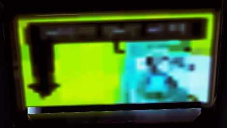
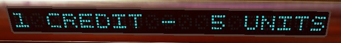
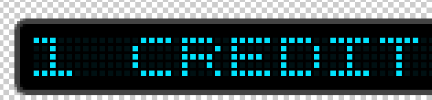
The display on every casino machine that reads out the credit-to-unit exchange rate makes no sense and it drives me mad because this is something you can be looking at for potentially hours.
The way they’ve textured faded zeroes into the background would suggest the panel is only capable of displaying characters that overlap in zero’s shape, however it’s clearly printing characters that would only be possible on a full dot matrix panel. Either that, or we’re to believe that these displays at one point just had 0 lit up across the entire panel for so long that they’re all burnt in.
In short:
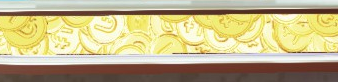
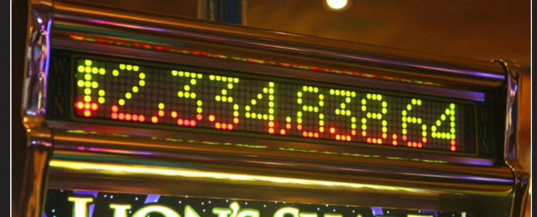
This…
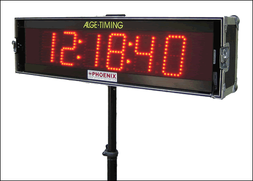
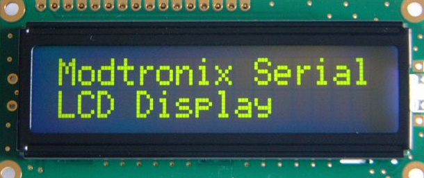
…is poorly trying to mimic something like this…
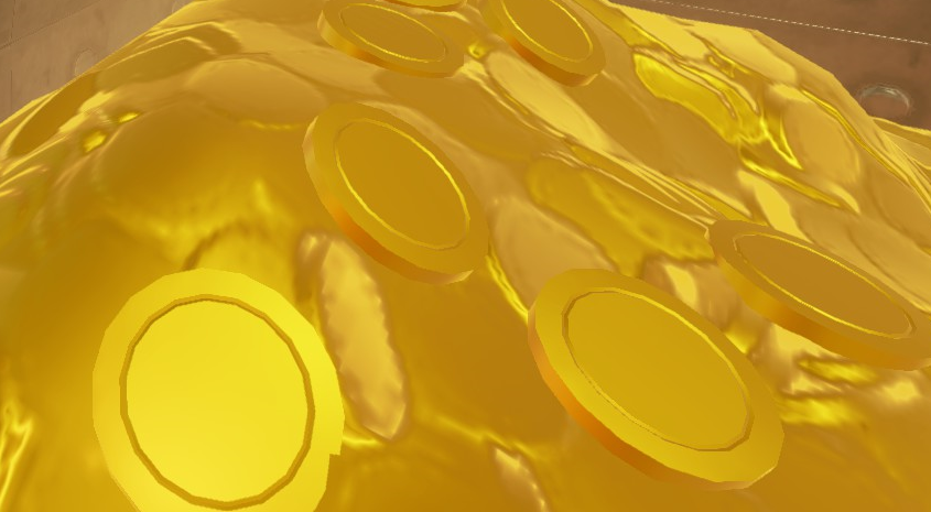
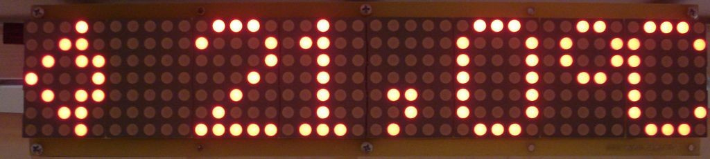
…when it should actually look something like this…


 )
)